Informe meteorológico de People's CDC COVID-19

Publicado

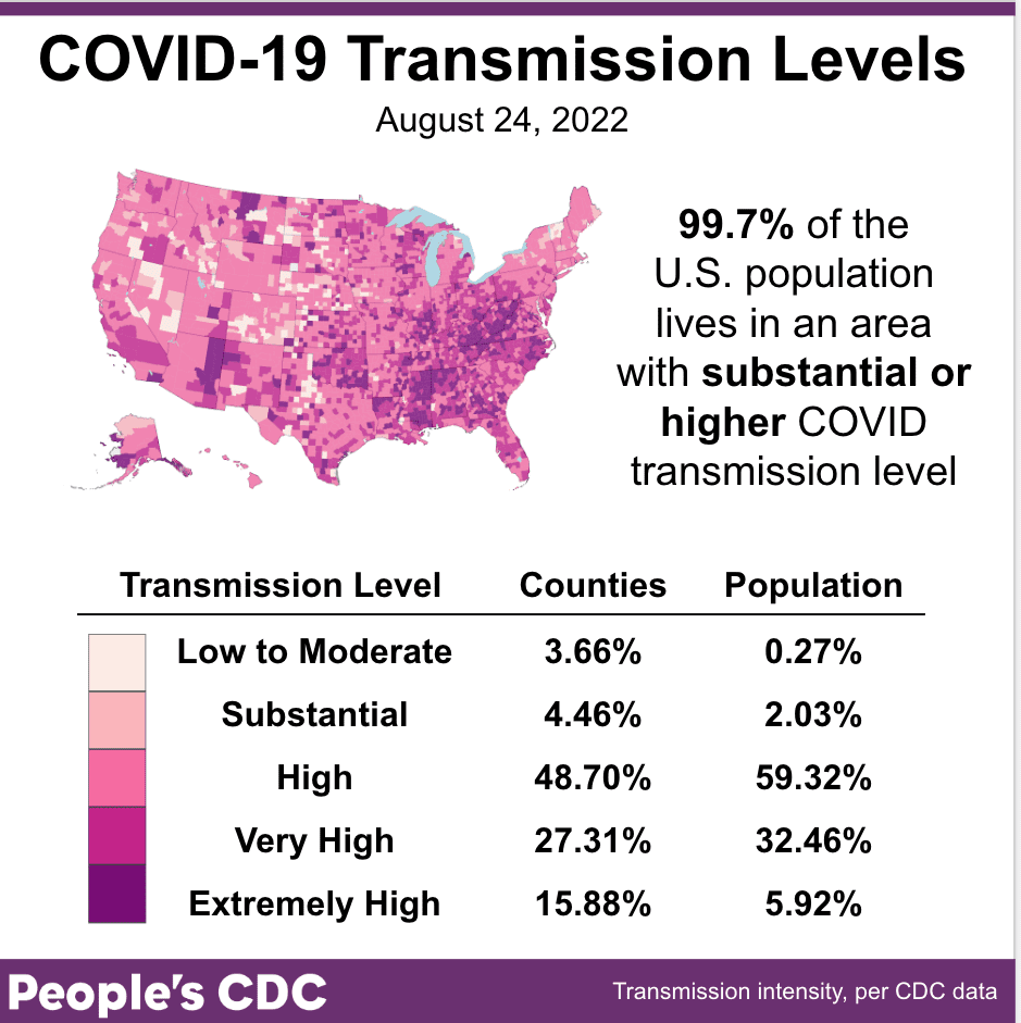
El clima: Nuestro mapa de transmisión, basado en las métricas originales de los CDC, muestra cuán altos son los casos en algunas áreas, con dos nuevas categorías para 200-300 y >300 casos semanales por cada 100 000. ¡Actualmente, más del 90 por ciento de las personas viven en un área con más de 100 casos semanales por cada 100,000!

This map and table show COVID community transmission in the US by county, with High broken into 3 subcategories: High, Very High, and Extremely High. Transmission is indicated via shades of fuschia, with the darkest shade indicating areas of Extremely High transmission, and the palest shade representing Low to Moderate transmission. Text indicates that 99.7 percent of the US population lives in an area with substantial or higher COVID transmission level, which is also represented via the three darkest shades of fuschia covering most of the map itself. Only 3.66 percent of counties, representing 0.27 percent of the population, are experiencing Low to Moderate transmission. Most of the country is experiencing High transmission, at 48.70 percent of counties representing 59.32 percent of the population; followed by Very High transmission, at 27.31 percent of counties representing 32.46 percent of the population. The graphic is visualized by the People’s CDC and the data are from the CDC.

Sobre variantes: A nivel nacional, hay pocos cambios desde la semana pasada: BA5 permanece en aproximadamente 88% y BA4.6 aumentó ligeramente de 7% a 8%. Esta puede ser una pequeña pausa en un año en el que hemos visto una rotación rápida y constante de variantes.

A bar chart shows data for the weeks of 5/28/2022 through 8/27/2022 with levels for each viral lineage shown vertically. In late-May, BA.2.12.1 and BA.2 were the dominant lineages, with only small amounts of BA.4 and BA.5 circulating. As time goes on, BA.4 and BA.5 quickly grow and BA.2.12.1 and BA.2 begin to shrink. By early July, BA.5 had become the dominant variant. As of 8/27/2022, BA.5 makes up the vast majority of cases at 88.7 percent, followed by BA.4.6 at 7.5 percent, and BA.4 at 3.6 percent of cases. The pattern of growth of BA.5 over the aforementioned time period appears to be exponential.

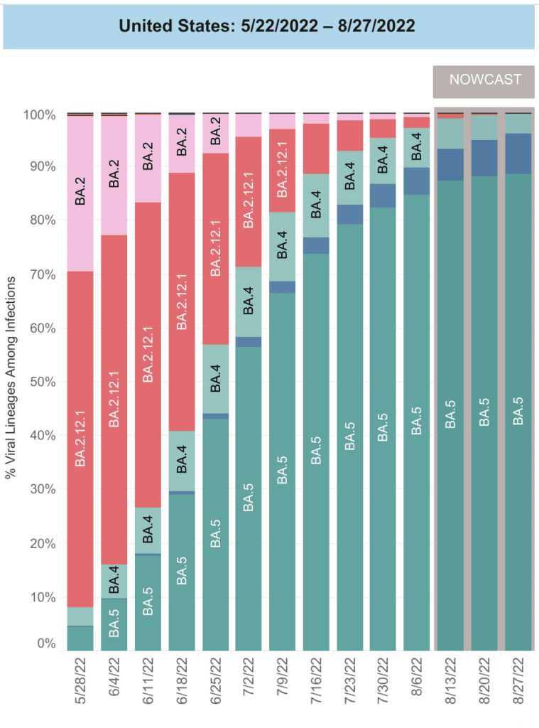
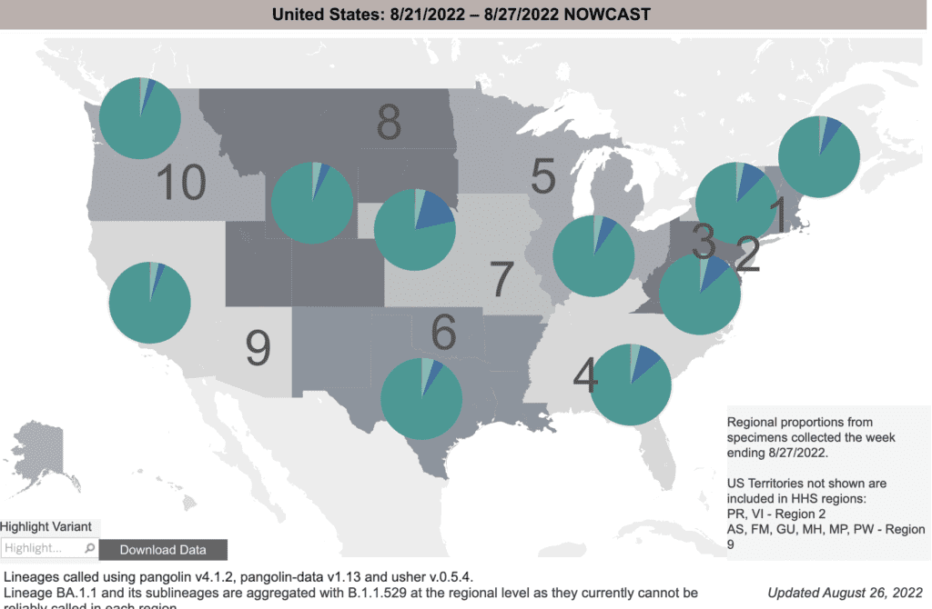
Regionalmente, vemos alguna variación, con BA4.6 menos común en la costa oeste pero representando hasta el 15 por ciento de los casos en el centro de EE. UU. El noreste está en el medio, con BA4.6 que comprende alrededor del 9 por ciento de los casos.

A grayscale map of the US shows proportions of COVID variants in 10 regions. On top of each region are pie charts indicating different regions’ proportion of each variant. The charts show that BA.5, in dark teal, is the largest proportion of variants in all regions. BA.4.6, in dark blue, is the next most prominent variant in nearly all regions but most notably in region 7, which represents Iowa, Kansas, Missouri, and Nebraska. On the bottom right, text says "Regional proportions from specimens collected the week ending 8/27/2022. US territories not shown are included in HHS regions: Puerto Rico, Virgin Islands - Region 2; American Samoa, Federated States of Micronesia, Guam; Marshall Islands, Northern Mariana Islands, Palau - Region 9."

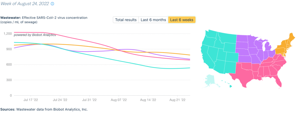
Monitoreo de aguas residuales: Datos nacionales de aguas residuales muestran que el aumento de BA5 ha alcanzado su punto máximo, con la primera disminución desde marzo. Los niveles aún son altos y la duración de este aumento plantea preguntas sobre cómo es "vivir" con COVID.

A graph with overlapping lines indicates wastewater viral concentration in dark blue & daily clinical cases in light blue from January 2020 to August 2022. The x-axis is the date & the y-axis on the left states “Wastewater: Effective SARS-CoV-2 virus concentration, copies per mL, or milliliter, of sewage” and the y-axis on the right states “Clinical: daily new cases.” The clinical cases & daily average have fairly consistent peaks & valleys, though the lines are discrepant, with the wastewater levels consistently higher than the daily clinical cases, especially during surges. This year the wastewater was at its lowest in mid-March, but it’s climbed since then with peaks of 780 copies per mL in June and 1077 copies per mL in July. The latest data point indicates a viral concentration of 678 copies per ML as of August 24. Source: “Wastewater data from Biobot Analytics, Inc.; Clinical data from USAFacts.”

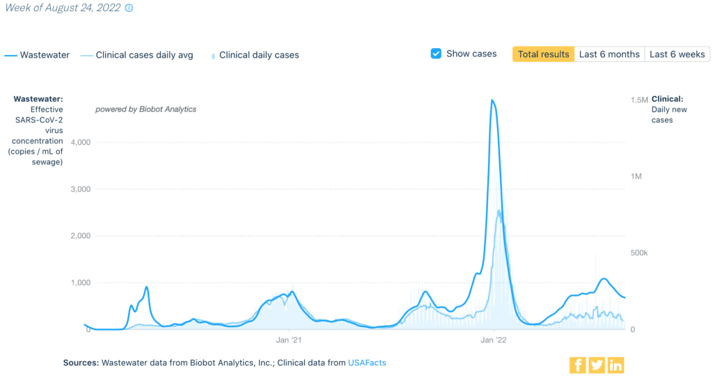
Por región, datos de aguas residuales (que no se ve afectado por pruebas en el hogar no informadas o pruebas reducidas) muestran disminuciones en todas las áreas. Occidente tiene actualmente los niveles más bajos en general, con 536 copias por mililitro.

A line graph shows the concentration of COVID virus in wastewater in four regions of the US: the west, which includes Alaska and Hawaii on this map; northeast; south; and midwest, from early 2020 to August 2022. Levels in all regions are decreasing, with levels ranging from 529 copies per milliliter of sewage in the west to 785 copies per milliliter of sewage in the northeast as of August 24, 2022. Data from Biobot Analytics.

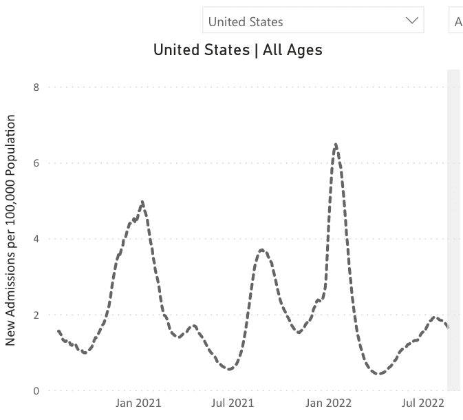
Hospitalizaciones: Mientras todavía está elevado, las hospitalizaciones también están comenzando a disminuir a medida que el aumento de BA5 se ralentiza.

A line chart representing new admissions of patients with confirmed COVID in the United States over time. The chart has “United States, All Ages,” as its title, “New Admissions per 100,000 Population” on its y-axis, and dates from January 2021 to July 2022 on its x-axis, though actual dates range from August 2020 to August 2022. The dotted line represents new admissions of patients with confirmed COVID in the US over time across all age ranges. The line indicates peak hospitalizations occurred in January 2021, August 2021, and January 2022, with smaller peaks happening in April 2021 and July 2022. At its latest data point, the line indicates that hospitalizations are currently moving in a downward trend.

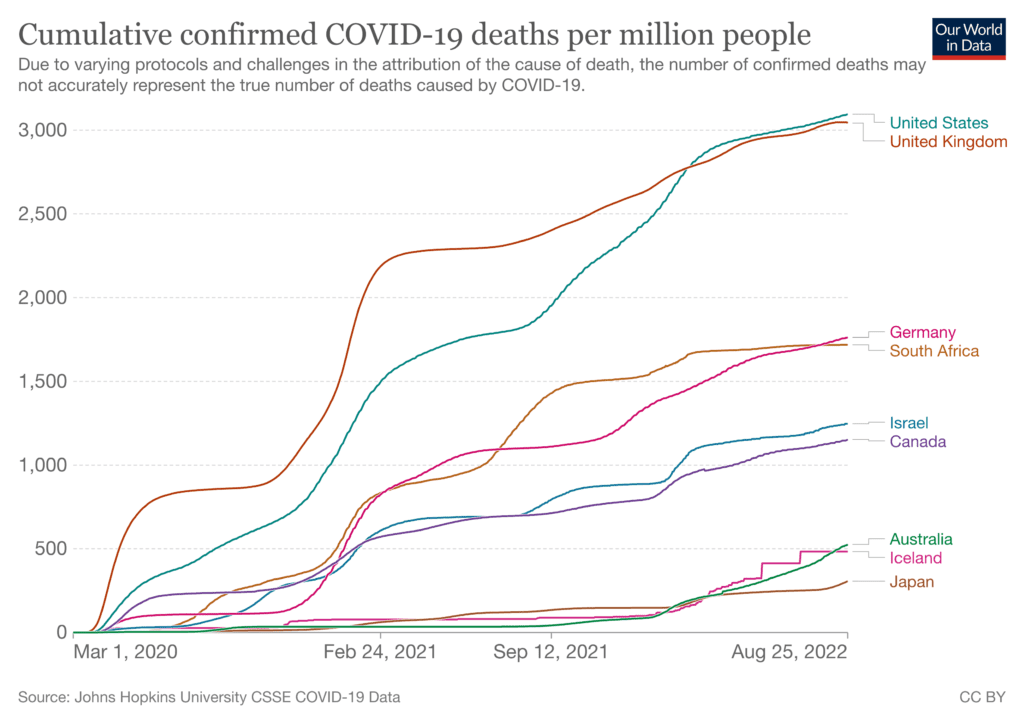
Fallecidos: Del 18 al 24 de agosto, 2.729 personas han fallecido por COVID a nivel nacional. Más de 210,000 estadounidenses han muerto a causa de COVID en lo que va de 2022.

Estados Unidos es un líder mundial en muertes por COVID. Junto con el Reino Unido, tenemos la mayor cantidad de muertes por población, lo que sugiere que nuestro enfoque para controlar la pandemia no es tan exitoso como el de otros países.

A line chart titled “cumulative confirmed COVID-19 deaths per million people,” representing cumulative deaths in nine countries, with numbers from 0 to 3,000 on the y-axis and dates from from March 2020 to August 2022 on the x-axis. Confirmed deaths per million people is led by the US, followed quite closely by the UK, both showing around 3,000 cumulative confirmed deaths per million people. Next are Germany and South Africa, showing around 1,750 confirmed deaths per million people; Israel and Canada, with around 1,250 confirmed deaths per million people; Australia and Iceland, with around 500 confirmed deaths per million people; and Japan, with around 250 confirmed deaths per million people. Text indicates that “due to varying protocols and challenges in the attribution of the cause of death, the number of confirmed deaths may not accurately represent the true number of deaths caused by COVID-19.” The source for these data is Johns Hopkins University CSSE COVID-19 Data.

Sobre COVID largo: Los científicos están examinando la posibles funciones y tratamientos de los microcoágulos en Larga COVID (LC). Si bien las personas con COVID tienen más probabilidades de desarrollar coágulos, aún no está claro que los coágulos contribuyan a la LC. 

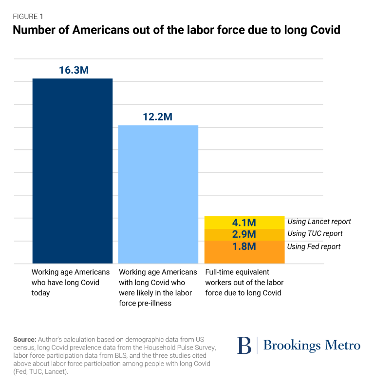
Nuevos informes dejan claro que Long COVID está teniendo un gran impacto en la fuerza laboral. Si bien la prevención de enfermedades debe ser un objetivo en sí mismo, las empresas también deben darse cuenta de que mantener a su personal y clientes saludables es lo mejor para ellos.

Bar chart titled “number of Americans out of the labor force due to long Covid,” presented by Brookings Metro. The first bar, in dark blue, represents “working age Americans who have long Covid today,” at 16.3 million. The next bar, in light blue, represents “working age Americans with long Covid who were likely in the labor force pre-illness,” at 12.2 million. The third bar, split into three categories in dark, medium, and light orange, represents “full-time equivalent workers out of the labor force due to long Covid,” with 1.8 million people per the Fed report, 2.9 million people per the TUC report, and 4.1 million people per the Lancet report. Text at the bottom notes, “Source: Author’s calculation based on demographic data from US census, long Covid prevalence data from the Household Pulse Survey, labor force participation data from BLS, and the three studies cited above about labor force participation among people with long Covid (FED, TUC, Lancet).”

Pronóstico: A medida que los estudiantes regresan a la escuela, usando capas de protección son la mejor manera de mantener las escuelas más seguras y evitar interrupciones debido a días de enfermedad. los La Academia Estadounidense de Pediatría lo tiene claro: las máscaras no interfieren en el aprendizaje de los estudiantes.

Screenshot of a tweet from the American Academy of Pediatrics that reads, “If caregivers are wearing masks, does that harm kids’ language development? No. There is no evidence of this. And we know even visually impaired children develop speech and language at the same rate as their peers.”

La administración decidió un enfoque de tratamiento y vacunación. Estudios muestran Paxlovid trabaja para prevenir la hospitalización y la muerte entre las personas mayores – pero sin beneficio para los menores de 65 años o sin condiciones subyacentes. ¡Necesitamos tratamientos de última generación!

Two sets of line charts representing “cumulative hazard ratio for hospitalizations due to Covid-19, according to age group and treatment status,” with cumulative hazard ratios on the y-axes, and follow-up in days from 0 to 35 on the x-axes. Each chart includes a blue line representing “no treatment,” for those who did not receive Paxlovid, and an orange line representing “treatment,” for those who did receive Paxlovid. The top chart, representing data among patients aged 65 and older, shows Paxlovid helped to prevent hospitalizations and death, with the no treatment line indicating much higher cumulative hazard ratios compared to the treatment group among that age group. The bottom chart, representing data among patients aged 40-64, shows Paxlovid did not help to prevent hospitalization or death, with the no treatment line close to and at times overlapping with the treatment line, indicating no difference in cumulative hazard ratios among those who did or did not receive treatment.

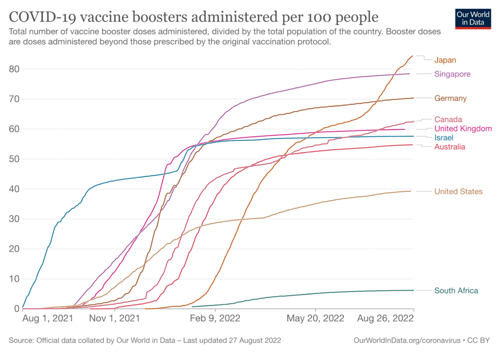
Las vacunas actualizadas, dirigidas a BA5 y la cepa original, pueden estar disponibles a partir de septiembre. Esta fantástica noticia viene con algunas preocupaciones. Los refuerzos solo estarán disponibles para personas mayores de 11 años, una vez más, dejando a los niños pequeños desprotegidos. 

Nuestra infraestructura de vacunas se ha cerrado en gran medida. Necesitamos un despliegue equitativo y bien financiado de estos refuerzos.. Sin embargo, EE. UU. va a la zaga de la mayor parte del mundo en el uso de refuerzos Y puede ser un desafío motivar al público para que obtenga este refuerzo.

A line chart titled “COVID-19 vaccine boosters administered per 100 people,” representing booster rates in nine countries, with numbers from 0 to 80 on the y-axis and dates from August 1, 2021 to August 26, 2022 on the x-axis.The chart indicates that Japan has the highest booster rates, with around 84 per 100 people having received booster doses as of the latest data point. Next is Singapore at 78.5 per 100 boosted, Germany at 70.4, Canada at 62.7, the UK at 59.9, Israel at 57.6, Australia at 54.8, the US at 39.3, and South Africa at 6.2. The source for these data is noted as “official data collected by our World in Data,” with the latest update having occurred on August 27, 2022.

Estamos potencialmente en un punto de inflexión. Si no surgen nuevas variantes y los nuevos refuerzos bivalentes son efectivos, podemos ver una verdadera disminución en los casos. 

Los datos ya sugieren que con altos niveles de vacunas, estamos viendo menos muertes, aunque todavía hay altas tasas de hospitalización, durante los aumentos repentinos.. Esto no cambia la posición del PCDC de que la prevención de infecciones en primer lugar es esencial, especialmente dadas las altas tasas de CP.

Sin embargo, no está claro qué impacto podría tener el regreso a la escuela y el típico aumento invernal. Y pueden surgir nuevas variantes en cualquier momento, otra razón para prevenir casos y reducir las posibilidades de que el virus mute.

Estar preparado: Sensible al tiempo: el gobierno planea finalizar su programa de entrega de una cantidad limitada de pruebas de COVID en el hogar gratuitas a través de USPS a partir del 2 de septiembre, según USPS. Puede verificar si debe recibir una última ronda de pruebas al visitando el sitio de prueba gratuito de USPS.

Y si parece que sus pruebas gubernamentales caducan pronto, verifique aquí para ver por cuánto tiempo son realmente buenos. 

Nota de datos: en este informe, los números extraídos de los CDC estaban actualizados al 24 de agosto de 2022. Los CDC actualizan los datos con frecuencia a medida que reciben información actualizada de los estados y condados. Los números que ve hoy pueden ser ligeramente diferentes de los números de este informe. 

Fuentes: ¡Revise los enlaces a lo largo y visite nuestro sitio web para obtener más información! https://peoplescdc.org

Compartir esto:
Traducir
Cerrar