Informe meteorológico de People's CDC COVID-19

Publicado

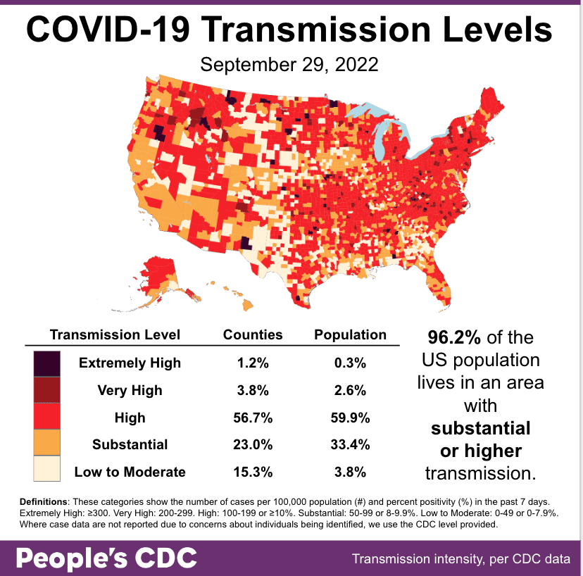
El clima: While this is the calmest the map has looked since the Spring, 96.2% of the population still lives with substantial or higher transmission. In particular, the East Coast seems to be heating up again.

Map and table show COVID community transmission in the US by county, with High broken into 3 subcategories: High, Very High, and Extremely High. Transmission is indicated via shades of pale yellow to red to black, with the darkest shade indicating areas of Extremely High transmission, and the palest shade representing Low to Moderate. Text indicates that 96.2 percent of the US population lives in an area with substantial or higher COVID transmission level, which is also represented via the three darkest shades of red covering most of the map itself. Most of the country is experiencing High transmission, at 56.7 percent of counties representing 59.9 percent of the population; 23 percent of counties representing 33.4 percent of the population are experiencing substantial transmission. Only 15.3 percent of counties, representing 3.8 percent of the population, are experiencing Low to Moderate transmission.The graphic is visualized by the People’s CDC with data from the CDC.

Sobre variantes: El variant picture remains unclear. BA5 is still most common at 81 percent, but has been decreasing for the past 6 weeks. Both BA4.6 (blue, aka Aeterna) and BF.7 (lime green, aka Minotaur) are showing continued growth.

A bar chart shows data for the weeks of 7/2/2022 through 10/1/2022 with levels for each viral lineage shown vertically. Since late June, BA5 has been the dominant lineage, growing from about 42 percent of cases to just over 80 percent by August and peaking in mid August at about 86 percent. Since then, it has receded, but at present still makes up about 80 percent of cases. The lineages that appear to be growing over the past few weeks are BA 4.6 (now at 12.8 percent) and BF 7 (now at 3.4 percent).

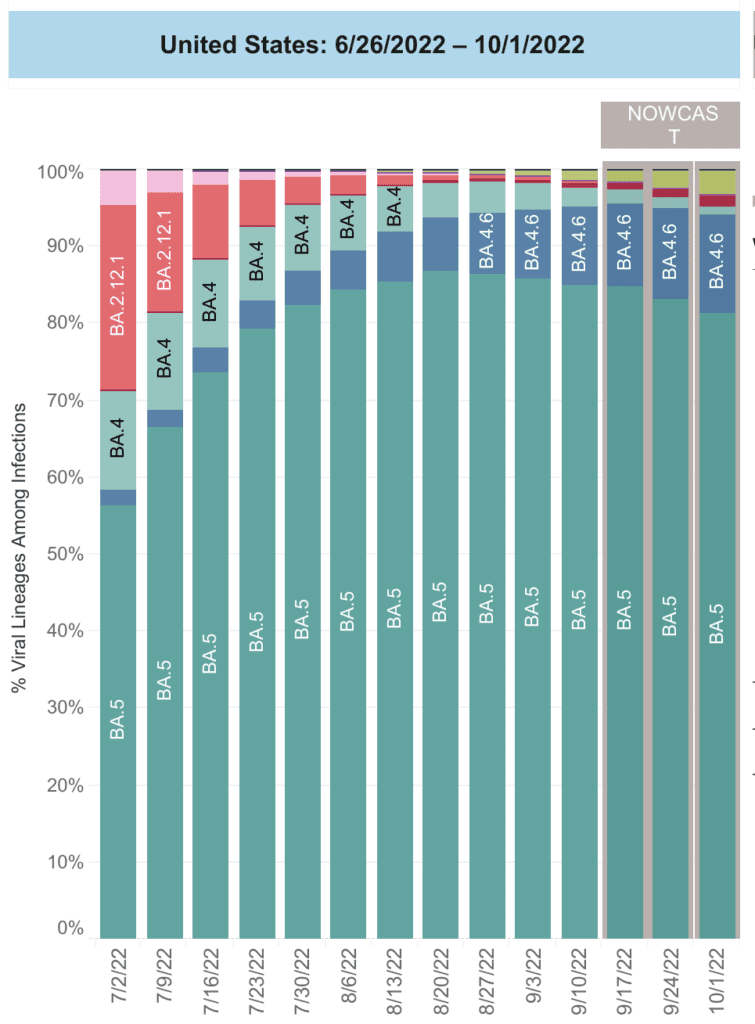
Aeterna is most common in the central Plains, while the Northeast is showing higher rates of both Aeterna & Minotaur.

The abundance of variants circulating now are slowly finding & using the same mutations–likely to evade immunity & spread faster. Vaccine-only plans do not address this problem–we need to drive down transmission using layers of protection.

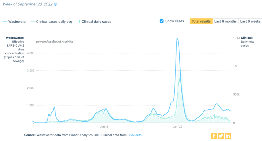
Monitoreo de aguas residuales: Nationally, we continue to see a decrease in niveles de aguas residuales–though these levels are much higher than the previous 2 years at the same date. Levels are highest & rising slightly in the Northeast; the Midwest may also be seeing a small increase.

A graph shows differences in wastewater viral concentration & daily clinical cases. At the top left is a legend. The top line, in solid blue, indicates viral concentration as determined by wastewater. The bottom line, in light blue, represents a daily average of clinical cases & follows the same pattern but is slightly lower throughout & much lower during large COVID waves. Bars in the same light blue color represent the total amount of clinical daily cases. There are small spikes in the graph in April 2020, January 2021, & September 2021, and a large spike in January 2022. The end of the graph shows low levels in April 2022 but a rapid increase until June 8th. More recently, there is a slight dip in numbers. Wastewater & cases lines track mostly together, but the wastewater line rises sooner & moves higher than the cases line especially in spikes and over the past few months. Bottom text reads "Source: Wastewater data from Biobot Analytics, Inc; Clinical data from USAFacts."

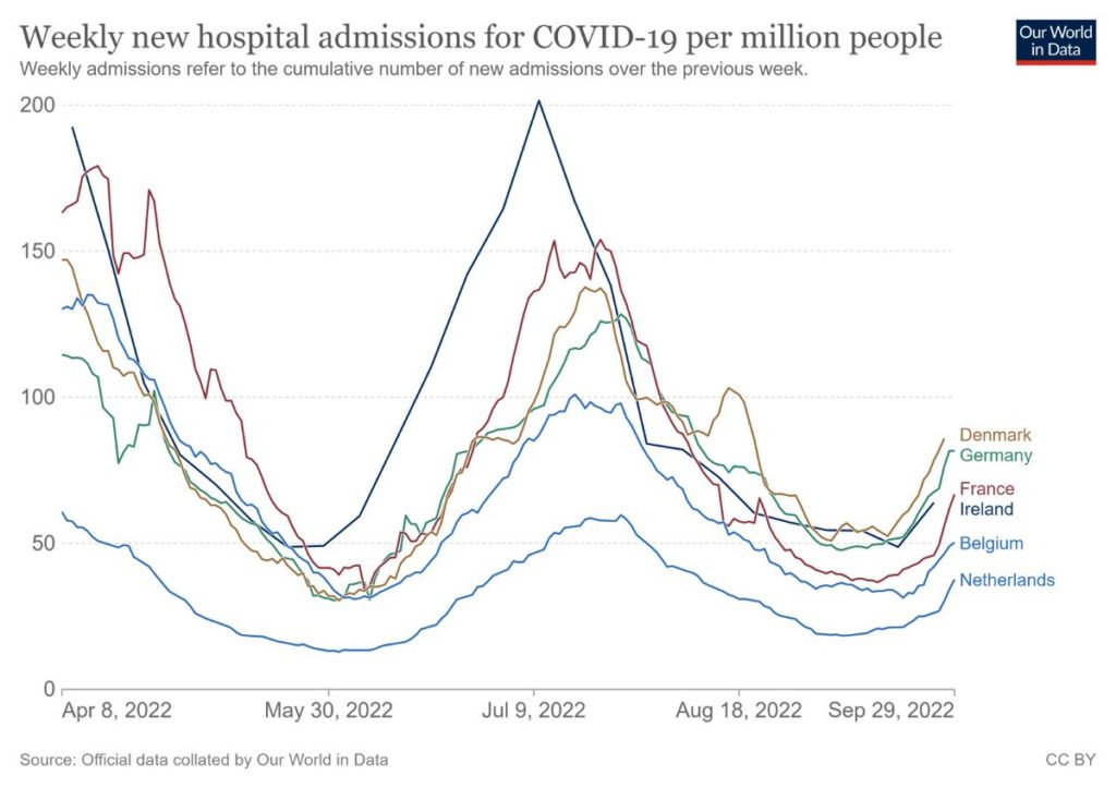
Hospitalizaciones: Hospitalizaciones are decreasing generally, which is good news. However, we are already seeing signs of increases in the Northeast. 

Two line charts representing new admissions of patients with confirmed COVID in the United States over time. The first chart has “United States, All Ages,” as its title, “New Admissions per 100,000 Population” on its y-axis, and dates from January 2021 to July 2022 on its x-axis, though actual dates range from August 2020 to August 2022. The dotted line represents new admissions of patients with confirmed COVID in the US over time across all age ranges. The line indicates peak hospitalizations occurred in January 2021, August 2021, and January 2022, with smaller peaks happening in April 2021 and July 2022. At its latest data point, the line indicates that hospitalizations are currently moving in a downward trend. The second chart is titled “HHS Region 1, All Ages” and represents the Northeasternmost states. The chart has similarly aligned peaks and valleys, but recently, appears to be increasing rather than decreasing.

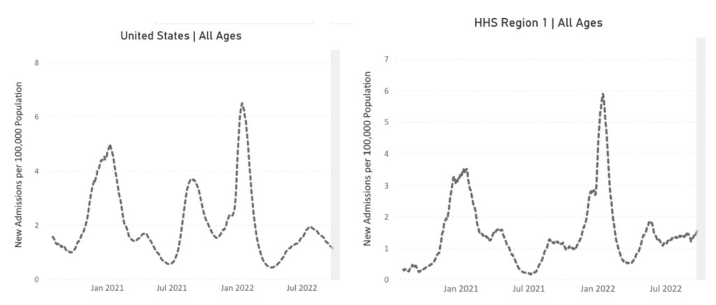
We’ve seen this pattern many times before–cases start to rise in the NE and then sweep across the country. Given increased hospitalizations in the UK & Europe this week (another common early warning sign), the fall surge is likely about to start.

This chart, from Our World in Data, is a line graph representing weekly new hospital admissions for COVID and includes rates from the following countries: Denmark, Germany, France, Ireland, Belgium, and the Netherlands. In all cases, increases have been noted over the past weeks, currently ranging between 40-100 admissions/million people. In most of these countries, the trajectory of the increase appears quite sharp.

Fallecidos: From September 22nd through September 28th, 3,088 people died of COVID nationally. 227,765 people have died of COVID in 2022 so far.

Pregnancy: Un artículo stressed the dangers of COVID during pregnancy & the safety of vaccines. COVID in pregnancy increased premature delivery, preeclampsia, stillbirth, neonatal mortality & maternal mortality. The vaccine is safe & protects both pregnant people & babies.

Sobre COVID largo: A new paper on Long COVID seeks to educate physicians on the symptoms, causes, and appropriate ways to support patients with Long COVID. It may be helpful to share with your health care provider if you have persistent or new symptoms after COVID.

The CDC wants you to Fall Into Healthy Habits, further pushing the responsibility of COVID onto individuals. We need a centralized response. While attending routine checkups, eating healthy & getting exercise is good advice, it is ineffective in stopping the spread of COVID.

Join us in demanding that Biden & Congress promote safety & equity: We need layers of protection via free, quality masking & testing, ventilation and air filtration, universal health care, vaccines, treatments, and paid sick leave. 

In the meantime, stay up to date with vaccines – including the new bivalent booster, wear high quality masks, use ventilation and HEPA filters whenever inside with others, and test & isolate when sick.

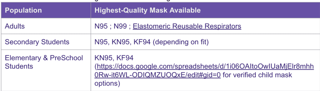
For mask options for children, find data on sizing aquí

A two-column chart with left column labeled “population” and right column labeled “highest-quality mask available.” For the “adults” population, the highest-quality masks read “N95; N99; Elastomeric Reusable Respirators.” For the population “secondary students,” the highest-quality masks read “N95, KN95, KF94 depending on fit.” For the population of “elementary and preschool students,” the highest-quality masks read “KN95, KF94.” A URL is linked for verified child mask options. That link is the same as the one previously mentioned.

If you cannot afford or are having trouble accessing N95 masks, contact @musewendi. They are also accepting donations to support this effort!

Notes: 1) The numbers in this report were current as of 9/29. The CDC updates data frequently as it receives refreshed information. Today’s numbers may be slightly different from the data here. 2) Check out the links throughout & see our website for more! https://peoplescdc.org.

Compartir esto:
Traducir
Cerrar