Informe meteorológico de People's CDC COVID-19

Publicado

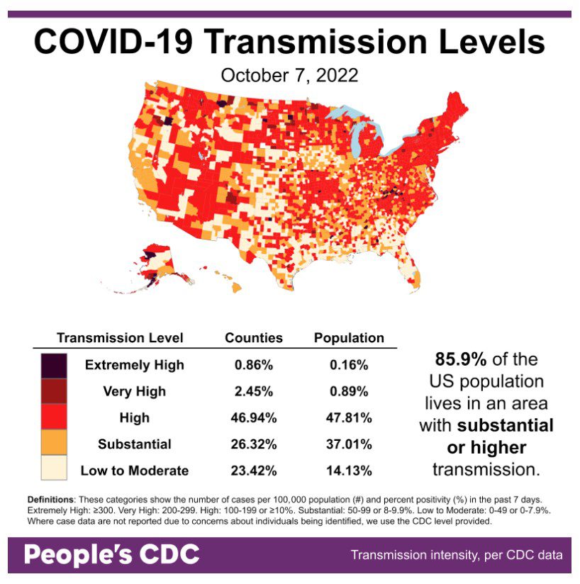
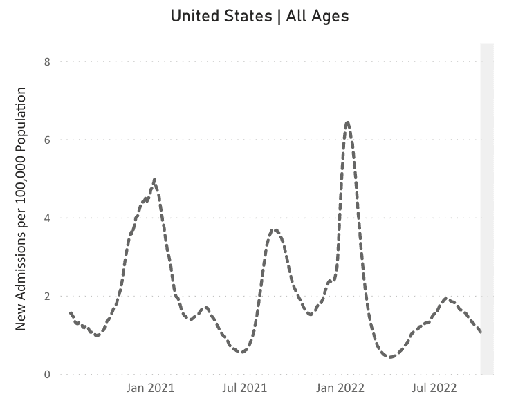
El clima: The map continues to trend calmly, although 85.9% percent of the population still lives with substantial or higher transmission. While a calm trend is welcome, layers of protection are always necessary to minimize any uptick the colder seasons may bring.

Map and table show COVID community transmission in the US by county, with High broken into 3 subcategories: High, Very High, and Extremely High. Transmission is indicated via shades of pale yellow to red to black, with the darkest shade indicating areas of Extremely High transmission, and the palest shade representing Low to Moderate. Text indicates that 85.9 percent of the US population lives in an area with substantial or higher COVID transmission level, which is also represented via the three darkest shades of red covering most of the map itself. Most of the country is experiencing High transmission, at 46.9 percent of counties representing 47.8 percent of the population; 26.3 percent of counties representing 37.0 percent of the population are experiencing substantial transmission. Only 23.4 percent of counties, representing 14.1 percent of the population, are experiencing Low to Moderate transmission.The graphic is visualized by the People’s CDC with data from the CDC.

Sobre variantes: El variant picture is similar to last week. BA.5 is most common, down to 79% & still declining. BA.4.6 (blue, Aeterna) increased to 14% and BF.7 (lime green, Minotaur) increased to 5%. The Northeast is seeing more of both Aeterna & Minotaur, while Minotaur is common in Central Plains.

A bar chart shows data for the weeks of 7/9/2022 through 10/8/2022 with levels for each viral lineage shown vertically. Since late June, BA.5 has been the dominant lineage, growing from about 42 percent of cases to just over 80 percent by August and peaking in mid August at about 86 percent. Since then, it continues to recede, but at present still makes up about 79.2 percent of cases. The lineages that appear to be growing over the past few weeks are BA.4.6, which is now at 13.6 percent, and BF.7, now at 4.6 percent.

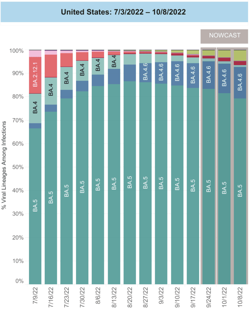
Hay many, many other variants out there, all competing to see who can best outpace our immunity. The pandemic is not over y we need to engage all layers of protection.

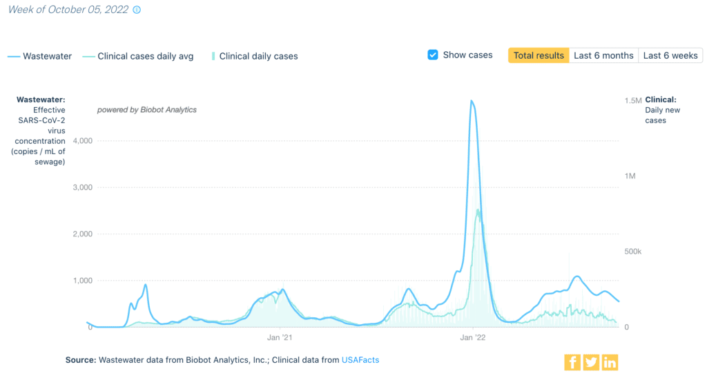
Monitoreo de aguas residuales: Nationally, we continue to see a decrease in niveles de aguas residuales. This is good news, but we are still far above the lowest points seen in the spring of ‘22 and the summer of ‘21. We can do more to suppress transmission.

A graph shows differences in weekly wastewater viral concentration & daily clinical cases. At the top left is a legend. The top line, in solid blue, is viral concentration in copies per milliliter of sewage r. The bottom line, in light blue, represents a daily average of clinical cases & follows the same pattern but is slightly lower throughout & much lower during large COVID waves. Bars in the same light blue color represent the total amount of clinical daily cases. There are small spikes in the graph in April 2020, January 2021, & September 2021, and a large spike in January 2022. The end of the graph shows low levels in April 2022 but a rapid increase until June 8th. More recently, there is a slight dip in numbers. Wastewater & cases lines track mostly together, but the wastewater line rises sooner & moves higher than the cases line especially in spikes and over the past few months. Bottom text reads Source: Wastewater data from Biobot Analytics, Inc; Clinical data from USAFacts.

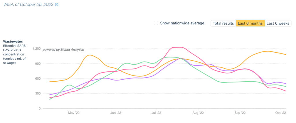
Regionally, wastewater is the highest in the Northeast (orange), which is seeing another small wave – continuing a pattern seen all summer. 

A line graph shows average weekly wastewater COVID viral concentration in four US regions. At the top left is a legend with text Week of October 5, 2022.  Four different lines are shown, each line representing the four regions, and indicates viral concentration in copies per milliliter of sewage. At the bottom is a region legend showing the green line as West, purple as Midwest, red as South and yellow as Northeast. Beginning in May 2022, Northeast is at the highest, second is Midwest, third is South, and fourth is West. From May 2022 to October, Northeast has three major spikes with a recent slight dip, Midwest has one major spike with a recent slight dip, West has one major spike and a recent slight dip, and South has one major spike and a recent slight dip. The end of the graph shows Northeast with the highest at 1,079 and the three other regions at a lower level and closer together with the following order, Midwest at 498, West at 439, and South at 347. Data from Biobot Analytics.

Hospitalizaciones: Hospitalizaciones are decreasing generally, which is good news. However, we are still seeing increases in the Northeast, as we highlighted last week. 

A line chart representing new admissions of patients to hospitals with confirmed COVID in the United States over time. The chart has “United States, All Ages,” as its title, “New Admissions per 100,000 Population” on its y axis, and dates from January 2021 to July 2022 on its x axis, though actual dates range from August 2020 to August 2022. The dotted line represents new admissions of patients with confirmed COVID in the US over time across all age ranges. The line indicates peak hospitalizations occurred in January 2021, August 2021, and January 2022, with smaller peaks happening in April 2021 and July 2022. At its latest data point, the line indicates that hospitalizations are currently moving in a downward trend.

Fallecidos: From September 29th through October 5th, 2,373 people died of COVID nationally. 

Sobre COVID largo: El US census released updated estimates of Long COVID this week. Overall, 14% of all adults reported Long COVID (lasting more than 3 months), a percentage that has been consistent since June.

Scientists continue to learn about multiple pathways that can cause Long COVID. Other data suggest that LC may look different in older adults, perhaps related to severity. Additional data show that COVID is associated with an increase in new type 1 diabetes diagnoses in youth.

Protections: While we shouldn’t be left with only individual-level protections, it’s important to make the most of them. More studies show CR boxes are effective. This graph shows CR boxes clean more air (higher CADR) for less money (black dots) than some HEPA air filters.

Bar graph showing Clean Air Delivery Rate CADR comparing Corsi Rosenthal CR boxes to HEPA filters in two setups, home & classroom. Top legend shows five symbols: square home office, square classroom, circle cost in dollars per CADR, square Power Draw, and triangle Sound. Left side y axis is CADR cubic feet per minute, right side y axis is cost in dollars per cubic feet per minute. Two additional right side y axes show power draw in watts and sound level in decibels. Ten bars grouped in two setups. Five sets, CR low, CR medium, CR high, HEPA 1, and HEPA 2. CR low has third highest CADR, lowest cost, moderate power draw, and medium sound. CR medium has second highest CADR, lowest cost, higher power draw, and higher sound. CR high has the highest CADR, lowest cost, very high power draw, and highest sound. HEPA 1 has much lower CADR compared to CR boxes, highest cost, high power draw, and lower sound. HEPA 2 has lower CADR compared to HEPA 1, high cost, high power draw, and lowest sound.

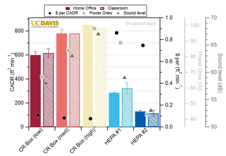
Learn how to make one at cleanaircrew.org.

Another important layer is staying up to date with vaccines. The newest Bivalent vaccines – available to those 12+ years old – are the first to be updated to Omicron (specifically, BA.5). However, messaging has been poor, resulting in a lack of awareness and thus, low uptake.

For an explanation on how the immune system interacts with COVID and the vaccines, Dr. Jeff Gilchrist, PhD has a wonderful thread. 

El CDC changed guidance around when healthcare workers need to wear masks. However, there’s a lot of confusion over which map to check. To be clear: healthcare settings are recommended to use masks when Community Transmission is high (not the falsely-calming green map).

The Community Transmission map is the same map we highlight every week at the top of the WR. We encourage masking at all times in all healthcare settings AND pharmacies so everyone, but especially immunocompromised people, can be safer when getting the care they need.

Finally, the CDC announced this week that they will be reporting COVID data less frequently. The PCDC believes the pandemic deserves attention & resources and will continue reporting weekly. We’ll keep you updated if we change data sources or timing of report information.

Notes: 1) The numbers in this report were current as of 10/7. The CDC updates data frequently as it receives refreshed information. Today’s numbers may be slightly different from the data here. 2) Check out the links throughout & see our website for more! https://peoplescdc.org.

Compartir esto:
Traducir
Cerrar