
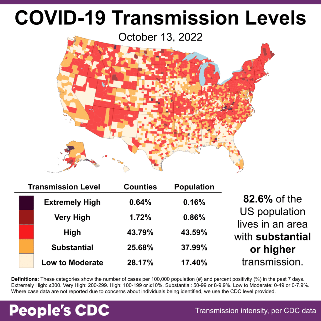
El clima: Although transmission levels have calmed since the recent surge, 82.6% of the population continues to live in areas of substantial or higher transmission. Layers of protection remain necessary to reduce the likelihood and severity of a winter surge.
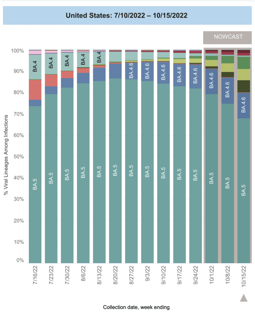
Sobre variantes: BA.5 remains the most commonly circulating variant at 67.9%, followed by BA.4.6 at 12.2%.
In previous reporting from the CDC, two sublineages, BQ.1.1 and BQ.1, were aggregated with BA.5 itself; this is the first week we’ve seen them broken out.
Newly updated data shows BQ.1.1 and BQ.1 represented only 2% of variants from 9/25 to 10/1 and 5.7% of variants from 10/2 to 10/8. This week, they represent 11.4% of currently circulating variants.
These new subvariants of BA.5 are particularly concerning given their “immune escaping” abilities. BA.2.75.2, an emerging subvariant of BA.2.75 and currently at about 1% of variants, exhibits similar abilities.
Monitoreo de aguas residuales: National niveles de aguas residuales appear to have remained relatively stable over the past week; unfortunately, these data remain high, and demonstrate an ongoing undercount of official case counts.

Regionalmente, wastewater data show an increase in the northeast when compared to last week.
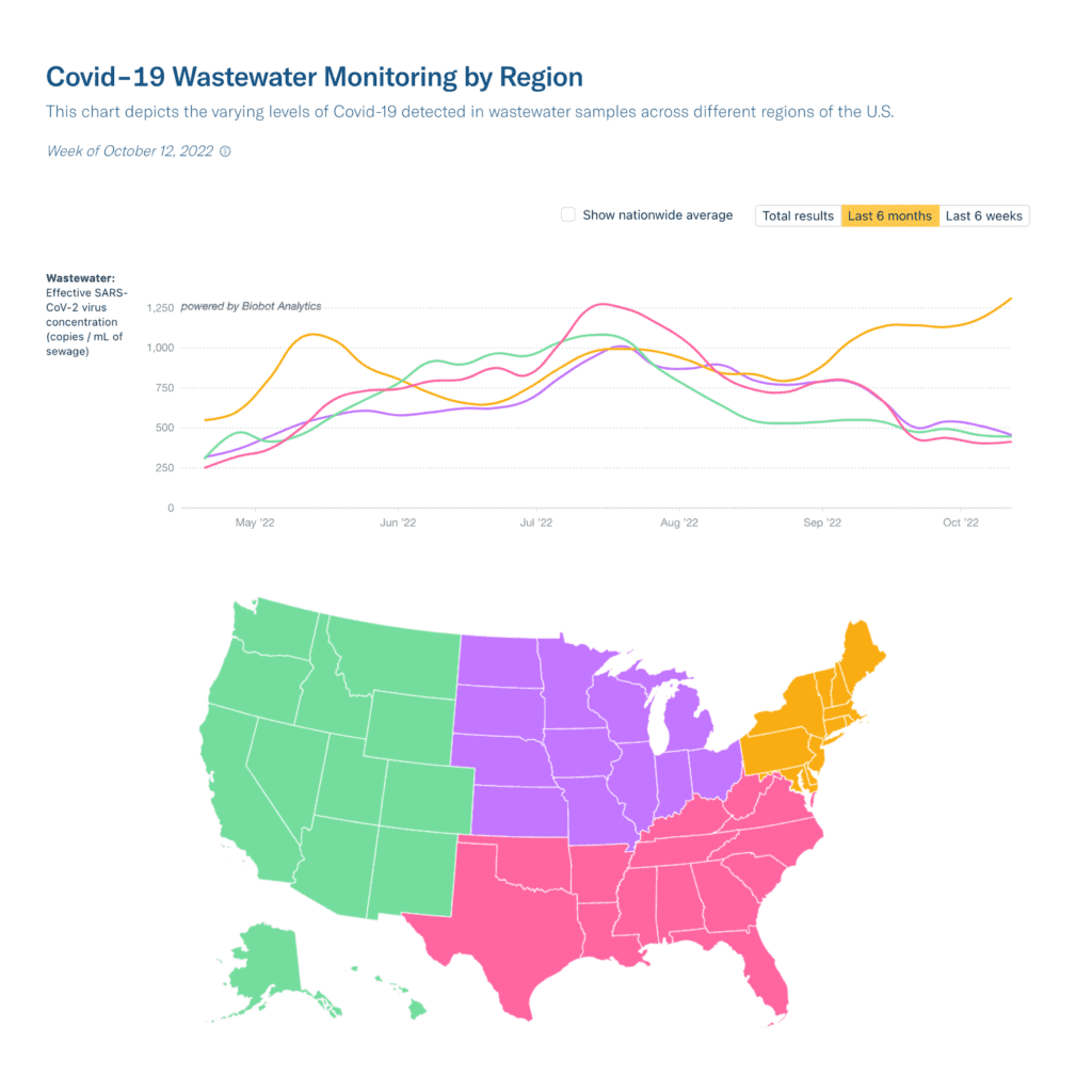
This may be due to some combination of people heading indoors as the months get colder, the rise of new more highly transmissible subvariants, and/or the continued abandonment of the people by the state and government.
The specific reasons for this increase in cases will be made clearer in the coming weeks; in the meantime, we know increases in the northeast region are often helpful in predicting increases in other regions. COVID is far from over.
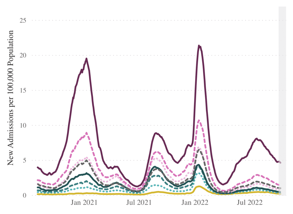
Hospitalizaciones: Hospitalizaciones continue to decrease for nearly all age groups except for those aged 70+, whose hospitalizations levels appear to have remained stable since last week’s report.
Fallecidos: From October 6 to October 12, at least 2,200 people died of COVID nationally. Over 233,000 people have died from COVID in the US this year – so far.
Sobre COVID largo: A new study of Long COVID finds that between 6 to 18 months after symptomatic infection, nearly half of those infected report incomplete recovery or no recovery at all.
Another study identifies fatigue, neurocognitive impairment, and chest symptoms among key symptom clusters of Long COVID, with significant impact on people’s health and working capacity.
In a stunning visual essay published in this week, Savannah Brooks chronicles her experiences with Long COVID as a former athlete, describing herself as “an example of what’s at stake for anyone who contracts Covid, no matter how fit.”
Pronóstico: A nuevo estudio shows just how poorly the CDC and other state agencies have been at tailoring their epidemiological research to the ongoing needs presented by the pandemic.
The authors note much of the work put out by these agencies have done little to help develop or measure the effectiveness of mitigation strategies. Better data is just one of many things we need from the state in order to prevent what is likely to be a winter surge.
The new bivalent boosters are now authorized for children as young as five years old. The CDC recommends getting the bivalent booster at least two months after your last dose.
The Kaiser Family Foundation reports that 40% of adults who’ve had their initial COVID vaccines are “not sure” if they should get the updated bivalent boosters; this demonstrates the ongoing failure of the state to provide adequate guidance.
New human trial data from Pfizer shows that their updated boosters provide substantial protection against the BA.5 subvariant.
Unlike in Moderna’s similar study, Pfizer did not compare efficacy against BA.5 with efficacy against older, now-uncommon subvariants.
To check whether you’re recommended to get an updated booster, you can use the widget available about halfway down this page on the CDC’s website.
Tome accion: Newly circulating immune-escaping variants, along with poor public health guidance from the state and little to no funding or urgency from the federal government, means we are likely to see a winter surge.
In addition to COVID, health officials in the US are also predicting a particularly brutal flu season.
Masks remain a critical tool in protecting ourselves and others from these and other respiratory illnesses. And resources such as the Corsi-Rosenthal box – which we also linked to in last week’s report – allow us to improve air quality in shared indoor spaces.
Sign this petition calling on Amtrak to designate “mask-only” cars on their trains to protect passengers from COVID.
Please also sign this petition demanding mask requirements at essential services – including public transit, healthcare settings, and government offices.
We should not have to DIY our “tools” in the midst of a public health crisis. Join us in pushing for public health solutions such as better ventilation and filtration infrastructure, free and easily accessible testing and high-quality masks, and universal paid time off.
Notes: 1) The numbers in this report were current as of 10/17. The CDC updates data frequently as it receives refreshed information. Today’s numbers may be slightly different from the data here. 2) Check out the links throughout & see our website for more! https://peoplescdc.org.