Informe meteorológico de People's CDC COVID-19

Publicado

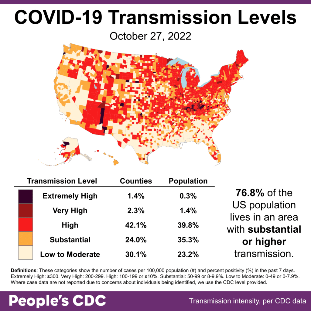
El clima: Tiempo we are seeing fewer areas with the incredibly high levels seen over the summer, 76.8% of the population continues to live in areas with substantial or higher transmission. Layers of protection remain necessary to reduce infection.

Map and table show COVID transmission levels by US county as of 10/27/22. Low to Moderate transmission levels are pale yellow, Substantial is orange, High is red, Very High is brown, and Extremely High is black. Text reads: 76.8 percent of the US population lives in an area with substantial or higher transmission. Northeast and midwest show mostly High transmission (red); CA, TX, and the Gulf Coast are mostly Low to Moderate (pale yellow); KY and to a lesser extent AZ, show several Extremely High or Very High counties (black or brown). Transmission Level table shows 1.4 percent of counties (0.3 percent by population) as Extremely High, 2.3 percent of the counties (1.4 percent by population) as Very High, 42.1 percent of counties (39.8 percent by population) as High, 24.0 percent of counties (35.3 percent by population) as Substantial, and 30.1 percent of counties (23.2 percent by population) as Low to Moderate. The People's CDC created the graphic with data from the CDC.

Sobre variantes: BA.5’s reign has come to a close, with 50% of cases this week. BA4.6 & BF7 are showing stable or slow growth (10% & 8%, respectively). Instead, BQ1 & BQ1.1, the more immune-evasive variants, are now showing rapid growth, up to 27% of all cases.

Stacked bar chart with x-axis as week shows weeks from 7/23/2022 through 10/29/2022 and y-axis as percent viral lineage among infections. The most recent 3 weeks are Nowcast projections. BA5 (teal) is the most common lineage overall, growing from about 80 percent of cases on 7/30 to a peak on 8/20 of about 86 percent. Receding since then, it presently makes up about 50 percent. BQ1 (forest green) and BQ1.1 (olive) increase from barely-visible proportions in August to current estimates of 14.0 and 13.1 percent, making them 2nd and 3rd most common currently. BA4.6 (blue) is 2nd-most common overall but 4th this week, slowly increasing from about 3 percent on the week of 7/23 to about 11 percent on the week of 9/17 and only slightly decreasing since then. BF7 (lime green) more slowly increases to 7.5 percent the current week. Even more slowly growing are BA2.75 (rose) and BA2.75.2 (maroon), and BA.5.2.6 (pastel green), all currently estimated around 2 percent.
Graphic source: CDC COVID Data Tracker: Variant Proportions

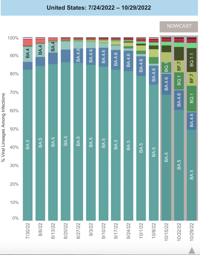
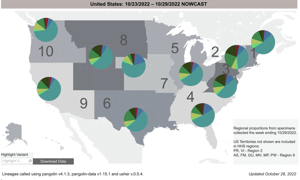
Hay regional differences in the variants and their growth: more cases are BQ1 & BQ1.1 (green & dark green) in the East, Great Lakes & South, while relatively rarer in the Central Plains & Pacific Northwest. However, we expect it will rapidly spread to these areas as well.

Regional difference map of the US with 10 regions (groups of roughly 3 or 4 states), depicted as shades of gray. Title reads: United States: 10/23/2022 - 10-29/2022 Nowcast. Each region has a colored pie chart. Legend reads “Regional proportions from specimens collected the week ending 10/29/2022” and “US Territories not shown are included in HHS regions: PR, VI - Region 2. AS, FM, GU, MH, MP, PW - Region 9.” BA.5 (teal) is most common in most regions, followed by BQ.1 (forest green) and BQ1.1 (olive). Region 2 (NY, NJ, PR, VI) is the exception with only 40 percent BA.5; it also has noticeably more BQ.1 (forest green) (about 25 percent). Region 7 (IA, MO, KS, and NE), and Region 10 (ID, WA, and OR) also differ, having higher percent BA.5 (about 60 percent) than other regions which are around 50 percent. Region 7 also has more BA4.6 (blue) than the rest. Bottom text reads: “Updated October 28, 2022” and  “Lineages called using pangolin v4.1.3, pangolin-data v1.15.1 and user v.0.5.4.”
Graphic source: CDC COVID Data Tracker: Variant Proportions

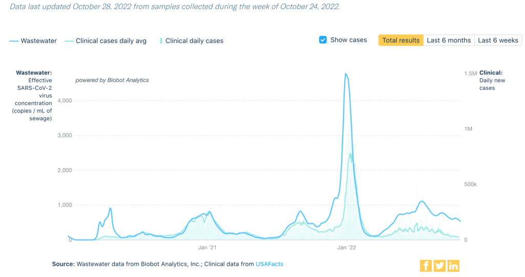
Monitoreo de aguas residuales: National niveles de aguas residuales continue to bounce around at a fairly high level but show general decline. All regions show fairly stable levels, except the Northeast – which is declining but still has the highest levels.

Title reads Covid-19 Wastewater Monitoring in the US. Top text says “this chart shows the SARS-CoV-2 virus concentration present in samples of wastewater taken from across the US. The level of virus in wastewater is a leading indicator, meaning it precedes the change in clinical case counts or hospitalizations.” Graph shows weekly wastewater viral concentration and daily clinical cases for all time, ending on 10/24/22. Blue line is viral concentration in copies per milliliter of sewage, which is higher than the light blue line is clinical cases daily average and is more erratic and relatively plateaued. Bars in the same light blue color represent total clinical daily cases. Wastewater increases from 5/2022 to its peak in late 7/2022, then decreases with a smaller spike in 9/2022. In the last few weeks, there is a slight increase in wastewater concentration but currently decreasing. Bottom text reads Source: Wastewater data from Biobot Analytics, Inc; Clinical data from USAFacts.
Graphic source: Biobot Analytics

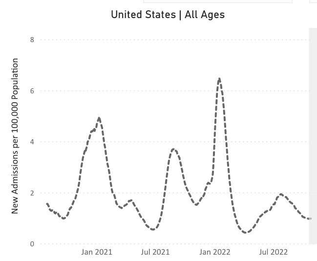
Hospitalizaciones: Hospitalizaciones are mostly flat compared to last week, with some increases in the East and Midwest.

A line chart representing new admissions of patients to hospitals with confirmed COVID in the United States. The chart has New Admissions per 100,000 Population on its y axis and labels of January 2021 to July 2022 on its x axis; the plot extends past x labels with data ranging from August 2020 to October 2022. New hospitalizations peak at about 5 per 100,000 in January 2021 and 6.5 per 100,000 in January 2022, with smaller peaks happening in August 2021 (about 3.7 per 100,000) and July 2022 (about 2 per 100,000). The line gradually decreases after the July 2022 minor peak to about 1 per 100,000 at the right most point.
Graphic source: CDC COVID Data Tracker: New Hospital Admissions

Fallecidos: For the week ending October 26, 2,649 people died of COVID nationally. This is the 16th week in a row that at least 2,500 people have died from COVID.

Sobre COVID largo: A study at Duke University scheduled to start in January will examine whether longer courses of Paxlovid have any effect on Long COVID.

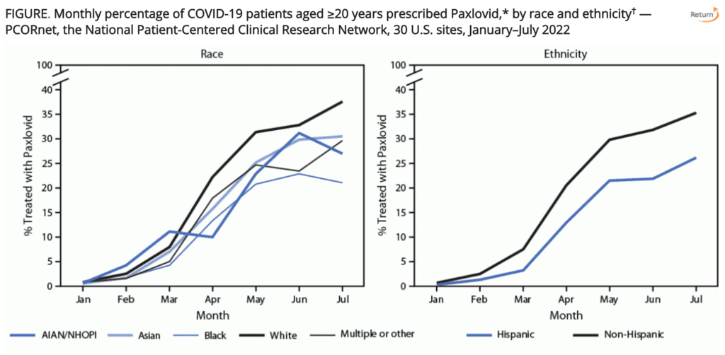
Pronóstico: El CDC reported this week that Black and Latino/Hispanic individuals were less likely to be prescribed Paxlovid. While the Biden administration wants to proclaim that we have the tools available, they are clearly not equally accessible.

Two line plots. Top text: “FIGURE: Monthly percentage of COVID-19 patients aged 20 years and older prescribed Paxlovid, by race and ethnicity — PCORnet, the National Patient-Centered Clinical Research Network, 30 US sites, January-July 2022.” Each plot has x-axis Month (Jan to Jul) and y-axis Percent Treated with Paxlovid. Both increase from Jan (0 percent) to Jul (around 30 percent). Both have several colored lines, each a race (left) or ethnicity (right). Lines diverge more over time. Race categories: AIAN/NHOPI, Asian, Black, White, and Multiple or other. Ethnicity: Hispanic or Non-Hispanic. White is highest after March but lower than AIAN/NHOPI before March. Black is lowest on the race plot (in Jul, 20 percent vs. 35 percent for white and between 25 and 30 for remaining). On Ethnicity plot, Non-Hispanic line is higher and gap widens to about 10 percent in July (35 percent and 25 percent respectively). This shows increased disparity in Paxlovid prescription over time.
Graphic Source: https://www.cdc.gov/mmwr/volumes/71/wr/mm7143a2.htm

We also have fewer tools to fight COVID! Evusheld, a monoclonal antibody used for prevention, is ineffective against newer variants, including BA4.6 and the BQs. We need to focus on reducing transmission while continuing to develop additional treatments.

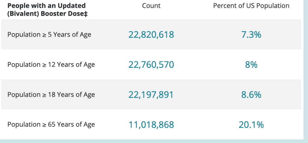
One tool we do have is the bivalent vaccine, which is still free. However, uptake has been very low: less than 10% of all folks eligible have been boosted.

A table with four rows and three columns. Title of leftmost column is bolded and says “People with an Updated (Bivalent) Booster Dose (double dagger mark),” Middle column is “Count” and right is “Percent of US Population.” Each of the four rows says Population greater than or equal to a given age; from top to bottom, the ages given are 5, 12, 18, and 65; Count is 22,820,618, 22,760,570, 22,197,891, and 11,018,868; Percent of US population are 7.3, 8, 8.6, and 20.1 percent. The footnote text for the double dagger mark is not shown in image but in the data source, it simply highlights that 22.8 million people ages 5 and up received the bivalent booster.
Graphic Source: CDC COVID Data Tracker: Vaccinations in the United States

Layers of protection remain important. For more great advice on the ventilation layer, check out MAP Center for Urban Health Solutions’ guide: Sharing practical information about indoor air quality with community spaces

Notes: 1) The numbers in this report were current as of 10/28. The CDC updates data frequently as it receives refreshed information. Today’s numbers may be slightly different from the data here. 2) Check out the links throughout & see our website for more! https://peoplescdc.org.

Compartir esto:
Traducir
Cerrar