Informe meteorológico de People's CDC COVID-19

Publicado

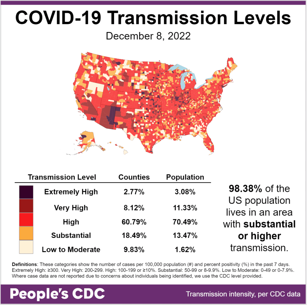
El clima: Transmission levels have risen again, with nearly the entire population (98.38 percent) currently living in areas with substantial or higher transmission – compared to 93.3 percent last week. These are extremely high levels before winter officially arrives next week.

Map and table show COVID transmission levels by US county as of 12/8/22. Low to Moderate transmission levels are pale yellow, Substantial is orange, High is red, Very High is brown, and Extremely High is black. Most of the map is red with some orange interspersed. Counties colored brown and black are scattered throughout, especially in the Southwest. The Northwest has more of a mix between pale yellow, orange, and red. Text reads: 98.38 percent of the US population lives in an area with substantial or higher transmission. A Transmission Level table shows 2.77 percent of counties (3.08 percent by population) as Extremely High, 8.12 percent of the counties (11.33 percent by population) as Very High, 60.79 percent of counties (70.49 percent by population) as High, 18.49 percent of counties (13.47 percent by population) as Substantial, and 9.83 percent of counties (1.62 percent by population) as Low to Moderate. The People's CDC created the graphic from CDC data.

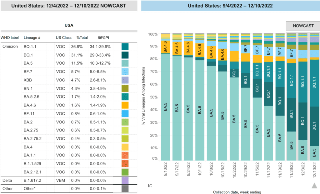
Sobre variantes: The CDC variant proportions report, shows that BQ.1.1 remains the most common (36.8 percent), followed by BQ.1 (31.1 percent). Most other variants are declining with the exception of XBB.

On the left, table estimating different viral lineage between 12/4/2022 to 12/10/2022 includes WHO label, US classification, this week’s percent total, 95 percent prediction interval, and color coding. The table is ranked with most prevalent at the top. On the right, stacked bar chart with weeks on the x-axis shows weeks from 9/4/2022 to 12/10/2022 and y-axis as percent viral lineages among infections. The recent 3 weeks are labeled as Nowcast projections. BQ1.1 (teal) and BQ1 (dark teal) continue to increase and have reached 36.8 and 31.1 percent, and are now the two most common variants. BA5 (bright teal) was previously the most common lineage. From its peak around 8/20 of about 86 percent, it has receded to 11.5 percent. BF7 (sky blue), barely present at the beginning of August, is now 4th, decreasing to 5.7 percent. XBB (periwinkle purple) is now fifth most prevalent at 4.7 percent. BA4.6 (dark yellow) has dropped to 1.6 percent.
Graphic source: CDC COVID Data Tracker: Variant Proportions

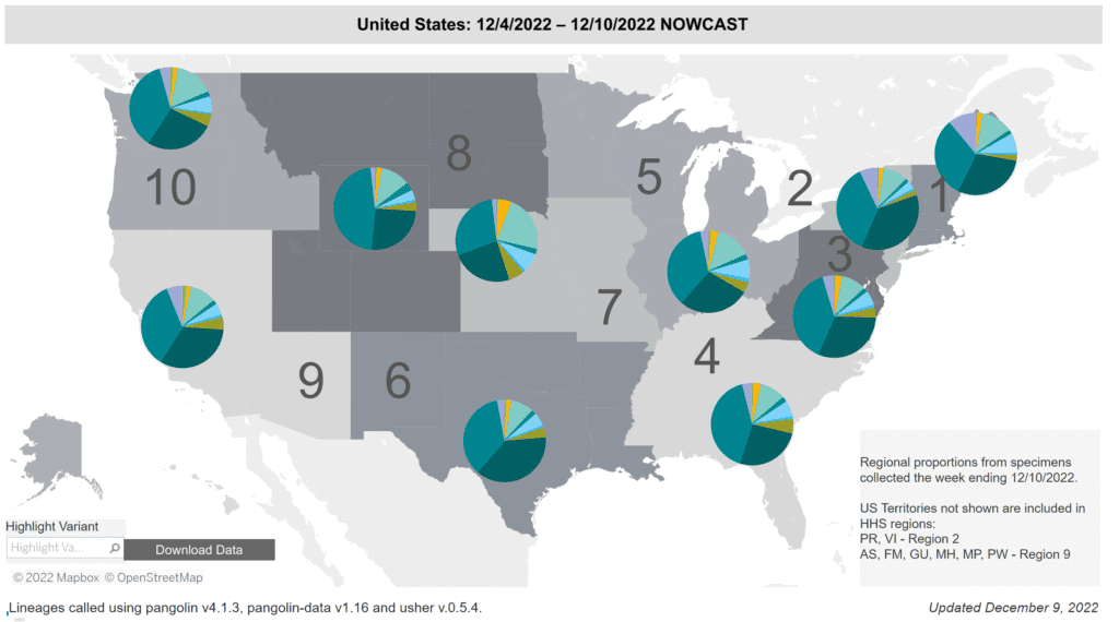
Regionalmente, BQ.1 & BQ.1.1 make up 50-75 percent of variants depending on region. XBB, in light purple, is most common on the East Coast but may be gaining a foothold elsewhere.

Regional difference map of the US with 10 regions (groups of roughly 3 to 7 states), depicted as shades of gray. Title reads: United States: 12/4/2022 - 12/10/2022 Nowcast. Each region has a colored pie chart. Legend at bottom right reads “Regional proportions from specimens collected the week ending 12/10/2022. US Territories not shown are included in HHS regions: PR, VI - Region 2. AS, FM, GU, MH, MP, PW - Region 9.” BQ1 (dark teal) and BQ1.1 (teal) are the most common in all regions, followed by BA5 (bright teal). Region 7 has the highest BA5 at 22.8 percent. Bottom text reads: “Updated December 9, 2022” and  “Lineages called using pangolin v4.1.3, pangolin-data v1.16 and usher v.0.5.4.”
Graphic source: CDC COVID Data Tracker: Variant Proportions

Monitoreo de aguas residuales: National wastewater levels continue to rise this week; other regions have caught up to the northeast. Levels are higher than 2020 but lower than 2021 was at this time of the year.

Title reads “Wastewater: Effective SARS-Cov-2 virus concentration (copies/mL of sewage), powered by Biobot Analytics.” Line graph shows the levels of COVID detected in wastewater by US region, each region with a different color trend line. A legend map of the US in the upper right corner shows the West region as green, South as pink, Midwest as purple, and Northeast as orange. The y axis shows copies per mL of sewage and the x-axis shows time between January 2020 to December 8, 2022 with January dates labeled on the axis. Northeast (orange) has higher peaks than other regions in April 2020 and January 2022. Since May 2022, all lines have plateaued above non-peak levels, with the Northeast (orange) slightly higher than other regions. Since November, all regional lines have increased, with a most recent average of 845 copies per mL. Source: Wastewater data from Biobot Analytics, Inc; Clinical data from USAFacts.
Graphic source: Biobot Analytics

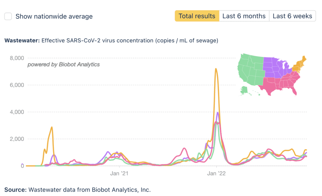
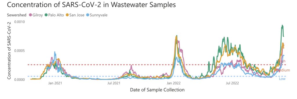
While most of the country still has lower levels than the January 2021 peak, some urban areas buck the trend; a particularly extreme case, Santa Clara county in the SF Bay Area, has reached an all-time high according to SCAN.

Title reads “Concentration of SARS-CoV-2 in Wastewater Samples.” Trend lines show wastewater data of Santa Clara, California by sewershed, with a legend in the top left assigning each sewershed a color: Gilroy (orange), Palo Alto (green), San Jose (yellow), and Sunnyvale (blue). Y-axis shows concentration of SARS-Cov-2 and x-axis shows date of sample collection ranging from October 2020 to early December 2022, with January months labeled on axis. Dotted horizontal lines distinguish high, medium, and low concentration ranges. As of late November, all sewersheds have high concentration of SARS-CoV-2. On December 2, Palo Alto (green) trend line is higher than any previous point at 0.00094 and remains high. All regions have steep increases since November.
Graphic source: SCAN Santa Clara County, CA website

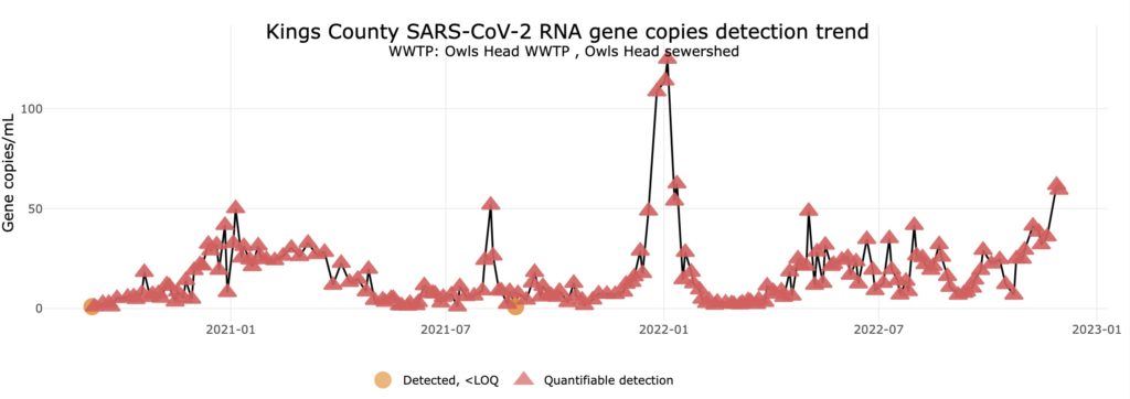
Kings County, NYC is at roughly half of its January peak, with other NYC regions showing similar, although slightly less severe, recent increases, according to NYS Wastewater Surveillance Dashboard.(Captured 12/9; dashboard down 12/10; back up 12/11).

Title reads “Kings County SARS-CoV-2 RNA gene copies detection trend, WWTP: Owls Head WWTP, Owls Head sewershed.” A line chart tracks  quantifiable detection measurements, shown by red triangles. Y-axis shows gene copies/mL between 0 and 100. X-axis shows time ranging from Summer 2020 to November 2022. In the January 2022 spike, copies detected surpassed 100 copies/mL. Most recent measurements from late November 2022 reach past 50 copies/mL, the highest measured since the January 2022 spike.
Graphic source: New York State Wastewater Surveillance Dashboard

Vaccinations:  El FDA authorized use of the updated bivalent booster for children as young as 6 months old.

New reporte by @KFF on vaccine commercialization finds uninsured and underinsured individuals may face significant barriers.

“Future supply may not always match demand, which would have unpredictable consequences for the price and availability of vaccines in the U.S.”

This move by the federal government is outrageous given the Administration’s insistence that “we have the tools,” “this is a pandemic of the unvaccinated,” and its refusal to implement other measures to ensure the public’s safety such as masking and ventilation requirements.

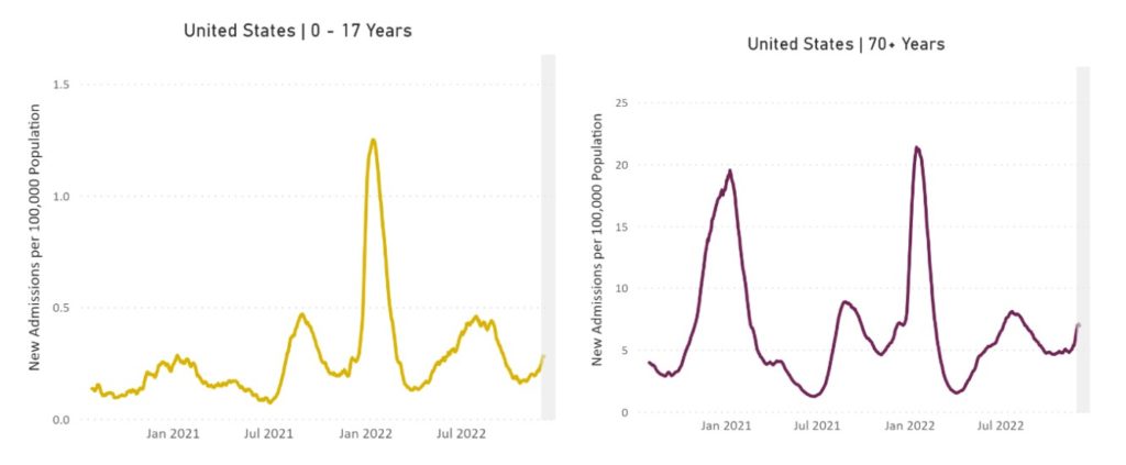
Hospitalizaciones: Hospitalizations are up 10.1% from the prior 7 day average, with the greatest increases continuing to be among children & those over 70.

Two line graphs representing new admissions to hospitals of patients with confirmed COVID in the United States with the first on the left representing ages 0 to 17 years and second on the right representing ages 70 years and older. Both graphs have New Admissions per 100,000 Population (all subsequent rates are reported per 100,000) on its y-axis and labels of January 2021 to July 2022 on its x-axis. Among children, new admissions peak at about 0.25 in January 2021 and 1.3 in January 2022, with other peaks happening in August 2021 at 0.5 and July 2022 at 0.4. The line gradually decreases after July 2022 to 0.2 with a recent increase to 0.3. Among older adults, new admissions peak at about 20 in January 2021 and 21.5 in January 2022, with other peaks happening in August 2021 at 8 and July 2022 at 7.5. The line gradually decreases after the July 2022 minor peak to 5 with recent increases to 6.9.
Graphic source: CDC COVID Data Tracker: New Hospital Admissions

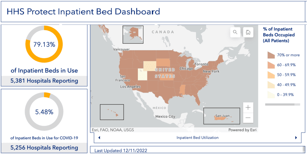
Non-COVID-specific hospital inpatient bed capacity is low across many regions of the US, according to the HHS.

Title reads HHS Protection Inpatient Bed Dashboard. In the center, a map of the continuous US shows states colored by % of inpatient beds occupied (all patients), with a legend to the right indicating dark brown as 70 percent or more, medium brown as 60 to 69.9 percent, light brown as 50-59.9 percent, tan as 40-49.9 percent, and off-white as 0 to 39.9 percent. The majority of states and territories are colored dark brown, with just Utah as off-white, Wyoming as tan, and South Dakota, Kansas, Puerto Rico, and Mississippi light brown. On the left, donut charts show 79.13 percent of inpatient hospital beds in use of 5,381 hospitals reporting and 5.48 percent of inpatient beds in use for COVID-19 of 5,256 hospitals reporting.
Graphic source: HHS Protect Public Data Hub

Fallecidos: The week of December 7, 2981 people died of COVID nationally. We are approaching a quarter million deaths in 2022.

Sobre COVID largo: A new reporte on Long COVID urges actions to address needs of patients and caregivers via @JAMAHealthForum @JAMANetwork 

The @washingtonpost reports that mass Long Covid disability threatens the economy, fails to mention it also threatens human rights and dignity.

Pronóstico: All US Federally-owned buildings will now be required to use MERV 13 filtration and “verify” ventilation according to a new @whitehouse fact sheet.

“Despite the predicted surge, public health experts anticipate the Biden administration will wind down the ongoing COVID public health emergency in the coming months” per an artículo in @rollcall.

After the public health emergency ends, CDC can request state data on surveillance, testing, hospitalizations & deaths for a period of time — but then it will need Congressional approval. Walensky predicted the agency may not be able to report COVID community levels in a year.

Tome accion: New studies on DIY air cleaner y efficacy of CR box show low-cost, field-constructed air purifiers can be effective.

Amid surges in #COVID, #flu, and #RSV, public health officials have increased their encouragement de mask wearing.

These locations include #NYC, #BayArea, y #LA , but they remain unwilling to implement what is needed – mandates.

A list of 41 consensus statements and 57 recommendations published in @Nature form a global #COVIDconsensus – we need a refreshed commitment to bring COVID to a real, durable conclusion.

Notes: 1) The numbers in this report were current as of 12/9. The CDC updates data frequently as it receives refreshed information. Today’s numbers may be slightly different from the data here. 2) Check out the links throughout & see our website for more! https://peoplescdc.org.

Compartir esto:
Traducir
Cerrar