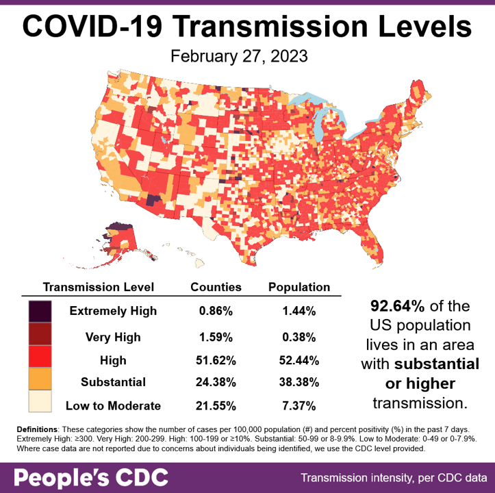
The Weather: While transmission levels dropped slightly from last week, 92.64% of the population is living in areas with substantial or higher transmission and the percent living in counties with substantial transmission has increased, which is not a good trend.
Due to incomplete data reporting from Hawaii and Mississippi, as well as a backlog of cases now being reported from Arizona and several counties in Georgia, determining an overall national trend in transmission levels is challenging.
Wins: California Nurses Association is relieved the CA Department of Public Health says that they are not lifting universal masking in healthcare–but we’ve got to keep the pressure on to make sure that they don’t rescind it later!
Keep up the pressure to #KeepMasksInHealthcare by joining the Senior and Disability Action-led campaign! It’s already working to keep CA DPH on their toes, so keep up the heat!
The current action hotspot in California is San Francisco, where they’re attempting to defy state-wide mask policy. Please join SDA in keeping up the pressure so we can minimize the risk of catching COVID in hospitals.
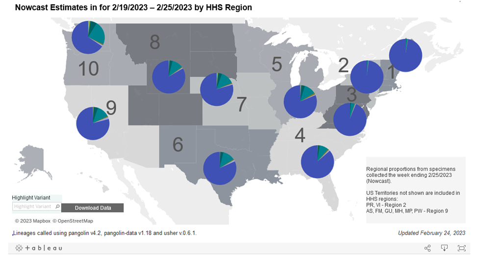
On Variants: This week, Kraken (XBB.1.5) makes up 85% of cases, surpassing the 80.2% of cases reported in last week’s Weather Report.
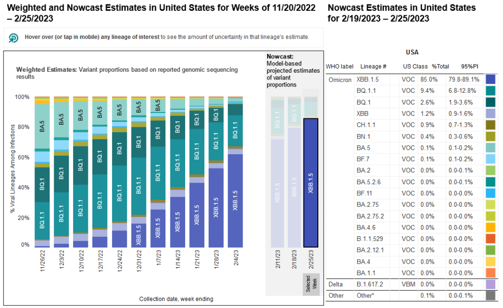
Kraken’s rise and spread has now become more complete across the country, popping-up in more than three-quarters of all cases in all regions except the Northwest.
Even in the Northwest, Kraken currently accounts for more than half of all cases. COVID protections are more important than ever.
Vaccination continues to be the best way to protect yourself from negative health outcomes from COVID infection. For example, a study has shown that vaccinated people who do get COVID tend to have fewer heart attacks and other cardiovascular issues.
It is critical to get vaccinated to lessen the chance of getting Long COVID and severe disease. While infection appears to confer protection from reinfection, according to a new meta-analysis, avoiding infection confers the best health outcome.
This meta-analysis also underscores the importance of on-going protective measures like masking and clean indoor air in addition to vaccines, as protection from reinfection drops dramatically over time, down to ~20-40% after 40 weeks.
This is why it is excellent news that even a small 10% increase in masking rates in schools has been shown to result in a large 50% decrease in detection of COVID in wastewater – masks continue to work to reduce transmission!
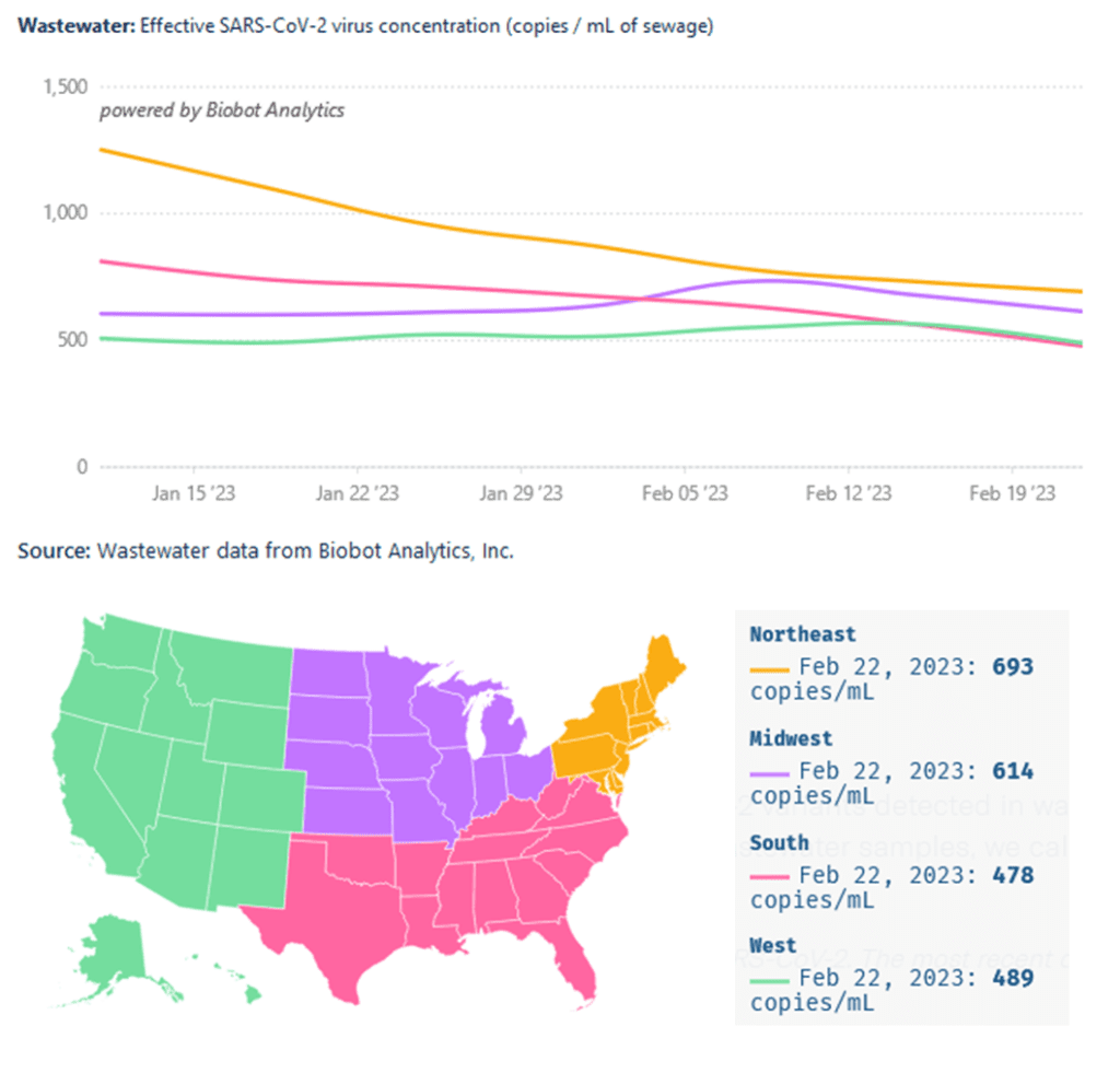
Wastewater Monitoring: Although wastewater levels appear to be decreasing across the country, it should be noted that this rate of decrease is leveling off in the Northeast, signaling that this trend may be temporary.
The rise in wastewater levels in January in the Northeast and South was recently followed by a rise in the West and Midwest as the Kraken spread westward. This indicates that any slowdown in the decrease in the Northeast could signal a similar leveling off in other regions soon.
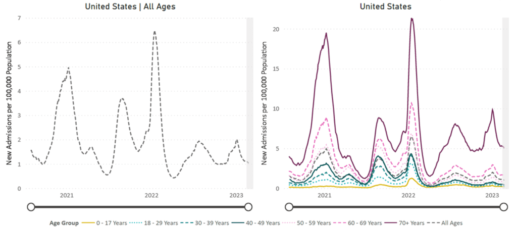
Hospitalizations: Hospitalizations for confirmed COVID cases continue at high levels, with rates nationally either declining at very slow rates, or flatlining depending on age group. Rates continue to be highest for those ages 70 and older.
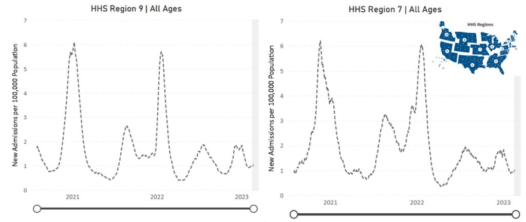
However, it appears there’s a slight increase in COVID hospitalizations for the Midwest (Region 5, 7, and 8) and West (Region 9), hinting that the aforementioned flatlining may become a rise in the near future.
Deaths: The week of February 25, at least 2,407 people died of COVID nationally. At least 1,115,637 people have died from COVID in the US in this continuing national tragedy.
This is especially tragic for our prison populations. The first comprehensive study on prison deaths shows a 50% rise in deaths in prisons in most states in 2020, mostly due to poor access to medical care during a time of rapid COVID spread in prisons.
Long COVID: It turns out that even our bones might be at the mercy of Long COVID, as researchers have recently discovered immune system-related and other changes in skeletal muscles of patients with Long COVID-induced fatigue.
It’s issues like these that result in increased unemployment nationally. Increasing evidence shows that such Long COVID effects negatively impact one’s ability to work, resulting in those with Long COVID being more likely to be unemployed.
Forecast: Negative mental health is also a result of COVID exposure. A recent study shows those who were pregnant or new parents who were exposed to COVID or living in countries with more COVID deaths in 2020 had higher symptoms of anxiety and depression.
Proper protective measures generally improved mental health outcomes amongst pregnant people, as these increased feelings of protectiveness against COVID.
These studies and outcomes are critical for public health moving forward given the dramatic uncertainty caused by unmitigated COVID spread today.
Take Action: Read and share this brief guide for inclusive gatherings put together by Strategies for High Impact and the What Would a Doula Do Collective. Call for solidarity with the disabled community and make each gathering more equitable than the last!
Join the Massachusetts Coalition for Health Equity to demand the Department of Public Health keep masks in healthcare! Let’s show them that we will NOT accept living in a country where we catch COVID in the hospital!
Please join the National Nurses United in demanding the Office of Information and Regulatory Affairs finish reviewing OSHA standards to protect nurses that treat you when you go to the hospital so that they don’t themselves catch COVID.
Notes: 1) The numbers in this report were current as of 2/25. The CDC updates data frequently as it receives refreshed information. Today’s numbers may be slightly different from the data here. 2) Check out the links throughout & see our website for more! https://bej.gbh.mybluehost.me.