The Weather
We’ve gotten a number of questions about how to explain the differences between CDC and WastewaterSCAN levels. We will briefly summarize the differences between the two organizations’ approaches, but the most important takeaway point is this: like in all data science, these systems have limitations. The decision to call something “Low,” “Medium,” or “High” is a group of scientists’ attempts to take raw data (in this case from sewage) and make that data have meaning. For both CDC and WastewaterSCAN, the models adjust as COVID levels change over time.
Remember, wastewater is an essential tool for tracking changes in COVID and other pathogens over time. Funding for wastewater should be maintained and expanded. The best way to use CDC or WastewaterSCAN data is not to rely on the literal levels they report, but to find the data for the site closest to you and look back to see how your current wastewater value compares to other moments during the pandemic. It can also help to see whether your area is experiencing an increase in wastewater levels, which may help you predict what might happen in the next few weeks.
The WastewaterSCAN approach, in brief: WastewaterSCAN has 145 reporting sites. These sites collect and measure the amount of pathogen (in this case, the genetic material of the virus that causes COVID, SARS-CoV-2) in the wastewater. They use systems to ensure the data is more reliable and to adjust for wastewater baseline. Then, they use equations to combine results from multiple sites in a way that accounts for differences between sites. Finally, they determine whether levels are high, medium, or low. They do this by checking whether the value falls in the upper, middle, or lower third of all levels over the past 365 days AND by determining whether the trend over the past 21 days is decreasing, stable, or increasing. You can read the details here.
The CDC approach, in brief: The CDC has over 1000 reporting sites (1245 reporting on COVID in the past 2 months). These sites collect and measure the amount of SARS-CoV-2 in the wastewater. They also ensure the data is reliable (e.g., they accept only data from sites with no recent substantial method changes and only use sites with at least 8 weeks of samples). They use equations to combine results from multiple sites in a way that accounts for differences between sites. At the CDC, they determine levels based on what they consider baseline, which they set just above 10% of values. They call this level “Low.” Other designations are based on standard deviation calculations. The CDC calculation doesn’t account for trends; rather, trends are reported separately. The system is reassessed and tweaked annually, and then numbers are adjusted forward and backward in time so values today are comparable to values in the past. You can read a detailed explanation here.
The CDC-based wastewater map was updated on September 17th and depicts wastewater levels for the period from September 6 through September 12.
According to the CDC’s COVID Wastewater Viral Activity map, Texas and the Virgin Islands are experiencing “Very High” levels. Washington, California, and Florida are experiencing “High Levels.” Eight states are experiencing “Moderate” levels. 13 states and Washington DC are experiencing “Low” levels, and 22 states are experiencing “Very Low” levels.
Arkansas, Mississippi, New Hampshire, Oklahoma, Oregon, and Virginia are all reporting “Limited Coverage,” meaning that the data is based on less than 5% of the population and may not be accurate for the entire state. Arizona, Guam, North Dakota, and Montana are reporting “Limited/No Data.”
Regional trend data from the CDC indicate the West has the highest wastewater viral activity but is trending downwards into the “Low” category. The South remains “Low” and is trending downwards. The Northeast and Midwest are both considered “Very Low,” with upward and stable trends, respectively.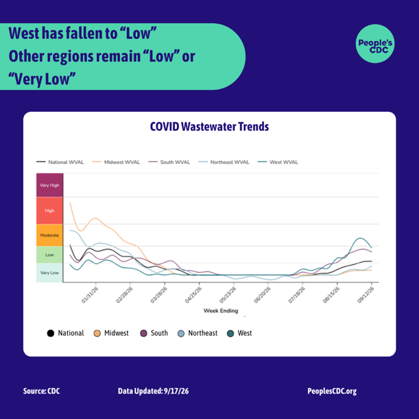 Graphic source: CDC
CDC Epidemic Trends
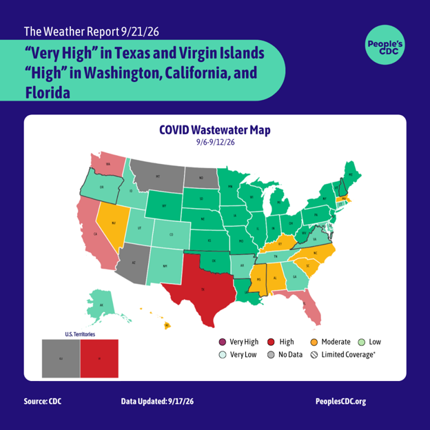
According to CDC Epidemic Trend data last updated on September 16th, the number of infections is estimated to be “Growing” or “Likely Growing” in 27 states. It is “Declining” or “Likely Declining” in 13 states, and not changing in 10 states.
These values are estimations based on a formula rather than measured data. It is estimated from daily incident emergency department visits reported through the National Syndromic Surveillance Program. It can show whether a current epidemic trend is growing, declining, or not changing, and it is an additional tool to help public health practitioners prepare and respond. It cannot tell us about the underlying burden of disease, just the trend in infections. An Rt < 1 does not mean that transmission is low, just that infections are declining. They could be declining from a high level to another slightly lower high level.
Please check out our Safer Gatherings Guide, which you can use for class, work, back-to-school nights, and any other gathering you may attend.
9/11 Health Impacts – 25 Years Later:
Over a week ago, the U.S. recognized the 25th anniversary of the September 11th attacks. Almost 3000 people died that day. The plume of debris, toxic dust, and smoke smothered the surrounding area and its inhabitants, indoors and outdoors. The dust contained carcinogenic material like asbestos, concrete, pesticides, plastic, paint, metals, and more. The Ground Zero cleanup process took 8 months, and jet fuel burned intermittently in the ruins for three of those months. During this period, the cleanup disrupted and dispersed toxic dust into the surrounding area. An estimated 400,000 New Yorkers were exposed to toxic material, and more than half of survivors in one CDC study would report new or worsening respiratory symptoms afterward. There is no single authoritative number on how many people have died from 9/11 related health conditions, but more than 57,000 WTC Health Program members have WTC-related cancer certifications, with rates showing increases over the baseline expected cancer rates in the US population.
On September 8, the Mamdani administration in New York City launched a portal of 170,000 previously classified documents related to the attacks, along with memos revealing the city’s mishandling of the response. New Yorkers were led to believe the air was safe, when it remained laden with pollutants for months. Instead, city officials downplayed concerns for a premature “back to normal” approach to avoid the responsibility of guaranteeing clean air. If you haven’t watched it yet, we recommend checking out Democracy Now’s coverage of the 9/11 response. We recognize in this story the same prioritization of “normal” for the sake of global markets and to the detriment of public health that characterized the COVID response.
We must also recognize that 9/11 became justification for normalizing a perpetual police state, and contributed to the ramping up of aggressive immigration policies today. Yet, the ramifications of 9/11 extend far beyond the US’s borders. We must remember the estimated 4.5 to 7 million who died in the so-called “War on Terror”, many of those from indirect causes like malnutrition, disease, infrastructural decay, sanctions, and environmental contaminants. An estimated 940,000 of those were direct deaths from the US, including countless bombings of hospitals, schools, and massacres of families.
___
Ongoing Ebola Spread in the Democratic Republic of the Congo:
The ongoing Ebola outbreak in the Democratic Republic of the Congo – first detected in May 2026 – is now the deadliest and most widespread Ebola outbreak recorded in the nation and the second-largest outbreak on record. While the outbreak was declared contained in neighboring countries like Uganda in August, the outbreak has spread throughout the DRC with a confirmed 3,475 deaths and 7,200 cases.
Bundibugyo virus is one of 4 known Ebola viruses that cause disease in humans. Bundibugyo virus disease, unlike the more common Ebola virus disease, has no available vaccines or approved therapeutics for those affected. However, on September 19th, Doctors Without Borders announced a 9 to 12 month study on the effectiveness of the ERVEBO vaccine – initially developed and approved for the more common Ebola virus – among frontline health workers for Bundibugyo. Even partial vaccine coverage could be pivotal for controlling the outbreak, which currently has a 48% fatality rate in the DRC. While exact prevalence estimates for Post-Ebola Syndrome among Bundibugyo survivors are unknown, many survivors face multisystemic health issues including musculoskeletal pain, fatigue, brain fog, blurry vision, insomnia, severe headaches, and mental health challenges.
Addressing the unfolding health crisis will require more than a vaccine: it also demands sustained health funding, infrastructural improvements, and increased disease surveillance. The Trump administration’s transactional “America First” strategies gain preferential access to valuable Congolese minerals in exchange for increased funding for epidemic preparedness and surveillance in the country. These “America First” policies – in addition to the US’s withdrawal from WHO and restructuring of USAID – add a new element of uncertainty for the future of international health assistance.
Take Action!
During the upcoming United Nations General Assembly, the governments of Montenegro, France, and Eswatini are hosting an event promoting healthy indoor air in schools. The event will be Thursday, September 24 from 8:00–9:30am ET, and you can go or watch the livestream. They’ll share best practices, and attendees can sign on to a pledge for healthy indoor air. So sign up! Share the event link with school leadership in your area, and use it to start a conversation about improving indoor air quality at schools in your neighborhood.