People’s CDC COVID-19 Weather Report

Published

The Weather: As BA5 has become the dominant new strain, we have been at a sustained surge for many weeks now. The transmission map shows that 99% of people in the US are still at high or substantial transmission.

This map and corresponding table show COVID community transmission in the US by county. Most of the US map is red, indicating high levels at 96.54 percent of the population or 86.86 percent of counties. An additional 2.87 percent of the population or 8.15 percent of counties are in areas with substantial transmission, in orange. Thus, over 99 percent of the US population lives in an area with high or substantial COVID transmission. Only the middle vertical line of the contiguous US--the Dakotas, Nebraska, Kansas, Oklahoma, and northern Texas--show a higher concentration of moderate and low transmission, in yellow and blue, respectively. The graphic is visualized by the People’s CDC and the data are from the CDC.

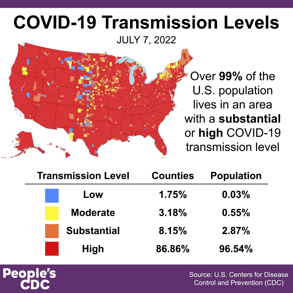
Relentless high transmission levels are the result of removing all public health protections. Vaccines are important for preventing severe disease but are not enough to keep cases low in our communities.

Watch the spread here:

On Variants: BA4/5 are now the dominant virus in the US, at an estimated 70% of cases – with almost half of all cases being BA5. BA2.12, which had been spreading rapidly, has mostly been replaced with these newer, more immune-evasive variants.

A bar chart shows data for the weeks of 4/2/2022 through 7/2/2022 with levels for each viral lineage shown vertically. In early April, BA.2 was the dominant lineage, with small levels of B.1.1.529 and BA.1. As time goes on, BA.2.12.1 starts to grow, and the aforementioned variants shrink.In mid-May, BA.2.12.1 and BA.2 are equally found. By 5/21/2022, BA.2.12.1 overtakes BA.2 as the dominant variant. In early May, BA.4 and BA.5 appear. As of 07/02/2022, they overtake others, now representing more than 70 percent of cases.

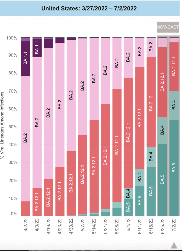
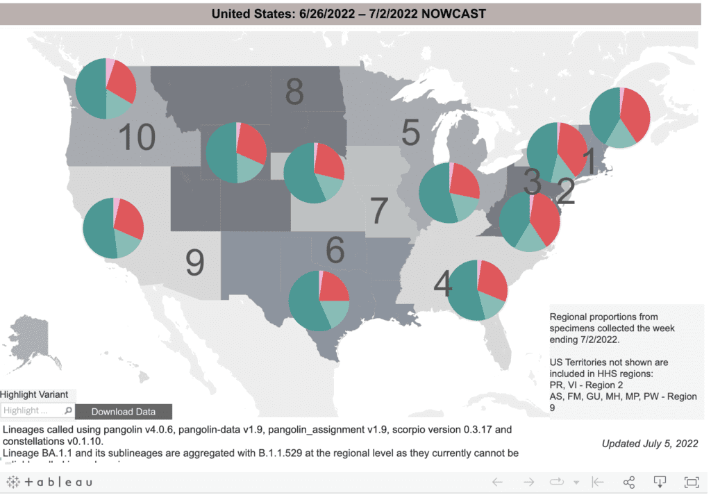
BA5 now makes up at least half of cases in every region except the Northeast, which just had a BA2.12 surge – and BA5 is expected to become the most common variant in the Northeast soon, which suggests little protection from previous surges this year.

A grayscale map of the US that sections the country into 10 separate regions. On top of each region are color coded pie charts which indicate the proportion of 4 total variants in each region for week ending 7/2/2022. BA4 & BA5, in light and dark green, respectively, have overtaken BA2.12, in red, making up over half of cases in every single region of the country. Further, in all regions but those in the Northeast and mid-Atlantic, BA5 alone makes up half or more than half of all variants. Text at the top reads, “United States: 6/26/2022 - 7/2/2022 NOWCAST,” and at the bottom right corner, “Regional proportions from specimens collected from specimens collected the week ending 7/2/2022.”

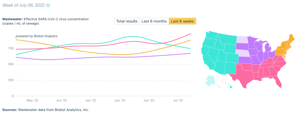
Wastewater Monitoring: National wastewater data from @BiobotAnalytics shows that the high plateau we reported last week is continuing and even starting to rise again. Our current levels match the peak levels of 2020 & 2021, yet we have far fewer protections in place.

This is a graph with overlapping lines indicating differences between wastewater viral concentration, in dark blue, & daily clinical cases, in light blue, from April 2020 - July 6, 2022. Although both lines indicate similar peaks and valleys, the line indicating wastewater viral concentration is generally higher than the line representing daily clinical cases throughout the time period represented. The two lines are visibly discrepant, with the wastewater levels line consistently higher than the daily clinical cases line, in April and May 2020, become better matched from July 2020 through July 2021, and begin again to become more discrepant August 2021 through July 2022. The lines are particularly discrepant during the peaks, and especially so during the winter 2021-2022 peak and the peak that continues to July 2022. The source is indicated at the bottom, “Wastewater data from Biobot Analytics, Inc.; Clinical data from USAFacts.”

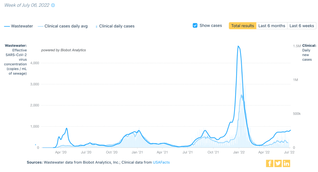
Regionally, we see all areas are flat or increasing, except for a slight decline in the West. All regions (except the South) are also at levels higher than the Delta wave of last fall.

This figure has a line chart on the left and a map of the US on the right. Lines in yellow, pink, blue, and purple correspond to different regions on the map: blue for the western US, Alaska, & Hawaii; purple for the midwest; pink for the south & mid-Atlantic; and yellow for the northeast. The line chart has “Wastewater: Effective SARS-CoV-2 virus concentration, copies / mL of sewage” on its y-axis, and dates from May 2022 to July 2022 on its x-axis; the lines indicate wastewater concentration for each region over time. The northeast’s line starts at the highest level in May, dips in June, and begins to rise again from late June to July. The south’s line indicates a gradual yet steady increase from May to July. The west’s line indicates an increase from May through June, dipping down to its May starting point by July. The midwest’s line is relatively steady from May through July. The source at the bottom of this graph indicates the source, “Wastewater data from Biobot Analytics, Inc.”

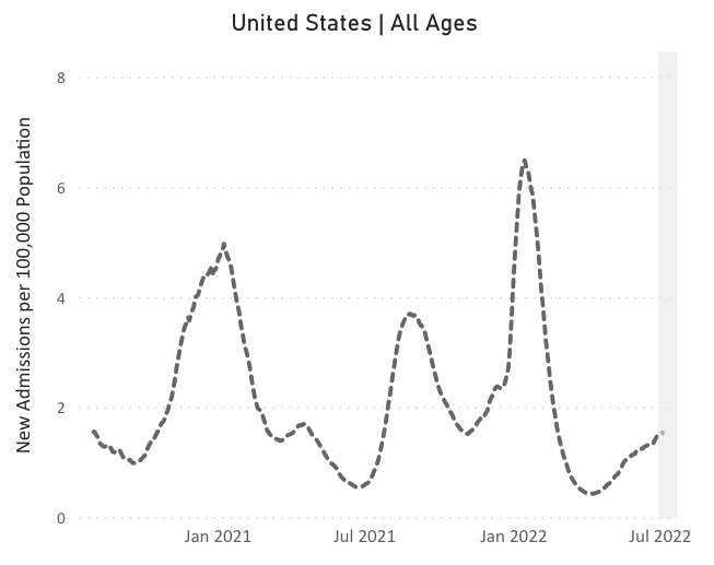
Hospitalizations: For 11 weeks in a row, hospitalizations have been rising nationally. After a brief dip in the Northeast, rates are rising again – showing little protection against BA5 from the previous surges. All regions are now seeing increased hospitalizations.

A line chart with “United States All Ages,” as its title, “New Admissions per 100,000 Population” on its y-axis, and dates from January 2021 to July 2022 on its x-axis. The dotted line indicates peaks in admissions around January 2021, August 2021, and January 20222, with hospitalizations rising from spring 2022 to July 2022.

Deaths: In the past week, from June 30 to July 6, 1,949 people died of COVID nationally

Be Prepared: New research shows folks with 3 doses of vaccine are 90% less likely to experience severe disease compared to those with no doses, even against Omicron BA1 & BA2. People with 3 doses were at least 50% less likely to have symptomatic infection than those with 0 doses.

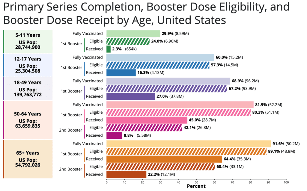
Yet booster rates are still low in the US – only 106 million people have had a booster. Consider a 2nd booster if you are over 50 or immunocompromised. We are still urgently waiting for updated vaccines made for Omicron variants. 

Horizontal bar chart titled “Primary Series Completion, Booster Dose Eligibility, and Booster Dose Receipt by Age, United States.” On the vertical axis are five age groups: 5-11 years; 12-17 years; 18-49 years; 50-64 years; and 65+ years. The first three age groups are broken down into “Fully Vaccinated” and “1st Booster,” which itself is broken down into “Eligible” and “Received.” The last two age groups are broken down similarly, with an added spot for 2nd boosters. The chart’s horizontal axis indicates percentage of the population, and age groups’ bars are differentiated via shaded color groupings. The most “fully vaccinated” age group is those 65+ at 91.6 percent, followed by 50-64 at 81.9 percent, 18-49 at 68.9 percent, 12-17 at 60.0 percent, and 5-11 at 29.9 percent. Among those aged 5-11, 2.3 percent have received their 1st booster; 12-17, 16.3 percent; and 18-49, 27 percent. Among those aged 50-64, 8.8 percent have received their 2nd booster, with 22.2 percent among those 65+.

COVID can be particularly dangerous for pregnant people & their babies. However, research shows that not only are vaccines safe, they helped prevent bad birth outcomes! Vaccinated patients were less likely to have preterm or stillbirths.

Scientists are keeping an eye on the new COVID variant BA.2.75. The new variant has a considerable number of mutations — nine — on its spike protein and has spread to at least eight countries. 

Forecast: With high transmission rates & few protections in place, COVID continues to cause avoidable death & sickness. We must organize & pressure leaders for free high quality masks & tests, improved ventilation, paid sick leave, unemployment supports, & universal health care.

On monkeypox: We continue to have a minimal response with little data to guide us. As of July 8th, there are nearly 800 confirmed cases – but comprehensive protections such as testing, tracing, & isolation, as well as vaccinations, are urgently needed.

On Long COVID: A recent study shows that the immune response to COVID can cause inflammation and damage in the brain. This may explain some symptoms, such as brain fog, often reported by Long COVID patients and gives researchers targets for LC treatments.

Sources – Check out the links throughout and see our website for more! https://peoplescdc.org

Share this:
Translate
Close