People’s CDC COVID-19 Weather Report

Published

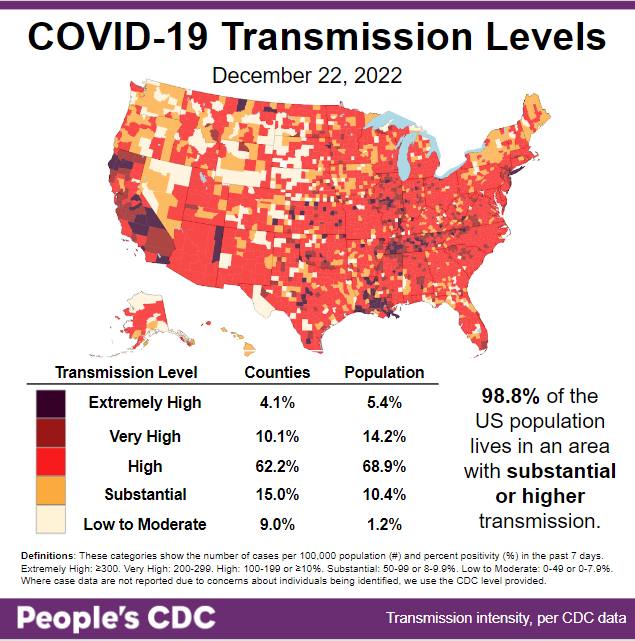
The Weather: Transmission levels are even higher than last week’s (98.5 percent), with 98.8 percent of the population living in areas with substantial or higher transmission.

Map and table show COVID transmission levels by US county as of 12/22/22. Low to Moderate transmission levels are pale yellow, Substantial is orange, High is red, Very High is brown, and Extremely High is black. Most of the map is red with some orange interspersed. Counties colored brown and black are scattered throughout, especially in the Midwest, CA, LS, TN, and Long Island. The Northwest has more of a mix between pale yellow, orange, and red. Text reads: 98.8 percent of the US population lives in an area with substantial or higher transmission. A Transmission Level table shows 4.1 percent of counties (5.4 percent by population) as Extremely High, 10.1 percent of the counties (14.2 percent by population) as Very High, 62.2 percent of counties (68.9 percent by population) as High, 15.0 percent of counties (10.4 percent by population) as Substantial, and 9.0 percent of counties (1.2 percent by population) as Low to Moderate. The People's CDC created the graphic from CDC data.

On Variants: The CDC variant report shows that BQ.1.1 is holding steady in the US at 36 percent of all variants. Other variants, like BA.5, BQ.1, and BF.7, are becoming less common.

A stacked bar chart with weeks on the x-axis shows weeks from 9/24/2022 to 12/24/2022 and y-axis as percentage of viral lineages among infections. The recent 3 weeks are labeled as Nowcast projections. BQ1.1 (teal) continues to increase to 35.5 percent. BQ1 decreased slightly to 27.4 percent. BA5 (light teal) was previously the most common lineage. From its peak around 8/20 of about 86 percent, it has receded to 6.9 percent. XBB (periwinkle purple) is now third most prevalent at 18.3 percent. BF7 (sky blue) is now fifth, decreasing to 3.9 percent. BN1 (green brown) has decreased to 3.8 percent.
Graphic source: CDC COVID Data Tracker: Variant Proportions

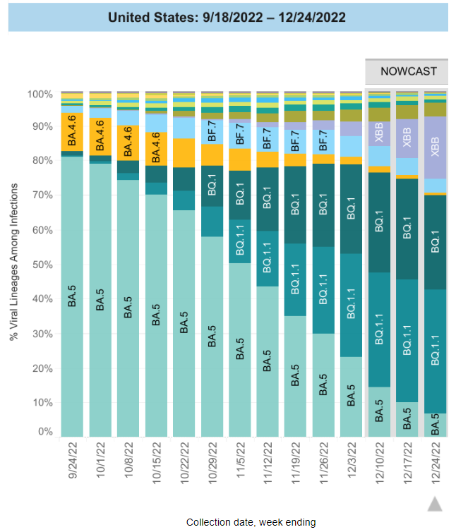
Meanwhile, XBB has shot up from 11 percent last week to 18 percent this week, which is a >50 percent increase! Variant XBB has evolved further into the more transmissible XBB.1.5, though the CDC is currently reporting on them together.

NY (and much of the northeast) is currently suffering the brunt of this new variant, with hospitalizations at their highest since January. Without serious COVID mitigation measures, XBB will likely balloon in the rest of the country in short order. 

Regional difference map of the US with 10 regions (groups of roughly 3 or 4 states), depicted as shades of gray. Title reads United States: 12/18/2022 - 12/24/2022 Nowcast. Each region has a colored pie chart. Legend at bottom right reads “Regional proportions from specimens collected the week ending 12/24/2022” and “US Territories not shown are included in HHS regions: PR, VI - Region 2. AS, FM, GU, MH, MP, PW - Region 9.” BQ1.1 (teal) and BQ1 (dark teal) are the most common in regions 3 through 9. XBB (periwinkle purple) is third most common in these regions except in regions 5 and 7 in which BA.5 is third most common. In regions 1 and 2, XBB is most common followed by BQ1.1 and BQ1. Bottom text reads: “Updated December 23, 2022” and  “Lineages called using pangolin v4.1.3, pangolin-data v1.17 and user v.0.5.4.”
Graphic source: CDC COVID Data Tracker: Variant Proportions

In some good news, preliminary findings show that the bivalent vaccine helps improve immune response to some of the most common circulating variants, including BQ.1.1 & XBB.

This corroborates last week’s CDC reports on bivalent effectiveness for reducing hospitalizations. Encourage everyone >6 mos to vaccinate for COVID & the flu, especially older folks—as well as take all the other precautions you can!

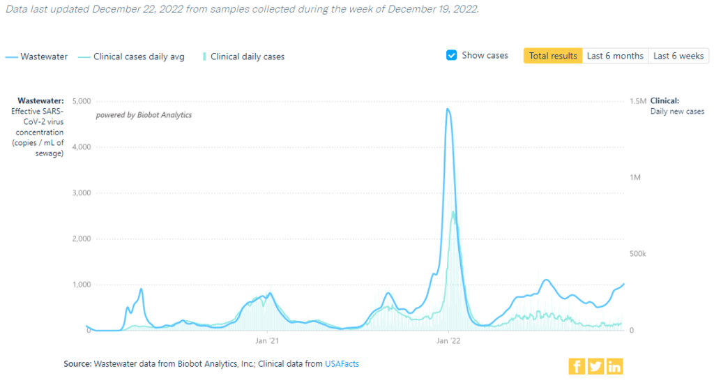
Wastewater Monitoring: National wastewater levels continue to rise this week, with the northeast hit the hardest. Levels are higher than any peak prior to last winter’s omicron BA.1 wave.

Title reads COVID Wastewater Monitoring in the US. Top text says “Data last updated December 22, 2022 from samples collected during the week of December 19.” Graph shows weekly wastewater viral concentration and daily clinical cases since the beginning of the pandemic and ending on December 21, 2022. A dark blue line represents viral concentration in copies per milliliter of sewage, and a light blue line represents the average of daily new clinical cases. Since about March 2022, the light blue case line is somewhat erratic and relatively plateaued at well less than 100K. Over the same time, the dark blue wastewater line is persistently higher.  It peaked above 1,000 copies/mL in late July 2022 and was decreasing until the end of October. A significant increase occurs and numbers now rival the July numbers at 1,032 copies/mL on December 21. Bottom text reads: “Source: Wastewater data from Biobot Analytics, Inc; Clinical data from USAFacts.”
Graphic source: Biobot Analytics

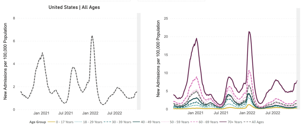
Hospitalizations: Hospitalizations are still rising across most of the US, with the current 7-day average at 5,376 admissions.

The CDC predicts that up to 12,400 new COVID hospital admissions will be reported on January 13, 2023.

Two line graphs representing new admissions to hospitals of patients with confirmed COVID in the United States with the first on the left representing all ages and second on the right differentiating by age group. Both graphs have New Admissions per 100,000 Population (all subsequent rates are reported per 100,000) on its y-axis and labels of January 2021 to July 2022 on its x-axis. Among all ages, new admissions peak at about 6.34 in January 2022, with other peaks in January 2021 at 4.91, August 2021 at 3.69, July 2022 at 1.90. The line gradually decreases after July 2022 to 0.97 with a recent increase to 1.62. Among older adults, new admissions peak at about 20 in January 2021 and 21.5 in January 2022, with other peaks happening in August 2021 at 8 and July 2022 at 7.5. The line gradually decreases after the July 2022 plateauing around 4.9 from October to November 15. Numbers have increased for the last five weeks to 7.87.
Graphic source: CDC COVID Data Tracker: New Hospital Admissions

Yale Medicine’s guide on existing COVID pharmaceutical treatments provides a detailed overview, listing what the drug is, who it’s for, how it’s taken, its side effects, how it works, how well it works, and additional information.

Deaths: The week of December 21, at least 2,952 people died of COVID nationally. In 2022, there have been over 250,000 deaths nationally. This should not become our “new normal.”

Long COVID: A new study focused on the persistent loss of smell finds a resemblance to an autoimmune-like inflammation process in the nose.

This finding gives insight into the possible underlying causes of other Long COVID symptoms, like fatigue and brain fog.

Another study about the prevalence of Long COVID and its impact on daily living included findings suggesting that prevalence of Long COVID is higher in females, those with comorbidities, or those not up to date with boosters.

Forecast: RSV rates may be dropping, but COVID and flu continue to be on the rise. Importantly…

…and counter to the framing in the article above, we believe that precautions should be taken against respiratory transmission for as long as they are needed, and that we should continue fighting for better conditions for all.

If you are able, plan ahead for ways to obtain Tamiflu and Paxlovid or other COVID treatments.

Take Action: Sign this petition to demand that the National Institutes of Health (NIH) block plans to continue clinical trials, called RECOVER, that test debunked, harmful treatments for Long COVID, including exercise and cognitive behavioral therapy.

As we have reported on previously, exercise is likely to do more harm than good for those who have Long COVID. If you or someone you know has Long COVID, it may also help to email NIH and RECOVER researchers personally.

More schools, this time in NJ, are mandating masks to counter the surges due to COVID, RSV, and the flu. A Data for Progress poll showed that 56 percent of people support mask mandates to prevent COVID surges, which is encouraging.

Relatedly, @MandateMasksNY regularly updates its mask guide to show residents which public venues still enforce masking. Start something like that for your area, and let us know if there are other organizations doing the same!

Year-End Reflections: This is our last report of 2022. It has been a trying year, but we appreciate you for continuing to read and share our reports.

We appreciate you for caring about each other while the government continues to put profit over people. We need to keep organizing and keep fighting for a better world for everyone!

Starting today, the Weather Report team at the People’s CDC is taking a pause from our COVID updates to provide our volunteers a chance to rest in anticipation of the new year. Our next report will be out on January 9, 2023.

While we’re away, we encourage you to use and spread the word about the People’s CDC’s newest guidelines for Safer Gatherings. We wish you a safe, restful, and joyful holiday season!

On a purple-pink gradient background, white text reads, “Layers of protection are the blankets we share on a chilly night. Stay warm this winter with safer gatherings.” In the center, three illustrated figures wearing masks sit around a campfire. From left to right, one plays the guitar, one is wrapped in a pink blanket, and one plays the accordion. Directly below the scene, a mauve band with bold white text reads “#LayersofLove.” At the bottom, small white text reads “SeeYouSafer.org”

Notes: 1) The numbers in this report were current as of 12/23. The CDC updates data frequently as it receives refreshed information. Today’s numbers may be slightly different from the data here. 2) Check out the links throughout & see our website for more! https://peoplescdc.org.

Share this:
Translate
Close