People’s CDC COVID-19 Weather Report

Published

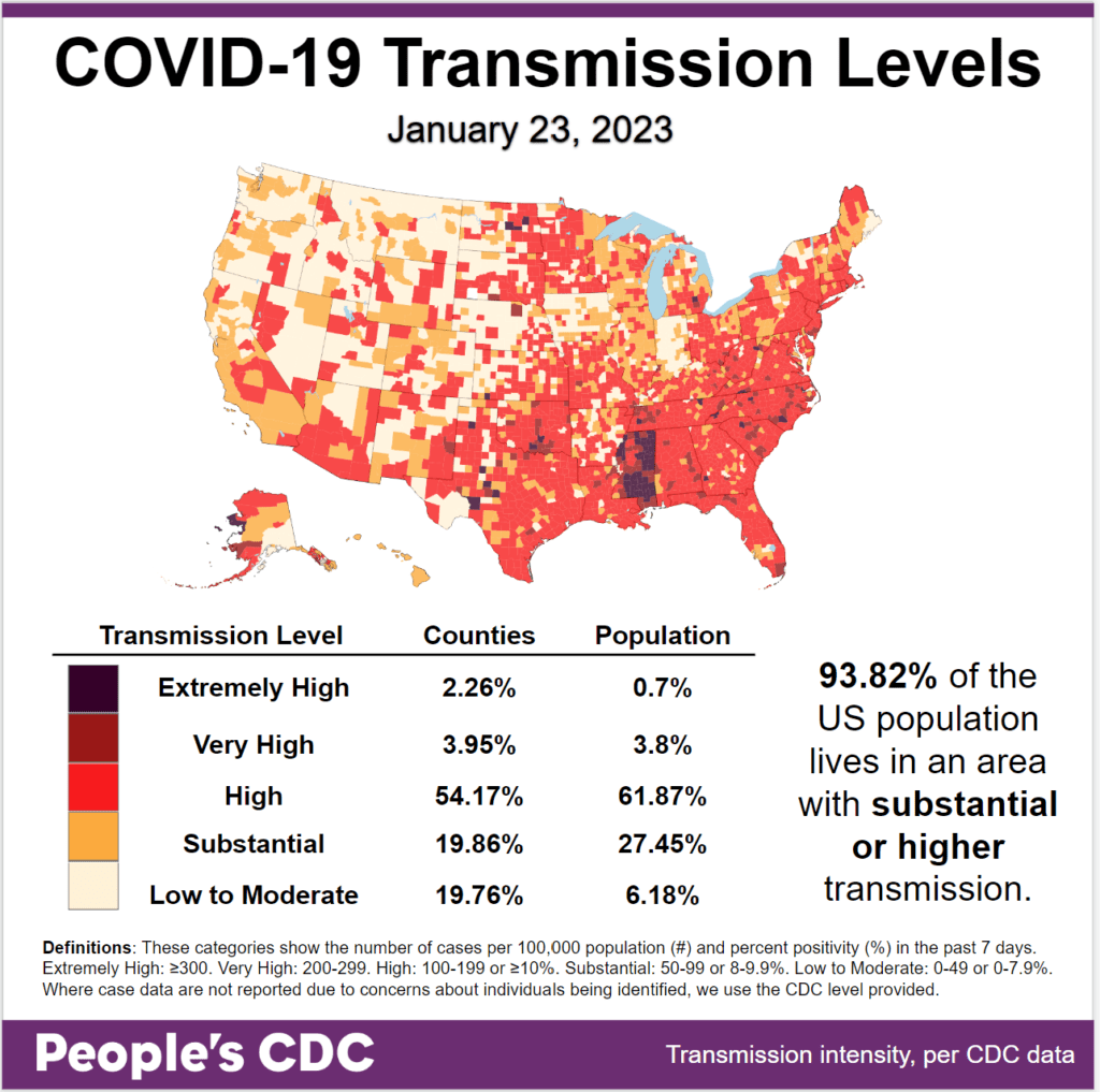
The Weather: Transmission levels remain high, with 93.82 percent of the population living in areas with substantial or higher transmission. Rates are particularly high in the South and the East Coast, with lower levels in the West.

Map and table show COVID transmission levels by US county as of 1/23/23 based on the number of COVID cases per 100,000 population and percent positivity in the past 7 days. Low to Moderate transmission levels are pale yellow, Substantial is orange, High is red, Very High is brown, and Extremely High is black. The eastern and southern parts of the map are almost entirely red, while the northwest is pale yellow and orange. Text in the bottom right reads: 93.82 percent of the US population lives in an area with substantial or higher transmission. A Transmission Level table shows 2.26 percent of counties (0.7 percent by population) as Extremely High, 3.95 percent of the counties (3.8 percent by population) as Very High, 54.17 percent of counties (61.87 percent by population) as High, 19.86 percent of counties (27.45 percent by population) as Substantial, and 19.76 percent of counties (6.18 percent by population) as Low to Moderate. The People's CDC created the graphic from CDC data.

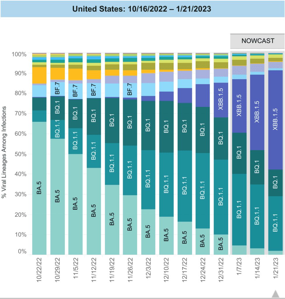
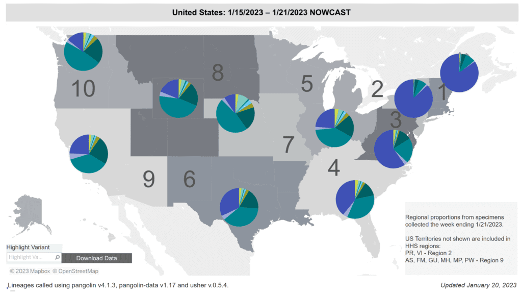
On Variants: This week the new variant XBB 1.5 (Kraken) has surpassed BQ1/1.1 as the most common variant (49.1%). It continues to dominate in the Northeast and is taking a larger share as it moves west across the U.S.

A stacked bar chart with weeks on the x-axis shows weeks from 10/22/2022 to 1/21/2023 and y-axis as percentage of viral lineages among infections. The recent 3 weeks are labeled as Nowcast projections.  XBB.1.5 (dark purple) continues to increase, making up about half of current week infections. BQ.1.1 (teal) has slowly decreased in recent weeks but remains the second most prevalent lineage currently around a quarter of infections. BQ.1 (dark teal) is now about half as prevalent as BQ.1.1 but remains visibly labeled. BA.5 (light teal), which in October was the dominant lineage, is now down to around 2 percent - joined by XBB (periwinkle purple) and a handful of other colors who together make up about 10 percent of infections in the week ending 1/21/23.
Graphic source: CDC COVID Data Tracker: Variant Proportions

Regional differences in dominant variants continue. Kraken (dark purple) is dominant in the Northeast and Southeast, and is gaining rapidly in other regions currently dominated by BQ1/1.1 (teal green).

Regional difference map of the US with 10 regions each with roughly 3 or 4 states depicted as shades of gray. Title reads “United States: 1/15/2023 - 1/21/2023 Nowcast.” Each region has a colored pie chart showing variant proportions. Legend at bottom right reads “Regional proportions from specimens collected the week ending 1/21/2023” and “US Territories not shown are included in HHS regions: PR, VI - Region 2. AS, FM, GU, MH, MP, PW - Region 9.” XBB1.5 (dark purple) makes up over 80 percent of the pie in regions 1 and 2 (Northeast), almost two-thirds in region 3 (Mid-Atlantic) and ranges from about 10 to 40 percent elsewhere. BQ1.1 (teal) shares a third of region 4’s infections and is the most dominant lineage in regions 5 to 10. Bottom text reads: “Updated January 20, 2023” and  “Lineages called using pangolin v4.1.3, pangolin-data v1.17 and user v.0.5.4.”
Graphic source: CDC COVID Data Tracker: Variant Proportions

Is it worth getting another booster with these new variants? A preprint showed that a bivalent booster enhanced neutralizing antibodies that new variants might otherwise escape with only 3 mRNA vaccine doses. 

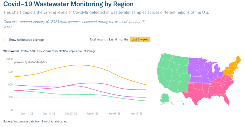
Wastewater Monitoring: National wastewater levels are showing a decline, though they remain at a high level that has continued through the past 6 months.

Graph shows weekly wastewater viral concentration and daily clinical cases since the beginning of the pandemic. Top text says “Data last updated January 19, 2023 from samples collected during the week of January 16, 2023.” A dark blue line marks viral concentration in copies per milliliter of sewage, with a left y-axis from 0 to 5,000. A light blue line marks the average daily new clinical cases, with a right y-axis from 0 to 1.5 million. Since about March 2022, the light blue case line is somewhat erratic and relatively plateaued at well less than 100K. Over the same time, the dark blue wastewater line is persistently higher. It peaked above 1,000 copies per mL in late July 2022 and was decreasing until the end of October. A significant increase occurred earlier in January 2023, rivaling the July numbers just above 1,000 copies/mL. The dark blue line is now trending down again. Bottom text reads: “Source: Wastewater data from Biobot Analytics, Inc; Clinical data from USAFacts.”
Graphic source: Biobot Analytics

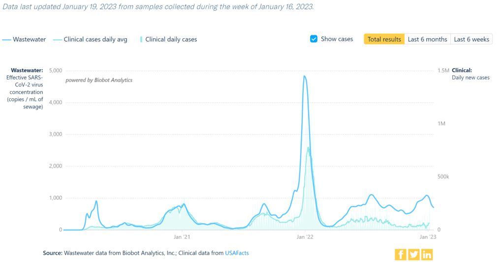
Wastewater levels continue to be high but are declining in the Northeast, and wastewater in all other regions appear to be plateauing.

Title reads “Covid-19 Wastewater Monitoring by Region. This chart depicts the varying levels of Covid-19 detected in wastewater samples across different regions of the U.S.” Line graph shows effective SARS-CoV-2 virus concentration as copies per mL of sewage on a y axis with an x axis showing 6 weeks of time between December 7 and January 18. Each of 4 regions has a different color trend line. A legend map of the US on the right shows the West region as green, South as pink, Midwest as purple, and Northeast as orange. Northeast (orange) has the highest virus concentration over the past 6 weeks, increasing throughout December, and then declining in the past three weeks, most recently right around 1,000 copies per mL. South (pink) has been more stable, currently around 800 copies per mL and second highest, followed by Midwest (purple) and Northwest (green) which are both near 500 copies per mL. Source: Wastewater data from Biobot Analytics, Inc.
Graphic source: Biobot Analytics

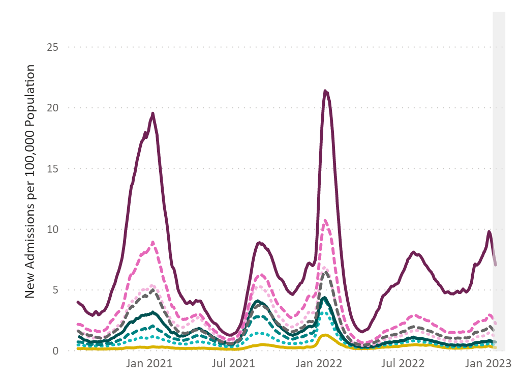
Hospitalizations: Hospitalizations are declining but remain high with a 7 day average of nearly 5000 per week. Many are people over 70 (dark purple).

A line graph represents new admissions per 100,000 population to hospitals of patients with confirmed COVID in the United States by age category between August 2020 and January 2023. A solid dark purple line, representing people 70 and older, stays above the other handful of colorful, mostly dotted lines representing other age groups. A dotted pink line representing ages 60-69 is the next highest line. Most lines show peaks in January 2021, August 2021, and January 2022. The dark purple line has a peak that starts climbing in summer 2022, declines slightly in the fall, and peaks again in December 2023, while the other age groups have much lower admissions and stay close enough together that they are hard to distinguish from each other. In January 2023, the dark purple line is beginning to decline, though continues to be much higher than the other age groups.
Graphic source: CDC COVID Data Tracker: New Hospital Admissions

Deaths: The week of January 18, at least 3,953 people died of COVID nationally. This is a stubbornly high death toll for a pandemic the government has declared “over.” 

Some pundits have seized on the politically convenient fiction that we are overestimating the number of deaths due to COVID. In fact, we are mostly undercounting deaths.

A pooled analysis of 12 studies found infection with COVID at any point during pregnancy increases the risk of death by nearly eight times compared to those who remain uninfected.

Long COVID: A recent study found increased risks up to one year post COVID infection of dysregulated cholesterol levels in the bloodstream, contributing to coronary artery disease and increased risk of heart attack.

A systematic review and meta-analysis of 101 studies (only 16 of which were considered high quality) found a wide spectrum of long-term cardiac symptoms following COVID infection. More large and rigorous studies are needed to better understand the implications of these findings.

If you are currently COVID positive, or have had COVID recently, it’s important to allow your brain and body to rest as much as possible.

Vaccines: Bivalent boosters still provide some immunity, and that imprinting will not make COVID more severe than it would be in someone with no previous exposure. In some people, the immune system can adapt, raising the possibility of improving immune responses.

CDC study found racial and ethnic differences in COVID vaccination coverage among children and suggests need for providers and trusted messengers to provide culturally relevant information to increase overall coverage and address disparities.

Another CDC study evaluated reasons for not receiving bivalent boosters. The most common were that people didn’t know about it or didn’t know they were eligible, highlighting the govt’s failure to properly distribute one of the only remaining tools left to fight the pandemic.

Forecast: Potential new treatment: VV116 is an oral antiviral agent with potent activity against COVID and a study found it to be comparable to Paxlovid with fewer safety concerns in adults with mild-to-moderate COVID who were at risk for progression.

COVID infection may affect the fetal brain during early gestation and highlight the need for further study of its impact on subsequent neurological development.

Take Action: Miss our one year anniversary webinar last week? Learn more about our work and accomplishments over the past year and how to get involved.

If you’re a university professor with the ability to do so, consider having your students review Dr. Mike Hoerger’s (@michael_hoerger) student-focused pandemic mitigation primer.

This week, it was reported that companies creating COVID vaccines pressured Twitter to suppress activist-led social media campaigns aimed at demanding for the ability to create more affordable, generic versions of existing vaccines.

Notes: 1) The numbers in this report were current as of 1/20. The CDC updates data frequently as it receives refreshed information. Today’s numbers may be slightly different from the data here. 2) Check out the links throughout & see our website for more! https://peoplescdc.org.

Share this:
Translate
Close