People’s CDC COVID-19 Weather Report

Published

The Weather: Transmission levels stay stubbornly high, with 93.3% living in areas with substantial or higher transmission, though fewer at the very highest level. Rates are higher generally in the South, parts of the Midwest, and the East Coast, with lower levels in the West.

Map and table show COVID transmission levels by US county as of Feb 1, 2023 based on the number of COVID cases per 100,000 population and percent positivity in the past 7 days. Low to Moderate transmission levels are pale yellow, Substantial is orange, High is red, Very High is brown, and Extremely High is black. Eastern, southern, and parts of the Midwest are almost all red, while the northwest is pale yellow and orange. Text in the bottom right reads: 93.3 percent of the US population lives in an area with substantial or higher transmission. Transmission Level table shows 1.3 percent of counties (0.5 percent by population) as Extremely High, 3 percent of the counties (1.2 percent by population) as Very High, 55.9 percent of counties (60.9 percent by population) as High, 20.1 percent of counties (30.8 percent by population) as Substantial, and 19.8 percent of counties (6.7 percent by population) as Low to Moderate. The People's CDC created the graphic from CDC data.

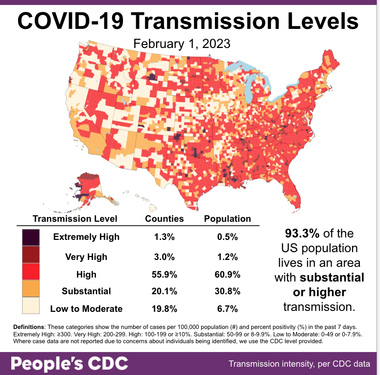
Note: Due to state reporting irregularities, cases may be underestimated in Washington and Wyoming and overestimated in East Baton Rouge, LA.

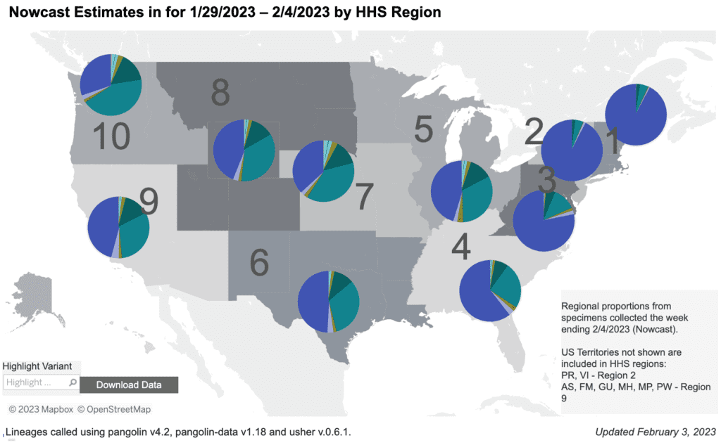
On Variants: The increase in Kraken (XBB1.5) continues, now making up 66.4% of cases, while the BQ variants decrease.

A stacked bar chart with weeks on the x-axis shows weeks from Nov 5, 2022 to Feb 4, 2023 and y-axis as percentage of viral lineages among infections. The recent 3 weeks are labeled as Nowcast projections.  XBB.1.5 (dark purple) continues to increase, making up about 66.4 percent of current week infections. BQ.1.1 (teal) has decreased in recent weeks but remains the second most prevalent lineage currently around a quarter of infections. BQ.1 (dark teal) is now about half as prevalent as BQ.1.1 but remains visibly labeled. BA.5 (light teal), which in October was the dominant lineage, is now down to nearly zero visibility - joined by XBB (periwinkle purple) and a handful of other colors in the week ending Feb 4, 2023.
Graphic source: CDC COVID Data Tracker: Variant Proportions

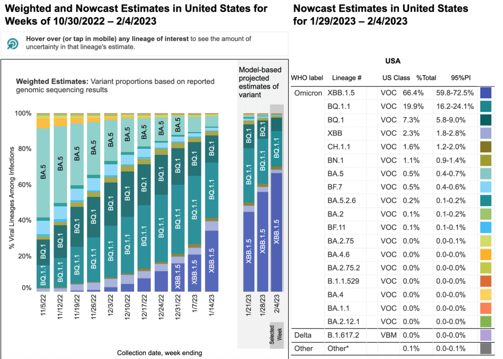
Regional differences continue. Kraken is almost the only strain in the East, and is gaining rapidly in other regions over BQ1/1.1. However, while there were increased hospitalizations in the East, we haven’t seen the same rise in other regions yet.

Regional difference map of the US with 10 regions each depicted as shades of gray. In general, the numbers start in the northeast and increase as they move south and then westward. Title reads “Nowcast Estimates in for 1/29/2023 to 2/4/2023 by HHS Region.” Each region has a colored pie chart showing variant proportions. Legend at bottom right reads “Regional proportions from specimens collected the week ending 2/4/2023.” XBB1.5 (dark purple) makes up about 90 percent of the pie in regions 1 and 2 (Northeast), more than 75 percent in region 3 (Mid-Atlantic) and ranges from about 20 to 50 percent elsewhere. BQ1.1 (teal) shares less than 30 percent of regions 3 and 4 infections and represents about 30-40 percent of infections in regions 5 through 10. BQ1 (green) represents about 5 to 15 percent of infections in Regions 3-10. Bottom text reads: “Updated January 27, 2023” and  “Lineages called using pangolin v4.2, pangolin-data v1.18 and user v.0.6.1.”
Graphic source: CDC COVID Data Tracker: Variant Proportions

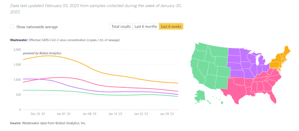
Wastewater Monitoring: National wastewater levels appear to be leveling off, though they are still at very high levels.

Graph shows weekly wastewater viral concentration and daily clinical cases since the beginning of the pandemic. Top text says “Data last updated Feb 3, 2023 from samples collected during the week of January 30, 2023.” A dark blue line marks viral concentration in copies per milliliter of sewage, with a left y-axis from 0 to 5,000. A light blue line marks the average daily new clinical cases, with a right y-axis from 0 to 1.5 million. Since about March 2022, the light blue case line is a bit erratic and relatively plateaued at well less than 100K. Over the same time, the dark blue wastewater line is persistently higher. It peaked above 1,000 copies per mL in late July 2022 and was decreasing until the end of October. A notable increase occurred early in January 2023, rivaling July numbers just over 1,000 copies/mL. It’s now downtrending slightly. Bottom text reads: “Source: Wastewater data from Biobot Analytics, Inc; Clinical data from USAFacts.”
Graphic source: Biobot Analytics

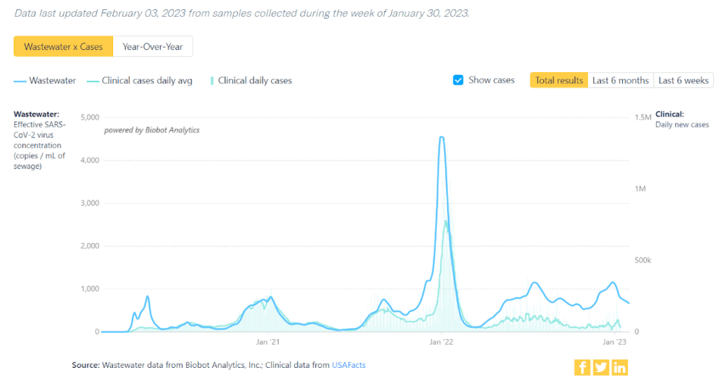
Indeed, regionally wastewater levels show a clear leveling off. While this is better than another surge, we are still looking at high, steady rates of disease.

 Titled “Covid-19 Wastewater Monitoring by Region.” Top text says “Data last updated Feb 3 2023 from samples collected during the week of January 30 2023.” A map of the US on the right shows the West as green, South as pink, Midwest as purple, and Northeast as orange. On the left, a correlating line graph depicts levels of SARS-CoV-2 detected in wastewater samples across the 4 regions, with viral concentration as copies per mL of sewage on y-axis, and 6 weeks of time from December 18 to January 29 on x-axis. Northeast has the highest virus concentration over the past 6 weeks, increasing throughout December, and then declining in the past 4 weeks, most recently starting to plateau around 1,000 copies per mL. South has been more stable, slightly decreasing to about 700 copies per mL over the past week and second highest, followed by Midwest near 600 copies per mL, and West around 500 copies. Source: Wastewater data from Biobot Analytics, Inc.
Graphic source: Biobot Analytics

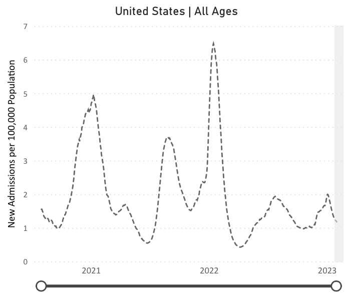
Hospitalizations: There is some better news: hospitalizations for confirmed COVID cases continue to decline. However, levels are still far above the lowest points, in July 2021 & April 2022. Hospital rates are much higher in seniors compared to other ages.

A line chart with “United States All Ages,” as its title, “New Admissions per 100,000 Population” on its y-axis, and dates from January 2021 to February 2023 on its x-axis. The dotted line indicates peaks in admissions around January 2021, August 2021, January 2022. Smaller peaks and higher troughs or valleys persist for the rest of 2022 and into 2023. The most recent peak in January 2023 reached about 2 admissions per 100,000 population and is now dropped to just above 1 admission per 100,000 population.
Graphic source: CDC COVID Data Tracker: New Hospital Admissions

Deaths: The week of February 1, at least 3,452 people died of COVID nationally.15,000 people have already died of COVID in 2023.

As much as some would like to blame these deaths on other causes, it is clear that COVID deaths are NOT being overcounted.

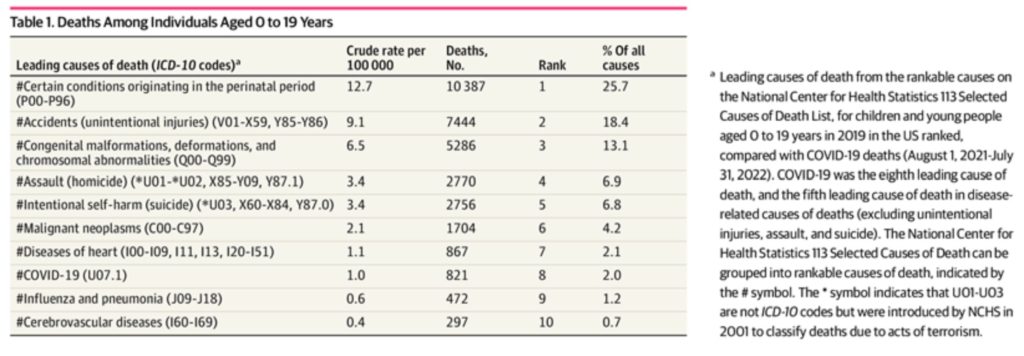
Sadly, a report this week found that COVID is the leading infectious/respiratory cause of death in children (almost double the rate of flu deaths) and the 8th leading cause of death in children overall. Better layers of protection can prevent these deaths.

This table, titled “Deaths Among Individuals Aged 0 to 19 Years” shows leading causes of death in the first column, then crude rate per 100,000, the number of deaths, the rank, and the percent of all causes in subsequent columns. The first most common cause of death is “certain conditions originating in the perinatal period.” Their crude rate is 12.7/100,000, representing 10,387 deaths and 25.7 percent of all causes. Next is accidents, unintentional injuries, making up 18.4 percent of all causes. Congenital malformations deformations and chromosomal abnormalities are 3rd at 13/1 percent. Next are assault at 4th, intentional self harm or suicide at 5th, malignant neoplasm at 6th, and diseases of the heart at 7. COVID-19 has a crude rate of 1/100,000, representing 821 deaths, is 8th on the table, and makes up 2 percent of all deaths in this age category. Influenza and pneumonia is 9th representing 1.2 percent of all deaths. Last in the table is cerebrovascular diseases at 10th.
Graphic source: Flaxman S, et al. Assessment of COVID-19 as the Underlying Cause of Death Among Children and Young People Aged 0 to 19 Years in the US. JAMA Network Open. 2023.

Long COVID: Some individuals with Long COVID develop postural orthostatic tachycardia syndrome (POTS), described in this review. Many symptoms are possible as the cardiovascular system is unable to respond normally.

This figure of a grayed out body picturing a red and blue circulatory system highlights, on the left, “local circulatory symptoms,” and on the right, “global circulatory symptoms.” The local list, each in pink boxes with black lines pointing to the part of the body implicated, includes migraines and brain fog, chest pain or angina-like symptoms, venous pooling, heath or cold intolerance, and raynaud-like symptoms. A bottom pink box reads “microvascular dysfunction?” The global list, in blue boxes, again with black arrows indicating the anatomic region of importance, includes fatigue and exercise intolerance, hypovolemia, postural orthostatic tachycardia syndrome, inappropriate sinus tachycardia, abnormal exercise-induced or tachypnea-induced tachycardia, orthostatic or postprandial hypotension, and hypotension susceptibility. A bottom blue box reads “general autonomic dysfunction?”
Graphic source: https://www.nature.com/articles/s41569-023-00842-w

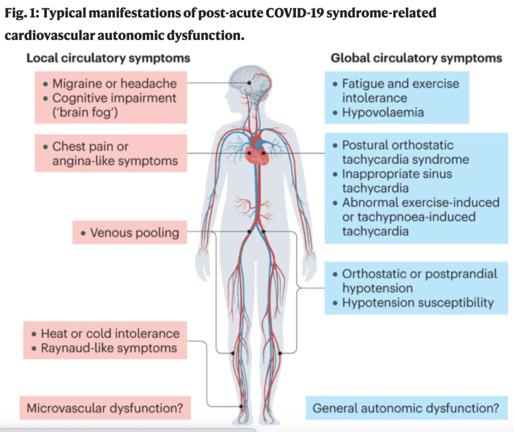
Symptoms “preferentially affect young & middle-aged women, possibly suggesting a genetic predisposition and/or a mechanistic role for sex hormones.” There are tests you can request from a medical provider. Research continues to find more tests & treatment.

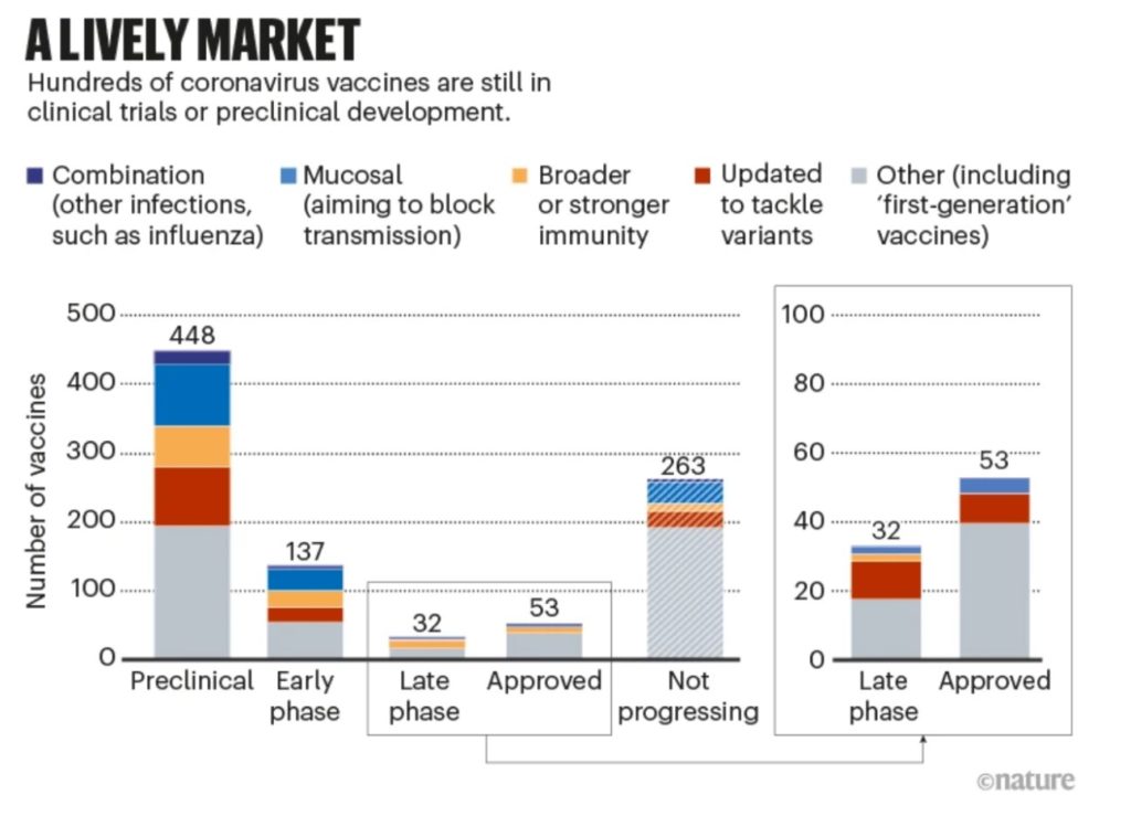
Vaccines: As variants continue to evolve, scientists are working to create vaccines that can recognize multiple – or even any – form of COVID, which would be a huge breakthrough. 

A stacked bar chart titled “a lively market: hundreds of coronavirus vaccines are still in clinical trials or preclinical development” shows number of vaccine products on the y axis and stages of development along the x axis. The preclinical bar, represents 448 vaccine products. The bar is segmented by type of product: about 10, represented by dark blue, are “combination (other infections such as influenza).” About 90, in light blue, are “mucosal (aiming to block transmission).” About 40, in orange, are “broader or stronger immunity.” About 80, in red, are “updated to tackle variants.” The rest, grey and just under 200, are “other.” The next bars, segmented similarly, shows that there are 137 products in early phase of development, 32 in late phase, 53 approved, and 263 not progressing. Late phase and approved are magnified in a chart to the right. The majority of both are in the “other” category, and each shows about 10 “updated to tackle variants” products.
Graphic source: https://www.nature.com/articles/d41586-023-00220-z

Take Action: This weekend’s Grammy awards featured layers of protection for attendees, similar to Davos last month. Guests must present negative lab-administered PCR tests, and the venues have MERV-15 air filters

COVID protections should be for everyone — not just the famous, and the rich.

Screenshot of press about access to the Grammy’s, titled “Nominee Premier Ceremony/Telecast Press Info: Red Carpet and Media Center.” It reads: at this time, access to media opportunities on the red carpet and media center will be limited to current GRAMMY nominees and winners plus one guest each. In bold, it states “to access the red carpet and/or media center, GRAMMY nominees, winners, and their guest must present a lab-administered negative COVID-19 PCR test taken within 2 days prior to the day of the event before entering, regardless of vaccination status.” It continues with instructions for how to present the test results and what is considered acceptable for entry, including proof of the test correlating to the attendee’s identity.
Source: https://www.recordingacademy.com/press-room/65th-grammy-attendee-info-2023

Many groups, including AFL-CIO, are standing strong against moves to end the Public Health Emergency by both the Republicans and the Biden administration, which will increase health risks and health disparities for everyone. https://twitter.com/AFLCIO/status/1620462368378716161 

Ending the Emergency will have drastic consequences. This decision is clearly not based on hospitalizations or deaths, as we see steady, high levels.

Some consequences of ending the Public Health Emergency include folks losing access to Medicaid & telehealth, while testing and vaccines will be less affordable

Join People’s CDC and others and sign this letter demanding officials recognize the ongoing pandemic and maintain the layers of protection needed. https://actionnetwork.org/letters/maintain-healthcare/ 

If you’ve already signed you can also check out this petition: https://actionnetwork.org/petitions/oppose-ending-the-national-and-public-health-emergency-declarations-2

Notes: 1) The numbers in this report were current as of 2/3. The CDC updates data frequently as it receives refreshed information. Today’s numbers may be slightly different from the data here. 2) Check out the links throughout & see our website for more! https://peoplescdc.org.

Share this:
Translate
Close