
The Weather: About 45% of all counties in the country are experiencing substantial or higher transmission levels based on the available data. Notably, Iowa no longer reports COVID data to the CDC as of April 1, 2023.
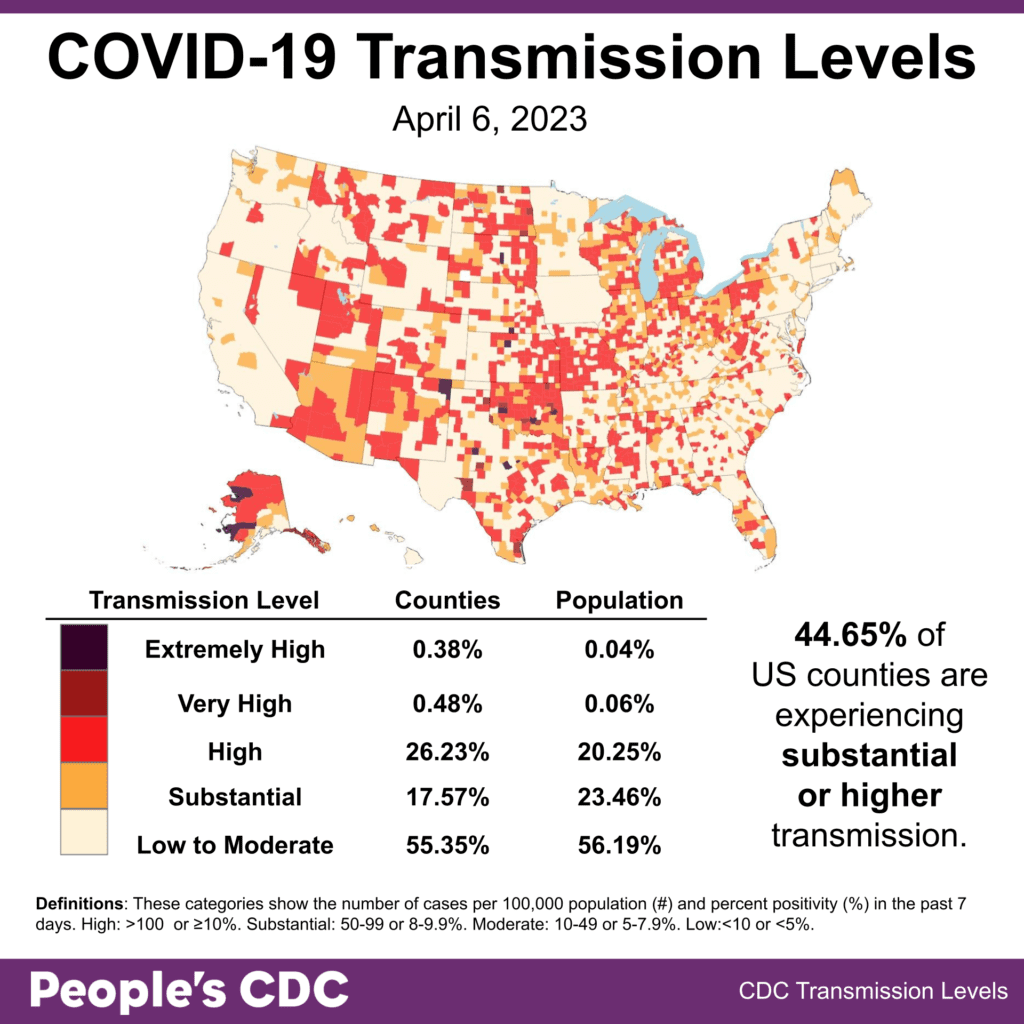
Although the CDC’s pastel-colored and misleading “Community Levels” map is featured more prominently on the CDC website, the more informative Community Transmission map is still available to find data for your county.
Wins: Seattle healthcare organizations have demonstrated the moral courage to protect patients from death and long-term illness by adopting a joint consensus statement to continue masking in healthcare facilities. This shows us that healthcare workers have every right and ability to defy malicious orders to remove universal masking from hospitals in order to protect us all from experiencing the dangerous risk of COVID reinfection at every hospital visit. If you are a healthcare worker who understands the serious danger that dropping these protections poses, know this: you are not alone, and we are stronger when we stand up and fight back.
Variants: This week, Kraken (XBB.1.5) makes up 88.3% of cases, which is a slight increase from last week’s Weather Report. Hyperion (XBB.1.9.1) continues to grow in proportion, now at 5.1% of cases.

Hyperion continues to rapidly eat into Kraken’s domination in the mountain states and parts of the Midwest, and is slowly increasing across the country as it is now minimally 3 percent of all cases in each region everywhere.

Wastewater Monitoring: Wastewater levels show a recent leveling off to slight downward trend, regionally and nationally. Nationwide average copies per milliliter remain at least twice as high as lower values seen in March 2022 and about 7 times as high as the levels seen in May 2021.

A recent article from Scientific American highlighted that funding for wastewater testing is not necessarily certain. The majority of US wastewater testing sites are funded through the CDC’s National Wastewater Surveillance System (NWSS), which is fully funded through 2025. However, wastewater testing availability is uneven across the country, and uncertain funding may make it more difficult to expand access to this important surveillance method. This is especially dire as we need fully funded wastewater testing in the coming years as testing rates go down and it becomes harder to accurately track the continuing pandemic using case counts.
Hospitalizations: Hospitalizations for confirmed COVID cases remain high at national rates of 3.11 per 100,000 for ages 70+ and 0.63 per 100,000 for all ages as of April 4.
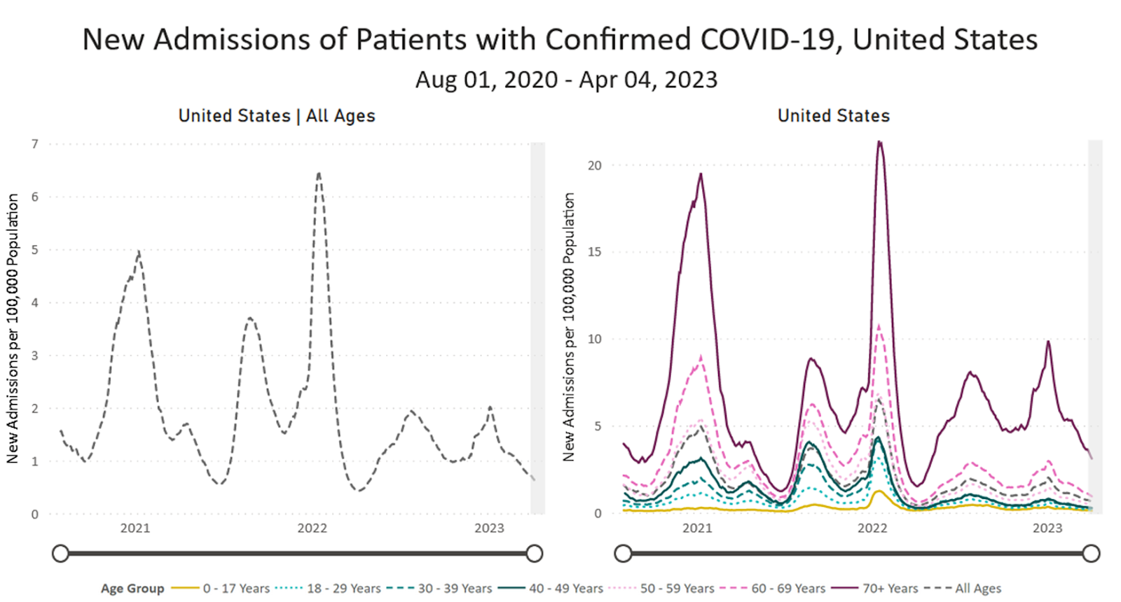
Hospital-Acquired COVID Cases: These hospitalizations don’t reflect the growing number of people who are getting COVID from going to hospitals as we remove protections. As a stark reminder, back in January 2022 during the height of Omicron, a record-breaking 3,000+ patients were getting COVID in the hospitals each week. Even now in 2023, over 138,000 COVID infections have occurred in hospitals already over three months, matching closely with how many we had back in 2021 up to this point. Note that these are all undercounts, as people are not tested after the end of their hospital visit.
COVID is even more transmissible now than ever, so clearly the dropping of basic protections such as universal masking in healthcare settings will result in increased COVID transmission in hospitals yet again – and more deaths and illness, something unacceptable in a society where we have the tools to fight this and claim to be a land of the free – it is hard for people to be free if they are sick or dead, after all.

Deaths: For the week ending April 5, 2023, 1,773 people died of COVID nationally. At least 1,127,104 people have in total died from COVID in the US. As with COVID cases, Iowa is no longer reporting COVID deaths beginning April 1, 2023.
Forecast: The forecast is uncertain. Although COVID transmission and hospitalizations appear to be decreasing and wastewater COVID levels are stable to slightly decreasing, far too many are dying from this preventable disease each week. Multilayered precautions to prevent COVID transmission are warranted for all of us, and continue reading for additional ways to support COVID protections.
Long COVID: A new report from a preprint visually shows us that the SARS-COV-2 viral spike protein persists in the brain over the long term, even in dead patients. Check out this twitter thread for some eye-opening video visuals of this. This demonstrates a direct link from catching COVID to neural cell death and long-term neurological symptoms, yet another reason why we should try to avoid getting Long COVID for the sake of our freedom to live healthy lives.
COVID Impacts in Dementia: Relatedly, Neuroscience News reports that COVID infection may accelerate multiple types of dementia. Although this is a small study of only 14 patients, dementia has already been identified as a high risk condition for severe COVID infection by the CDC. Also, these patients may be at a higher risk of exposure, often residing in nursing homes and other facilities that may not provide adequate COVID protections.
Take Action: The best way to avoid getting Long COVID is to avoid catching COVID in the first place, and to that end many of us have compiled our own ways to ask for safer in-person meetings. For example, check out Noha Aboeleta’s thread on how she has asked for safer in-person meetings, to positive reception. The biggest takeaway is that it is always a good thing to at least bring this up as people tend to be willing to do the right thing if told what to do to make meetings safer.
If your hospital or healthcare provider has dropped universal masking, you can fight back by knowing and using your American with Disabilities Act (ADA) rights. You can invoke these rights even if you are not disabled, as you can claim to be at high risk for severe outcomes from COVID, which is the truth for all of us in this environment of few COVID protections and high risk of Long COVID.
Tell them in writing that you are making a formal request for universal masking and proper air filtration as a reasonable accommodation under the ADA, and offer to bring masks or a portable air purifier if they do not have these. If the secretary does not know anything, ask to talk to the manager. Ask them to give you their answer in writing. If they tell you “no,” then they have broken the law.
Doctors are required to provide reasonable accommodations under the ADA, so you can file an ethics violation of their licensure to the state board. You can also alternatively file a complaint with the Department of Justice, or if you have the means you have strong legal standing for suing them. The doctors’ offices and hospitals will feel the pressure and must accept your accommodation to avoid this issue. All in all, hospitals are violating ethics standards and the law by dropping universal masking, and we need to hold them accountable to bring precautions.
Notes: 1) The numbers in this report were current as of 4/06. The CDC updates data frequently as it receives refreshed information. Today’s numbers may be slightly different from the data here. 2) Check out the links throughout & see our website for more! https://bej.gbh.mybluehost.me.