People’s CDC COVID-19 Weather Report

Published

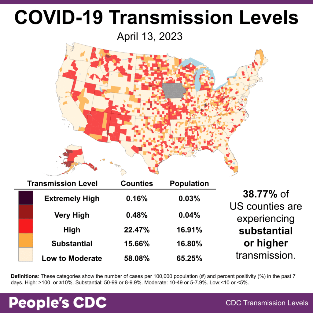
The Weather: As of April 13, about 39% of reporting US counties are experiencing substantial or higher COVID transmission based on available data. Iowa (shown in gray) no longer reports COVID data to the CDC as of April 1, 2023.

Map and table show COVID transmission levels by US county as of April 13, 2023 based on the number of COVID cases per 100,000 population and percent positivity in the past 7 days. Color coding is: Low to Moderate pale yellow, Substantial orange, High red, Very High brown, and Extremely High black. The US shows mixed red, orange and pale yellow, with areas of pale yellow predominating on the west coast and Northeast. Iowa is pale yellow with no data reporting. Text in bottom right: 38.77 percent of the US counties are experiencing substantial or higher transmission. Transmission Level table shows 0.16 percent of counties (0.03 percent by population) as Extremely High, 0.48 percent of counties (0.04 percent population) Very High, 22.47 percent of counties (16.91 percent population) High, 15.66 percent of counties (16.80 percent population) Substantial, and 58.08 percent of counties (65.25 percent population) Low to Moderate. The People's CDC created the graphic from CDC data.

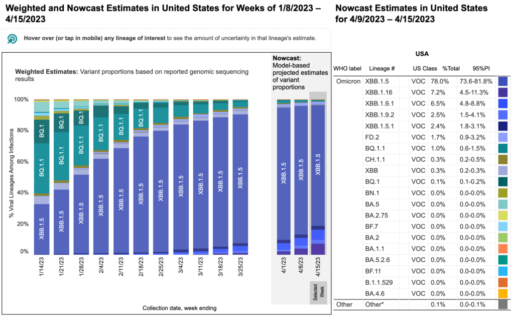
On Variants: XBB.1.5 (Kraken) remains the most prominent variant in the US, representing 78% of cases as of 4/15/2023, a slight decrease from last week. XBB.1.16 (Arcturus) is now designated dark purple on the CDC’s variant proportion graph and is the second most prevalent variant, representing 7.2% of cases, showing a rapid increase over the last few weeks. XBB.1.9.1 (Hyperion) shows a slight increase to 6.5% as the third most prevalent variant.

A stacked bar chart shows x-axis as weeks and y-axis as percentage of viral lineages among infections. Bar chart is titled  “Weighted and Nowcast Estimates in United States for Weeks of 1/8/2023-4/15/2023.” Table is titled “Nowcast Estimates in United States for 4/9/2023-4/15/2023.” The recent 3 weeks are Nowcast projections. For 4/15, XBB.1.16 (dark purple) has emerged as the second dominant variant at 7.2 percent. XBB.1.9.1 (blue) has increased slightly to 6.5 percent. XBB.1.5 (medium purple) predominates and slightly decreased to 78.0 percent. Other variants including BQ 1.1, XBB, XBB.1.5.1, BQ.1, and CH1.1.1 are smaller percentages represented by a handful of other colors as small slivers.
Source: CDC COVID Data Tracker: Variant Proportions

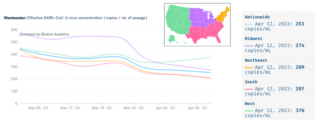
Wastewater Monitoring: National wastewater data continues to show a plateau to slight decline on average, with the Midwest, Northeast, and South mirroring that trend. The West region shows a slight increase from April 5 to April 12. Use this Action Network template to write the White House and your representatives to support increased funding and growth of wastewater surveillance.

Top title reads “Wastewater: Effective SARS-CoV-2 virus concentration (copies / mL of sewage). Line graph shows the levels of COVID detected in wastewater by US region, each region with a different color trend line. The y-axis shows copies per mL of sewage and the x-axis shows time labels between March 5, 2023 and April 9, 2023. A legend map of the US in the center shows the West region as green, South as pink, Midwest as purple, and Northeast as orange. The national average is shown as a dashed light cyan line. Virus concentrations show a plateau or slight decrease since the end of March for three regions except in the West where a slight increase is happening. A table on the right shows values for April 9, 2023: Nationwide is 253 copies/mL, Midwest 274 copies/mL, Northeast 209 copies/mL, South 207 copies/mL and West 376 copies/mL.
Source: Data on Covid-19 and Mpox Wastewater Monitoring | Biobot Analytics

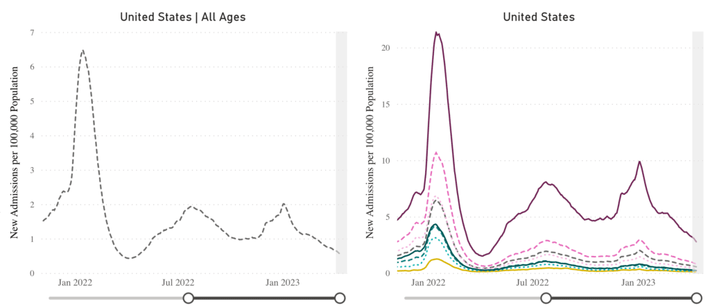
Hospitalizations: Hospitalizations continue on a slight downward trend. The national average as of April 12, 2023, was 0.56 new admissions per 100,000 population, and the 70 years and older age group hospitalization rate was 2.78 per 100,000 population.

Image of line graphs titled “New Admissions of Patients with Confirmed COVID-19” from January 2022 to Apr 12, 2023. A line graph showing hospitalizations for all ages is on the left, and is broken down by age group on the right. The y-axis is labeled “New Admissions per 100,000 Population” and ranges from 0 to 7 for all ages and 0 to 20 by age group. The x-axis is time from January 2022 to Apr 12, 2023. Current hospitalizations are at a rate of 0.56 per 100,000 people. 70+ (solid red-purple) is the highest for the whole graph with a larger gap within the last year, followed by 60-69 (dashed dark pink), and then progressively decreasing by decade, with the last 2 groups being 0-17 years (solid gold) and 18-29 years (dashed light cyan). In the last month, all ages are slightly decreasing. Age 70+ admissions are at about 2.78 per 100,000. The other age groups are about 1 or less.
Source: https://covid.cdc.gov/covid-data-tracker/#new-hospital-admissions

Share our campaigns and resources to support healthcare masking and protect patients, healthcare workers, and communities.

Deaths: For the reporting week ending April 12, 2023, 1,327 Americans died of COVID. Over 1,128,404 Americans have died from COVID since the beginning of the pandemic.

External Review: In the face of mounting political and corporate pressure to return to unsafe pre-pandemic activities despite the growing death toll and millions affected by long COVID, the People’s CDC External Review, titled “Too Many Deaths, Too Many Left Behind,” calls on the CDC to implement evidence-based and ethical public health approaches that protect people. Please share the external review with others who are interested in improving public health.

Notes: 1) The numbers in this report were current as of 4/17/23. The CDC updates data frequently as it receives refreshed information. Today’s numbers may be slightly different from the data here. 2) Check out the links throughout & see our website for more – https://peoplescdc.org

Share this:
Translate
Close