
The Weather
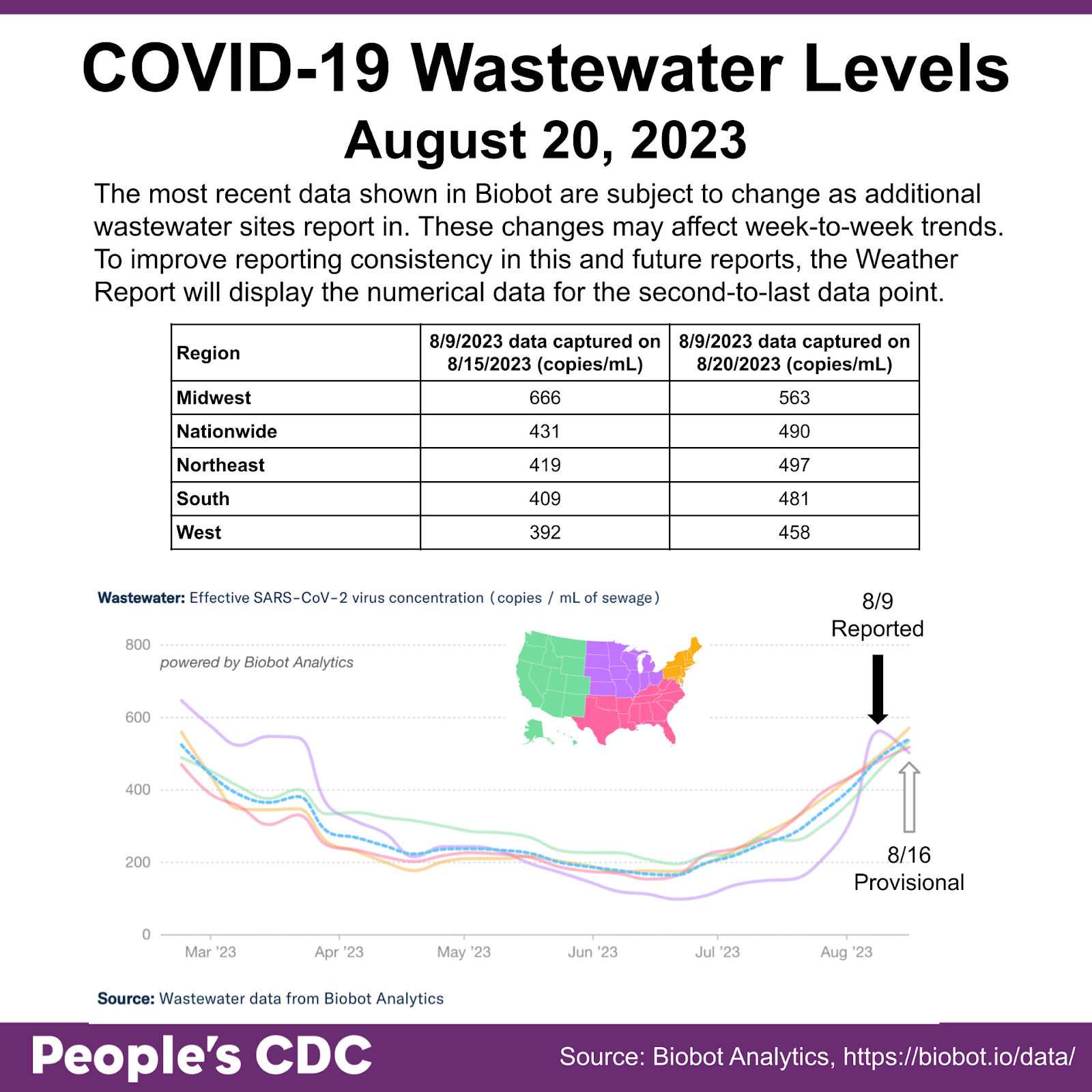
Wastewater levels continue to rise in most of the country. As the most recent week’s biobot data are subject to change, we will focus on the data from last week, August 9th. We are making this change in how we present the Biobot data after noticing that post hoc adjustments Biobot makes to its data can change the appearance of wastewater trends significantly (for example, from upward to downward trends and vice versa). Differences can also be caused by changes in wastewater site reporting practices, or from errors in the mathematical models used to create the reported value.
Using August 9th data, all regions show an increase since July 19, continuing an overall increasing trend since mid-June.
As always, remember that local wastewater levels, if they are available to you, will give you a much better sense of what’s happening where you are than the national data.
For example, you can see that the COVID wastewater level in Duplin County, NC is below the national average (shown in a faint dotted line) and appears to be trending downward. Alameda County, CA, Henry County, VA, and Butler County, PA, on the other hand, are all making sharp upward spikes. Note the y-axis: in Alameda County, the upward trend follows along the national average line whereas the others far exceed the national average.
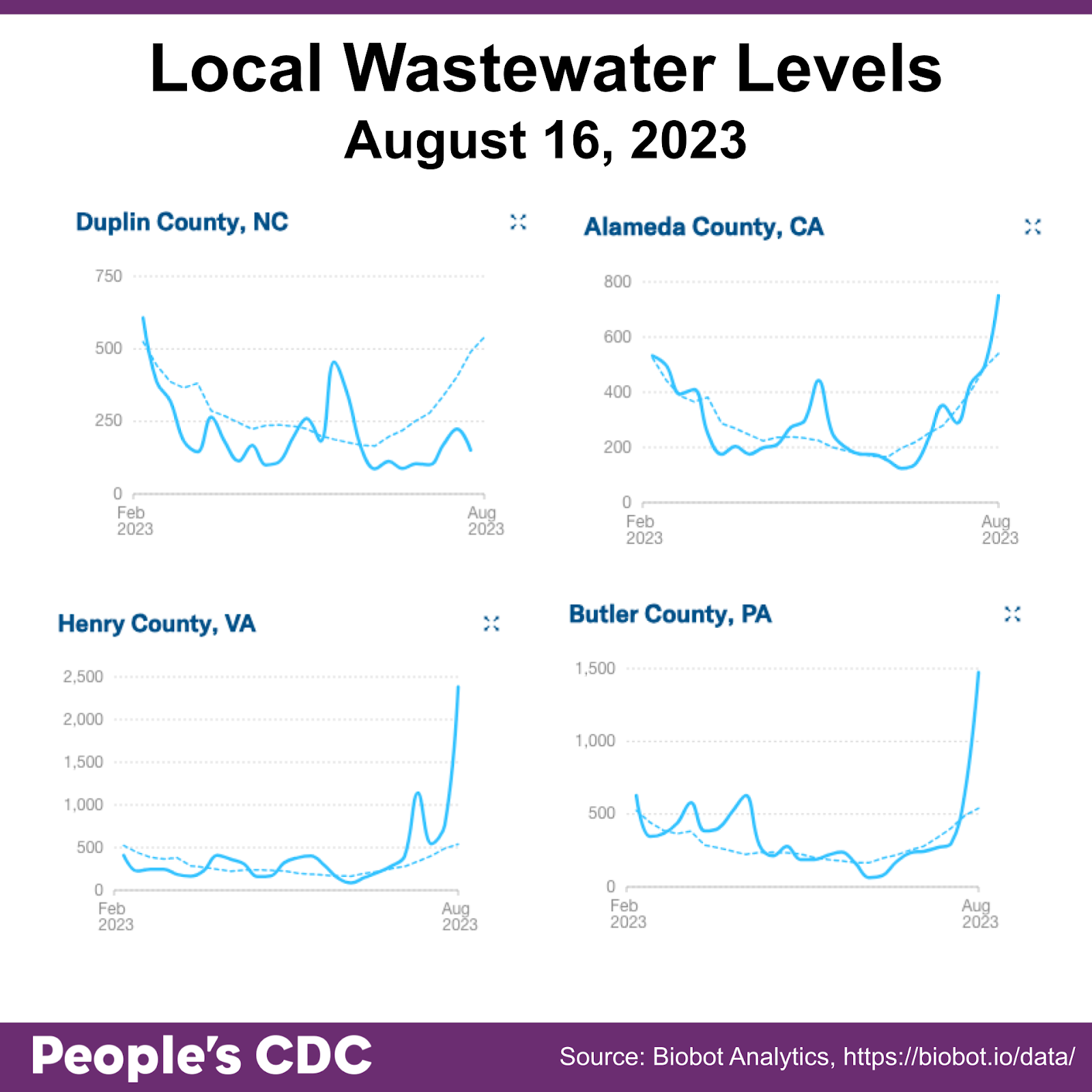
During this month’s People’s CDC Webinar on Wastewater on August 10th, Marc Johnson, PhD explained that “The best thing is to look at each sewer shed compared to itself. So the best thing is to look at that sewer shed over time and don’t say how high is my number compared to Boston; [instead] say how high is my number now compared to where it was this spring or last summer. Or, compare it to when you know things were bad.”
You can look for your local wastewater information at Biobot Analytics, The Wastewater SCAN Dashboard, or CDC’s National Wastewater Surveillance System.
If you don’t have local wastewater data, call or write your representatives and tell them you want it! According to Dr. Johnson, “if you let them know that this is important, then usually they’re perfectly happy to keep doing it.”
Hospitalizations:
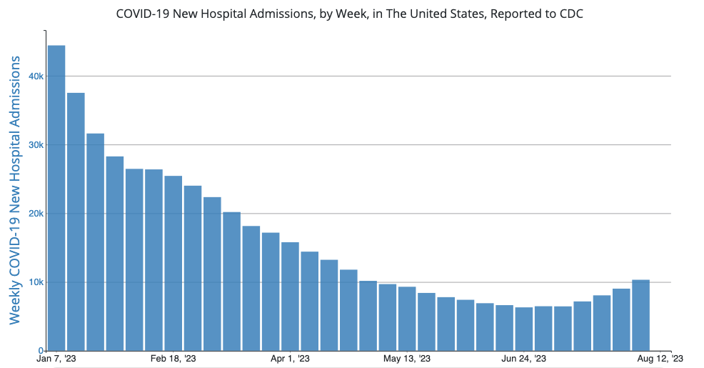
Nationally, COVID hospitalizations continue to increase.
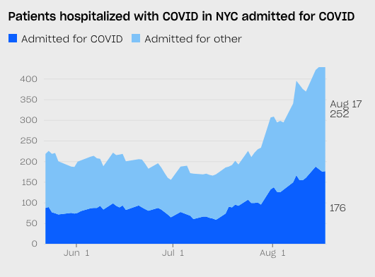
Again, it’s important to check out what’s happening locally to better understand your individual and communal risk. In New York, for example, where The City continues to report on the local COVID situation, we see steep increases in hospitalizations.
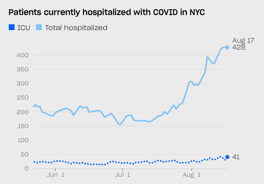
We also see that, of the patients hospitalized with COVID, many have been admitted for something other than COVID. To a certain extent, this can be attributed to a lack of clarity on reporting guidance. But it is also likely that folks admitted with one problem are catching COVID in the hospital, a predictable result of removing mask requirements within the hospital setting. Without more robust and clearer COVID reporting requirements, we can’t be sure what is really happening in hospitals.
The numbers of deaths attributed to COVID, surely undercounted, are also steadily increasing, which correlates with the increasing hospitalizations and wastewater data trends. Since the start of 2023, over 1 million people have died from COVID. You can find CDC’s COVID death data and resources here. But, keep an eye out for an explainer from our team about why we no longer routinely report CDC’s death data in our Weather Report.
Wins:
Pasadena, CA continues to keep masking in healthcare settings, and other hospitals are responding to the current increases in hospitalizations by reinstating mitigation measures. Upstate University Hospital in New York, for example, reimplemented masking and expanded COVID testing policies.
The Arabic Music Retreat (held at Mount Holyoke College in MA) has made clear that they’re centering community care with robust COVID mitigation measures for their event this year.
Long COVID:
Long COVID Justice and Ed Yong have created a paywall-free PDF and audio recording of his recent article, “Fatigue Can Shatter a Person: Everyday tiredness is nothing like the depleting symptom that people with long COVID and ME/CFS experience.” You can access them here – see the 3rd and 4th links from the top).

Forecast:
Without robust surveillance, it is hard to understand how bad the current surge is, how bad it will get, and how long it will last. Certainly, it does not bode well that school is starting, that masking has been widely abandoned, and that updated vaccines will not be available for at least another month.
In preparation for the new school year, the EPA and the Efficient and Healthy Schools Program are hosting a webinar on reducing airborne infection risks on August 23 at 1:00pm EST. Learn more and register here.
Take Action:
As rates continue to increase, and as we’re seeing some hospitals make the change to reinstate making, you can call your local hospitals and healthcare systems to demand masking be reinstated in healthcare settings. We previously provided resources with some language you can use here.
National Nurses United shared the following statement on the CDC HICPAC vote: “CDC/HICPAC has decided to delay the vote on HICPAC’s terrible, weakened proposals to update the Isolations Precautions guidance—a victory for sure!! But it’s not nearly enough. The fact remains that the process is still happening behind closed doors! CDC/HICPAC hasn’t released the proposed updates, working group meetings are still closed to the public, and our requests for their evidence review have been denied. The vote delay gives CDC/HICPAC more time to properly engage stakeholders, and we need to make sure they hear this loud and clear.”
Please attend the meeting on Tuesday, 8/12/23 at 12pm ET at this Zoom link (Meeting ID: 161 532 2622; Passcode: 36073986). Show up and have your voice heard, in support of evidence-based guidance supporting public health measures that keep us all safe. It is time for the CDC to put people over profits, and they must be held accountable.
Are you interested in being part of a remote portrait project of immunocompromised Americans as a response to the ongoing COVID-19 pandemic and the resultant loss of civil rights for disabled people to participate in public life? Participation would be compensated ($100). Please reach out to megseliz0@gmail.com.
Notes: 1) The numbers in this report were current as of 8/19/2023. 2) Changes in testing access as well as data reporting have led many federal data sources to become less reliable. 3) Check out the links throughout & see our website for more! https://bej.gbh.mybluehost.me