
The Weather
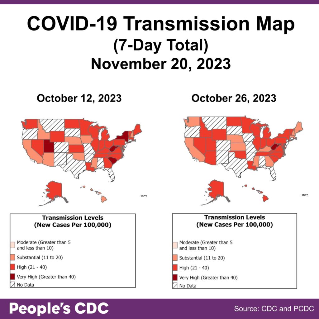
The CDC ended their national US COVID community-level transmission map in May. We created this map to document 7-day cumulative COVID rates based on laboratory-confirmed COVID cases in states that are still tracking and reporting. Obviously, this map cannot be relied upon to give accurate information about transmission risk because only a fraction of COVID cases are actually counted. Still, it provides us a visual reminder that the COVID pandemic is not over. You can read more about our map and methods here.
Wastewater
The wastewater monitoring landscape is in flux! We remind you that you should find the most local source of wastewater for you, and use that as your best source of pandemic monitoring. You might find your city or one nearby on Biobot’s website. Scroll to the bottom and click the “SHOW ALL” button.
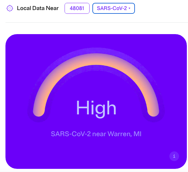
You can also check out WastewaterSCAN. You will see two boxes next to the words “Local Data Near.” Put your zip code in one, and select the Sars-CoV-2 for the second box. Then, you’ll see the company’s assessment of your risk level.
The image below is the resulting risk level for 48081, a zip code in Macomb County, Michigan.
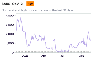
If you’re wanting a graph to compare current wastewater levels to previous periods of time, click “DASHBOARD” on the upper right hand corner of the site. A US map will come up with a search bar at the top of it. Put your zip code into the map or scroll into the nearest wastewater site manually. When you click on the purple dot representing your nearest monitoring site, you’ll see a panel on the left titled “Overview for [CITY, STATE].” On the upper right hand side of that panel, there is a purple arrow. Click it. Then you can see trends. “Last 3 months” is the default period of time, but you can change the period of time you’re looking at by clicking the down arrow and selecting a different range.
The image below shows a local graph for the wastewater site nearest that same Michigan zip code.
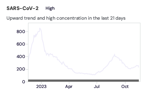
Below is the graph for national wastewater data. Your local data will likely differ from national trends, so it is best to look up the wastewater site nearest you.
Wins
We are heartened to see masks at protests throughout the country. Whether it’s #StopCopCity actions to oppose further militarization of police in this country or marches, die-ins, and disruptions to oppose occupation and genocide in Palestine, people see that we can demand and create another world together, and that we can keep each other safe while we do it.
Long COVID
A recent study has been published that is relevant for those considering taking nirmatrelvir (Paxlovid) or molnupiravir (Lagevrio) to reduce the risk of Long COVID. This study of Medicare enrollees, published in JAMA Internal Medicine, found that nirmatrelvir and molnupiravir were associated with a small reduction in the incidence of Long COVID.
On repeat infections, Nature Communications published a cohort study done in Spain and the UK comparing COVID cases, reinfections, and negative-test controls which demonstrated that reinfections had a higher risk of Long COVID. This is a big deal– it builds on the growing literature demonstrating the dangers of repeat infections, pointing again to the importance of taking this pandemic seriously and avoiding infection, as many times as we can.
Take Action
Sign NNU’s letter urging the CDC “to reject HICPAC’s weak draft and create a new one that protects health care workers and their patients!”
And check out this piece published in JAMA this week arguing that physicians, hospital administrators, and regulators have an ethical obligation to protect patients through masking.
Safer Gatherings
It’s that time of year again! Please ensure your holiday gatherings are as safe as possible by implementing as many layers of protection as you can!
![Graphic includes a gradient orange square with large, white text at the top reading “WE’RE HOLDING A SAFER IN PERSON GATHERING, HERE’S HOW:” Under the text is a list of eleven items in black text with white highlighting, each with a colored-square bullet point. The list reads [red square] MASK INDOORS FIVE DAYS PRIOR, [red square] UNIVERSAL PRE-EVENT TEST, [red square] CHECKING FOR SYMPTOMS AND EXPOSURE, [purple square] UNIVERSAL MASKING, [purple square] PROOF OF VACCINATION, [purple square] GATHERING OUTDOORS, VENTILATION & AIR QUALITY, [purple square] SMALL, [purple square] CONSISTENT GROUPS, [purple square] PROVIDE SUBSTANTIVE ONLINE OPTIONS, [peach square] UNIVERSAL POST-EVENT TESTING, [peach square] CONTACT TRACING. Below list, white text reads “EXPLORE THE FALL 2023 SAFER GATHERINGS GUIDE ON OUR SUBSTACK.”](https://bej.gbh.mybluehost.me/wp-content/uploads/2023/11/11.20.23_Safer_Gatherings-1024x1024.png)
On that note, we will not be publishing a Weather Report next week, because our team will be dedicating our time to revamping our current Safer Gathering Toolkit instead! We look forward to sharing with you soon!
Notes:
1) The numbers in this report were current as of 11/17/2023.
2) Changes in testing access as well as data reporting have led many federal data sources to become less reliable.
3) Check out the links throughout & see our website for more! https://bej.gbh.mybluehost.me