Informe meteorológico de People's CDC COVID-19

Publicado

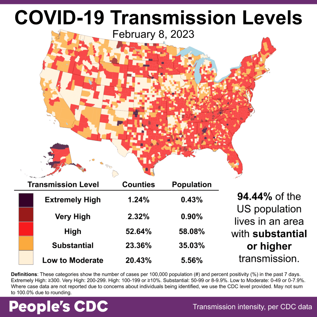
El clima: Transmission levels stay stubbornly high, with 94.44.% living in areas with substantial or higher transmission. Rates are higher generally in the South, parts of the Midwest and the East Coast, with lower levels seen in the West.

Map and table show COVID transmission levels by US county as of Feb 8, 2023 based on the number of COVID cases per 100,000 population and percent positivity in the past 7 days. Low to Moderate transmission levels are pale yellow, Substantial is orange, High is red, Very High is brown, and Extremely High is black. Eastern, southern, and parts of the Midwest are almost all red, while the northwest is pale yellow and orange. Text in the bottom right reads: 94.44 percent of the US population lives in an area with substantial or higher transmission. Transmission Level table shows 1.24 percent of counties (0.43 percent by population) as Extremely High, 2.32 percent of the counties (0.9 percent by population) as Very High, 52.64 percent of counties (58.08 percent by population) as High, 23.36 percent of counties (35.03 percent by population) as Substantial, and 20.43 percent of counties (5.56 percent by population) as Low to Moderate. The People's CDC created the graphic from CDC data.

Sobre variantes: El increase in Kraken (XBB1.5) cases continues to rise – 74.7% of cases this week, in comparison to 66.4% last week. The instances of BQ variant cases continue to decrease.

A stacked bar chart with weeks on the x-axis shows weeks from Nov 12, 2022 to Feb 11, 2023 and y-axis as percentage of viral lineages among infections. The recent 3 weeks are labeled as Nowcast projections.  XBB.1.5 (dark purple) continues to increase, making up about 74.7 percent of current week infections. BQ.1.1 (teal) has decreased in recent weeks but remains the second most prevalent lineage currently around 15.3%. BQ.1 (dark teal) is now about half as prevalent as BQ.1.1 but remains visibly labeled. BA.5 (light teal), which in October was the dominant lineage, is now down to nearly zero visibility - joined by XBB (periwinkle purple) and a handful of other colors in the week ending Feb 11, 2023.
Graphic source: CDC COVID Data Tracker: Variant Proportions

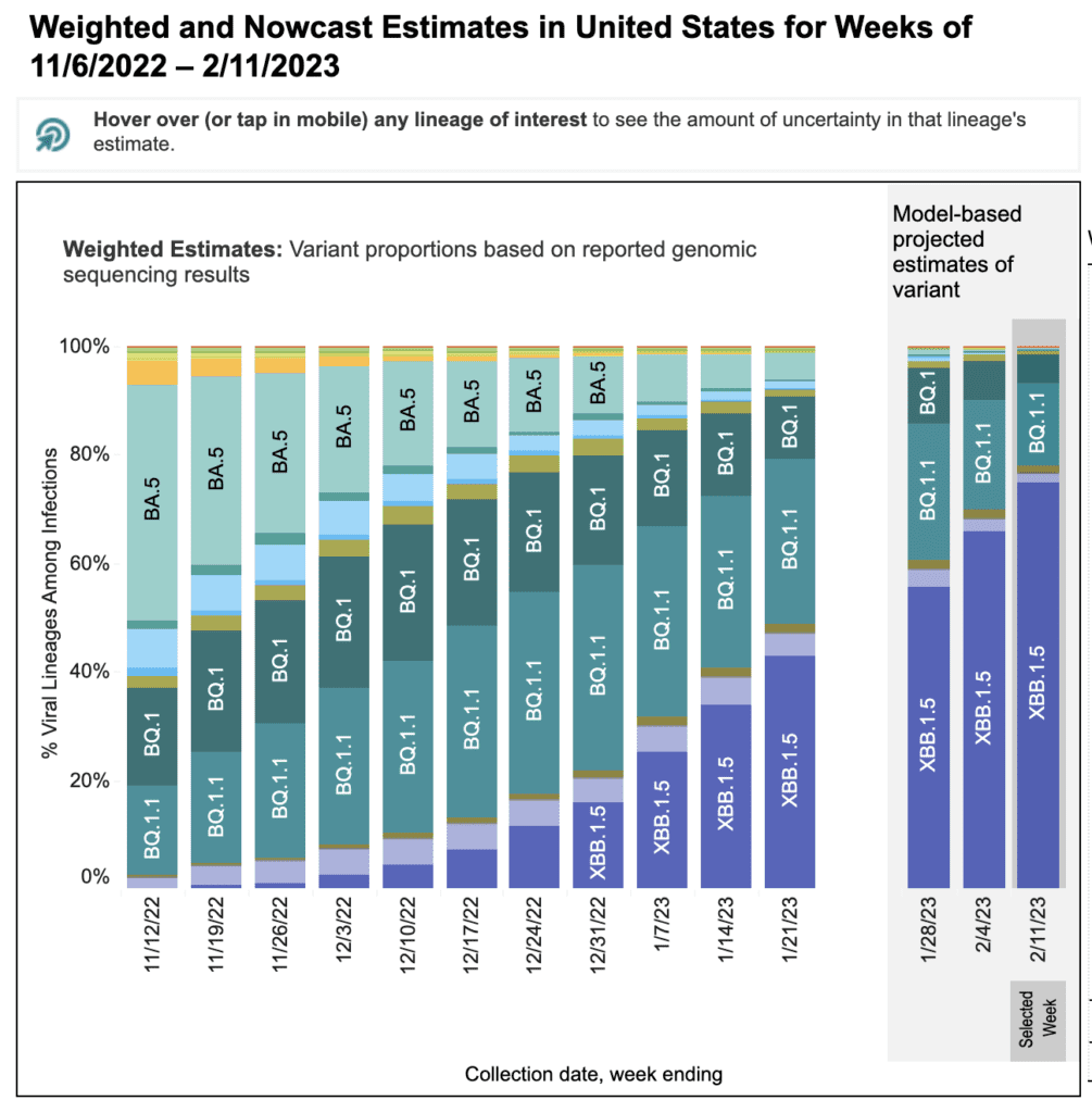
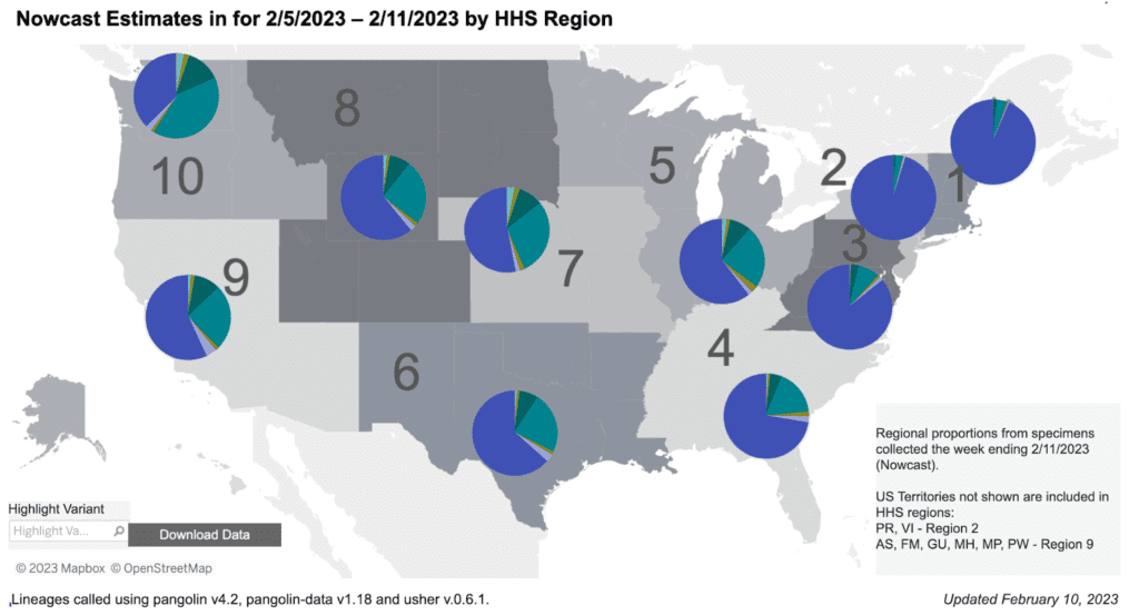
Regional differences continue. Kraken is almost the only strain in the East, and is still gaining rapidly in other regions over BQ1/1.1.

Regional difference map of the US with 10 regions each depicted as shades of gray. In general, the numbers start in the Northeast and increase as they move south and then westward. Title reads “Nowcast Estimates for 2/5/2023 to 2/11/2023 by HHS Region.” Each region has a colored pie chart showing variant proportions. Legend at bottom right reads “Regional proportions from specimens collected the week ending 2/11/2023.” XBB1.5 (dark purple) makes up about 90 percent of the pie in regions 1, 2 and 3 (Northeast & Mid-Atlantic) and ranges from about 30 to 75 percent elsewhere. BQ1.1 (teal) is about 40 percent of cases in region 10 (North-West). It shares less than 25 percent along the east coast, representing about 25 percent of infections in regions 5 through 9. BQ1 (green) represents about 5 to 15 percent of infections in Regions 4-10. Bottom text reads: “Updated February 10, 2023” and  “Lineages called using pangolin v4.2, pangolin-data v1.18 and user v.0.6.1.
Graphic source: CDC COVID Data Tracker: Variant Proportions

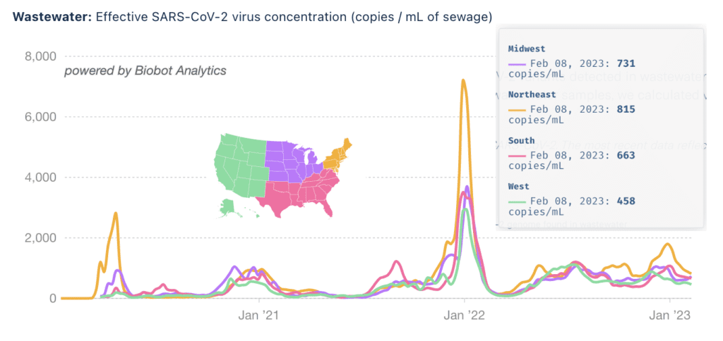
Monitoreo de aguas residuales: There are slight increases in wastewater levels in the Midwestern and Southern regions, but nationally levels continue to be leveling off. However, the numbers are all still high, showing that the risks of COVID are far from over.

Title reads “Wastewater: Effective SARS-Cov-2 virus concentration (copies/mL of sewage), powered by Biobot Analytics.” Line graph shows the levels of COVID detected in wastewater by US region, each region with a different color trend line. A legend map of the US in the center shows the West region as green, South as pink, Midwest as purple, and Northeast as orange. The y axis shows copies per mL of sewage and the x-axis shows time between late January 2020 to February 8, 2023 with January’s the last labeled on the axis. Northeast (orange) has the highest peaks in Jan 2020, Jan 2022, and Jan 2023. In the last six weeks this line has declined to meet the other lines. A legend on the right shows that for Feb 8, 2023 wastewater levels are 731 copies/mL in the Midwest, 815 copies/mL in the Northeast, 663 copies/mL in the South, and 458 copies/mL in the West.
Graphic source: Biobot Analytics

A committee from the National Academy of Sciences recommended continued funding of wastewater collection but it is not clear how the report will be used for specific funding decisions. 

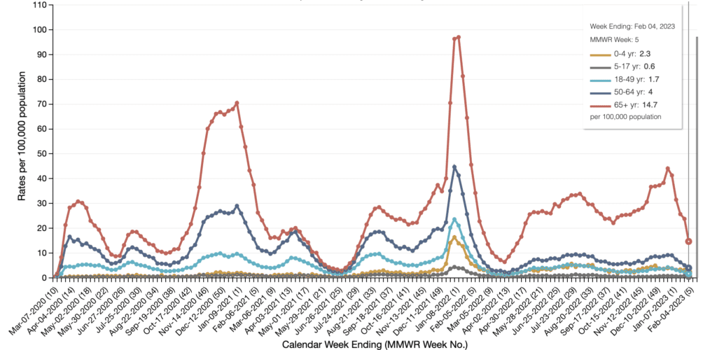
Hospitalizaciones: Hospitalizaciones for confirmed COVID cases continue to decline this week, but are still far above the lowest points seen since the beginning of the pandemic. 

 A line graph showing hospitalizations broken down by age group. The y-axis is labeled Rates per 100,000 people and range from 0 to 110. The x-axis is labeled Calendar Week Endings and in parentheses MMWR Week No, ranging from March 7, 2020 (10) to Feb 4, 2023 (5). 65+ (red) is the highest over the entire graph with peaks at 30 in spring 2020, 70 in Feb 2021, and 100 in Feb 2022. From April 2022 to Jan 2023 it ranged between 20 and 50, while under-65 were all under 10. In the last month 65+ has fallen to its current low at about 15. The next highest, 50-64 year-olds (dark blue) peaks in Jan 2021 at 30 and Feb 2022 at 45. The rate is lower for each age group until under-18 where 0-4 year olds have a higher rate than 5-17 year olds. There is a legend on the right titled “Week Ending: Feb 4, 2023, MMWR Week: 5” that shows rates per 100,000. 0-4 years is 2.3 per 100,000, 5-17 years is 0.6, 18-49 years is 1.7, 50-64 years is 4, and 65+ is 14.7.Source: CDC
Graphic Source: Laboratory-Confirmed COVID-19-Associated Hospitalizations

Fallecidos: The week of February 8, at least 3,171 people died of COVID nationally. In 2023, at least 21,378 people have already died due directly to COVID.

Researchers found that hospitalized COVID patients taking Paxlovid were 35% less likely to die than those that did not, but were unable to achieve statistical significance, as non-Paxlovid patient mortality was lower than expected.

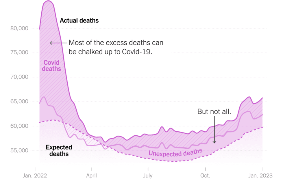
David Wallace-Wells and workers at the NY Times visualized a model-based prediction of extra deaths last year, finding that almost 50 percent more people died than would have without COVID.

Line graph showing actual deaths compared to expected deaths. Y-axis ranges from 55,000 - 85,000 deaths, the x-axis is Jan 2022 to Jan 2023. Actual deaths have a magenta line, with a peak over 85,000 in Jan 2022 and lowest in May 2022 at 56,000, rising again to 65,000 in Jan 2023. The bottom of the graph shows expected deaths, which peak in January 2022 and 2023 and dip slightly between Jul and Oct. This is indicated by a pink dotted line. The area between expected and actual deaths is shaded in dark pink. The COVID deaths section has stripes to separate them, with a solid medium pink line at the bottom. The area between these lines indicate total COVID deaths. Overall, unknown cause deaths are higher than expected deaths. Text with an arrow pointing to the Jan 2022 peak says “Most of the excess deaths can be chalked up to COVID-19.” Additional text reads “but not all” with an arrow pointing to Oct 2022 where COVID-deaths and non-COVID unexpected deaths are about equal.
Graphic Source: New York Times, 2/2/23, “Why Are So Many Americans Dying Right Now?”

Covid Largo: Un estudio found that in white, middle-aged, female individuals, so-called “healthy BMI” and sleep duration were associated with reducing long COVID risk by about 15%.

This study suffered from demographic narrowness limiting generalizability. Further research is needed to understand risk factors of Long COVID among other population groups in order to properly identify racial and ethnic disparities.

Vincent Mor makes a comparison of Long COVID with stroke recovery, where it’s known that material economic conditions make large trajectory differences; given the number of folks with long COVID, this will be yet another mechanism increasing inequality.

Treatments: Un estudio found that VV116, an oral antiviral developed in China, has fewer adverse events than Paxlovid and is otherwise equivalent, showing that exceptional societal cost to US medicine is not necessarily borne out in exceptional medications.

There is some evidence that a developing interferon injection might reduce likelihood of severe COVID outcomes, but due to small sample size and lack of high effect strength evidence is not very strong and requires further research and evaluation.

A consortium of researchers associated COVID during pregnancy with increased risk of severe complications or death, both to the pregnant individual and their child. Vaccination roughly halved the risk.

A study found that Molnupiravir increases the mutation rate of COVID, likely due to it attempting to prevent COVID RNA from replicating by mutating it, but sometimes failing and instead creating viable, mutated, virions.

Vaccines: Two (1, 2) separate studies found that the UK decision to increase time between first and second dose of mRNA vaccine from 3 to 12 weeks prevented roughly 10,000 deaths.

El CDC added COVID vaccines to its youth and adult recommendation schedules, although non-federal state or local jurisdictions determine school requirements and may not heed this recommendation.

Pronóstico: In addition to the consequences of ending the PHE reported last week – losing access to Medicaid & telehealth –  a pandemic-era boost to SNAP has already ended in 18 states, with the rest to follow at the end of February.

The government will also likely fail to prevent drug companies from raising the price of mRNA vaccines to more than $110 a dose, creating further disparate impact to those who have insurance and those who do not.

While we await the possible end of the public health emergency, Johns Hopkins University is shutting down its influential tracker. They cite, somewhat contradictingly, both redundancy with the CDC’s tracker and the increasing insufficiency of state government reporting. This makes us even more dependent on the perversely incentivized federal government.

Tome accion: Sign up to attend our The Fault in Our SARS book launch if you’re interested in the gory details of the State’s sacrificing lives on the altar of its own power via capital.

Square image with a purple background with a close up of a hand putting on a mask. White text reads “The fault in our SARS / Covid-19 in the Biden era / Book Launch / 15 February 2023 / Hosted by Edgar Rivera Colon, People’s CDC / Two online events, with author Rob Wallace and special guests. Register to Attend / Suggested donations: $10 for the Agroecology and Rural Economics Research Corps (ARERC). All are welcome to join.” Black bullet points on blue background reads “For relief of: Federal public health obligations, mask mandates, ten-day quarantines, global vaccine equity, employer complaints” and yellow text in a blue bubble reads “24 months.”

Remind folks that masking, rather than asking disabled folks to attend events remotely, is more inclusive. In your workplace consider advocating for remote work by organizing with your co-workers.

Air Purification: Consider replicating, if possible, this tale of schoolkids being the ones they were waiting for by building their own classroom air purifiers.

Improving Masks: Consider making or buying a mask brace to increase the efficacy of existing surgical masks, fashioning a mask test fit kit, or perhaps use a sampler pack to find the best fitted N95.

Access to Rapid Tests: If you live in the so-called US and have health insurance, stock-up while you can on COVID rapid antigen tests, both for yourself and others; you can get 8 free tests/person every 30 days.

Consider mapping your group of personal supporters (“pod”) with this worksheet, then sharing surplus antigen tests or other COVID-protective gear with them.

Notes: 1) The numbers in this report were current as of 2/10. The CDC updates data frequently as it receives refreshed information. Today’s numbers may be slightly different from the data here. 2) Check out the links throughout & see our website for more! https://peoplescdc.org

Compartir esto:
Traducir
Cerrar