Informe meteorológico de People's CDC COVID-19

Publicado

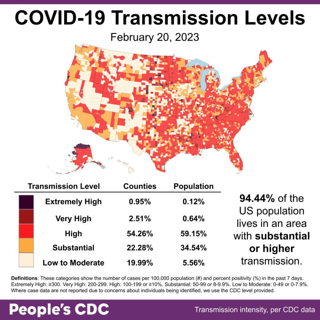
El clima: While levels remain at 94.44% of the population living in areas with substantial or higher transmission, there’s a slight increase in those living with areas of Very High transmission.

Due to incomplete data reporting from Utah, Maine, and New Mexico, cases are underreported this week. This means that likely more than 94.44% of the population are living in areas with substantial or higher transmission levels.

Map and table show COVID transmission levels by US county as of Feb 20, 2023 based on the number of COVID cases per 100,000 population and percent positivity in the past 7 days. Low to Moderate transmission levels are pale yellow, Substantial is orange, High is red, Very High is brown, and Extremely High is black. Eastern, southern, and parts of the Midwest are almost all red, while the northwest is pale yellow and orange. Text in the bottom right reads: 94.44 percent of the US population lives in an area with substantial or higher transmission. Transmission Level table shows 0.95 percent of counties (0.12 percent by population) as Extremely High, 2.51 percent of the counties (0.64 percent by population) as Very High, 54.26 percent of counties (59.15 percent by population) as High, 22.28 percent of counties (34.54 percent by population) as Substantial, and 19.99 percent of counties (5.56 percent by population) as Low to Moderate. The People's CDC created the graphic from CDC data.

Logros: Tracking only transmission or variant evolution can be bleak and collective action creates the possibility of a more equitable pandemic response. Starting this week, we will highlight “wins” – stories of people making workplaces, gatherings, & institutions safer for all.

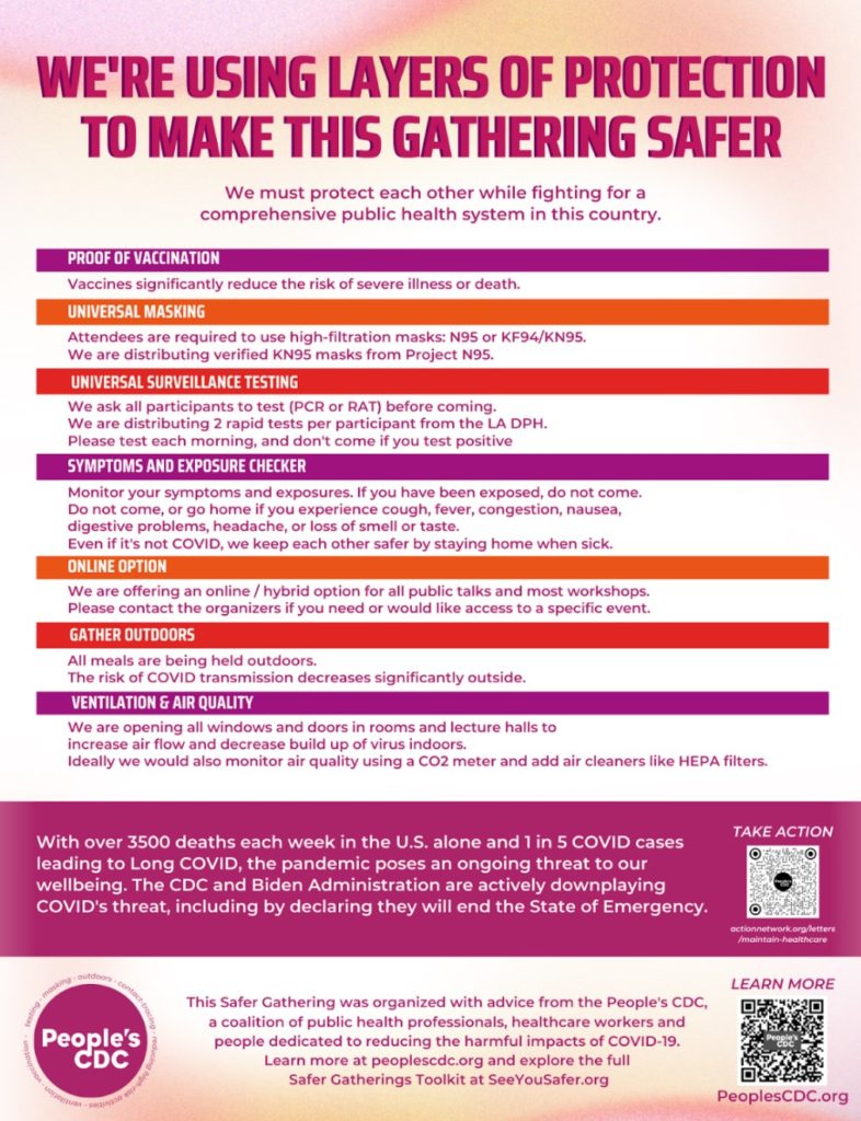
Organizers used our Safer Gatherings toolkit and @DisabledAcadem resources to convince a conference to shift their policies.

The National Students for Justice in Palestine Conference featured layers of protection including KN95 masks from @projectN95, daily rapid tests from @lapublichealth, outdoor meals, and more. We advised on their COVID protocol and created this poster for them to hang!

This poster’s title reads, “we’re using layers of protection to make this gathering safer.” In smaller text below: “We must protect each other while fighting for a comprehensive public health system in this country.” In bars of alternating purple, orange, and red, the following layers of protection serve as headings: proof of vaccination, universal masking, universal surveillance testing, online option, outdoor meals, ventilation, and air quality. Below each heading is a description of how the conference organizers have operationalized each layer. Near the bottom of the poster, white text on a maroon background reads, “with over 3500 deaths in the U.S. alone and 1 in 5 cases leading to Long COVID, the pandemic poses an ongoing threat to our wellbeing. The CDC and the Biden Administration are actively downplaying COVID’s threat, including by declaring they will end the State of Emergency.” Below that is text encouraging attendees to get more information at SeeYouSafer.org.

We look forward to learning about and sharing more wins! Our hope is that these stories will inspire and build the collective power we’ll need to shift our government’s response.

Sobre variantes: This week, Kraken (XBB.1.5) makes up 80.2% of cases, surpassing last week’s total of 74.7% of cases, which was reported in last week’s Weather Report.

A stacked bar chart with weeks on the x-axis shows weeks from Nov 13, 2022 to Feb 18, 2023 and y-axis as percentage of viral lineages among infections. The recent 3 weeks are labeled as Nowcast projections.  XBB.1.5 (dark purple) continues to increase, making up about 80.2 percent of current week infections. BQ.1.1 (teal) has decreased in recent weeks but remains the second most prevalent lineage currently around 12.1 percent. BQ.1 (dark teal) is now about half as prevalent as BQ.1.1 but remains visibly labeled. BA.5 (light teal), which in October was the dominant lineage, is now down to nearly zero visibility - joined by XBB (periwinkle purple) and a handful of other colors in the week ending Feb 18, 2023.
Graphic source: CDC COVID Data Tracker: Variant Proportions

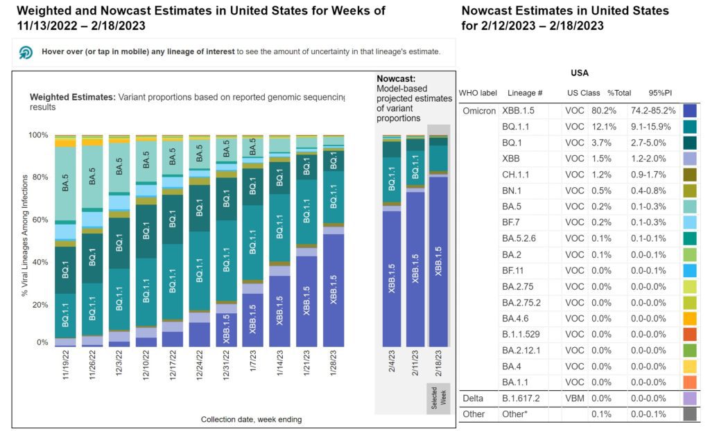
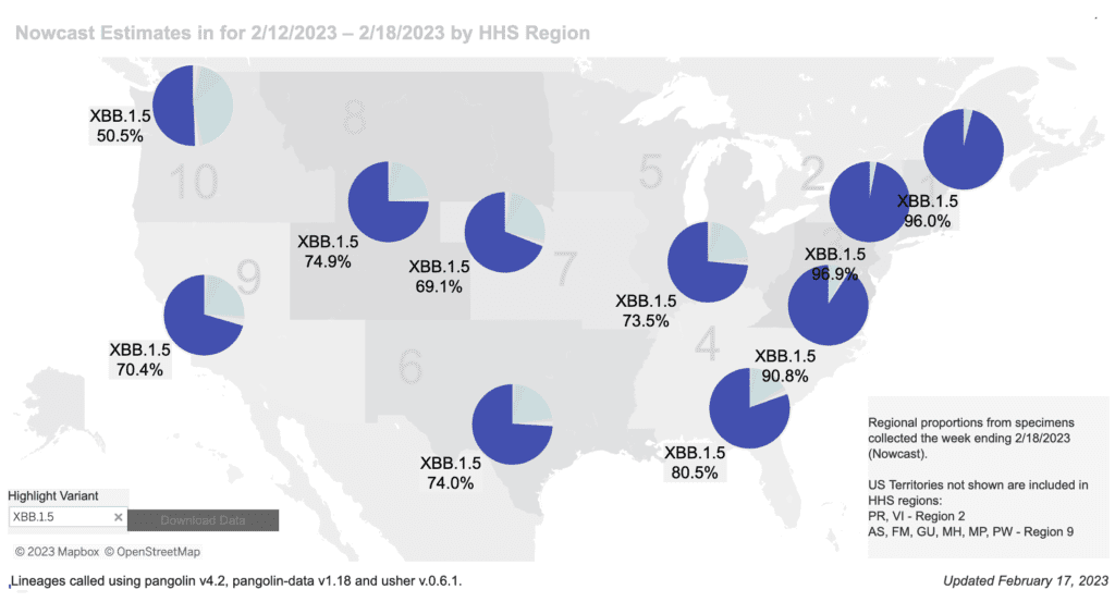
Tiempo regional differences continue, XBB.1.5 makes up more than half of cases in all regions and more than three quarters of cases in Regions 1, 2, 3, and 4. XBB.1.5’s consistently fast spread highlights the importance of maintaining COVID-19 protections.

Regional difference map of the US with 10 regions each depicted as shades of gray. In general, the numbers start in the Northeast and increase as they move south and then westward. Title reads “Nowcast Estimates for 2/12/2023 to 2/18/2023 by HHS Region.” Each region has a colored pie chart showing variant proportions. Legend at bottom right reads “Regional proportions from specimens collected the week ending 2/18/2023.” XBB1.5 (dark purple) makes up about 96 percent of the pie in regions 1 and 2, and 91% in 3 (Northeast & Mid-Atlantic). The proportion of XBB1.5 decreases moving westward, with ranges from about 50 to 80 percent across the remainder of the country. Bottom text reads: “Updated February 10, 2023” and  “Lineages called using pangolin v4.2, pangolin-data v1.18 and user v.0.6.1.”
Graphic source: CDC COVID Data Tracker: Variant Proportions

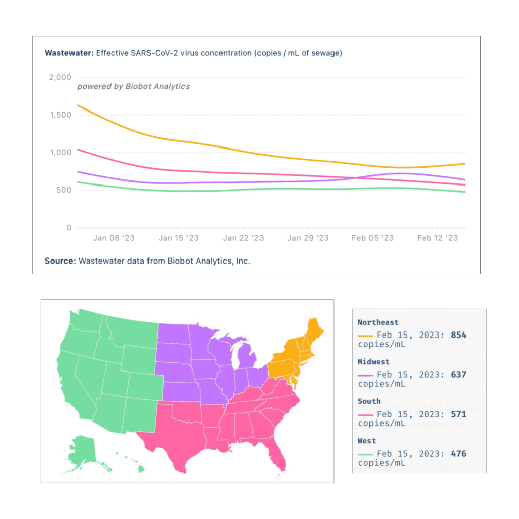
Monitoreo de aguas residuales: Although the Midwest and South saw slightly lower niveles de aguas residuales, the Northeast and West experienced an increase.

Title reads “Wastewater: Effective SARS-Cov-2 virus concentration (copies/mL of sewage), powered by Biobot Analytics.” Line graph shows the levels of COVID detected in wastewater by US region, each region with a different color trend line. The y-axis shows copies per mL of sewage and the x-axis shows time between January 4, 2023 to February 15, 2023. A legend map of the US in the center shows the West region as green, South as pink, Midwest as purple, and Northeast as orange. There is a box on the right of the map that indicates the absolute number of copies/mL per region. Northeast (orange) has the highest amount of copies/mL, decreasing from 1,634 copies on January 4 to 854 on February 15, and appears to be slightly increasing again as of that date. As of February 15, there are 637 copies/mL in the Midwest (purple), 571 copies/mL in the South (pink), and 476 copies/mL in the West (green).
Graphic source: Biobot Analytics

Hospitalizaciones: A drug aimed at curbing severe COVID has renewed hope among researchers, given the limited treatments left to beat back serious infections. But it will continue to face regulatory hurdles to make its way to patients.

A review of current COVID therapies recommends continued drug development with an emphasis on “combinatorial drug therapies that can be used prophylactically, to prevent infection and stop onward transmission.”

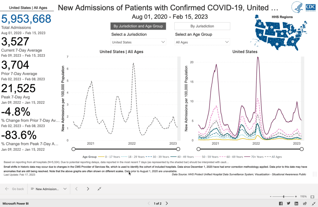
Researchers identified a protein in the lungs that may help protect against COVID. Although hospitalizaciones for confirmed COVID cases are declining, they still remain at high levels and the rates for those over 70 remain the highest.

Image of line graphs titled “New Admissions of Patients with Confirmed COVID-19” from August 1 2020 to February 15 2023. A line graph showing hospitalizations for all ages is on the left, and broken down by age group on the right. The y-axis is labeled new admissions per 100,000 people and range from 0 to 7 for all ages, and 0 to 20 by age group. The x-axis is time from August 1 2020 to February 15 2020. For all ages, the biggest peak is in January 2022, and another peak most recently occurred in early January 2023, and is currently downtrending with the most recent rate of 1.06 per 100,000 people. By age group, all ages individually peak in August and January of each year. 70+ (red) is the highest over the entire graph, followed by 65-69, and then progressively decreasing by decade, with the last 2 groups being 0-17 years and 18-29 years. In the last month, all ages are slightly decreasing. Age 70+ admissions are at about 5.5 per 100,000. The rest are under 2. Source: CDC
Graphic Source: https://covid.cdc.gov/covid-data-tracker/#new-hospital-admissions

Fallecidos: The week of February 18, at least 2,838 people died of COVID nationally. At least 1,113,245 people have died from COVID in the US.

Covid Largo: Evidence increasingly suggests that Long COVID is a neurological disease, suggesting a focus on the brain and nervous system for treatment development.

Black Americans, already facing a disproportionate burden of COVID illness and death, also face implicit bias and trouble accessing care for Long COVID

NIH studies recently showed significant racial disparities in risk of hospitalization and Long COVID, with Hispanic and Black adults more likely to experience ongoing symptoms.

A new estudio reciente found COVID Omicron infection continues to be associated with an increased risk of diabetes. That risk was higher in unvaccinated patients, suggesting a benefit of vaccination. 

Pronóstico: Moderna is the only manufacturer to announce free vaccines for the uninsured. Unfortunately this will be implemented through a patient assistance program which requires complex applications. Vaccines should be free for all, with no additional administrative burden.

The US government has agreed to buy 1.5 million more doses of Novavax and fund an updated vaccine for this fall.

Tome accion: New CDC MMWR shows that people with bivalent vaccine were 14x less likely to die than unvaccinated and 3x less likely to die than those who received the monovalent series. Tell your friends and family to get the latest booster!

Check out this brief commentary on the HHS briefing about the end of the public health emergency (PHE). 

Speak out against the end of the PHE aquí y aquí. Support masks in healthcare settings aquí.

Notes: 1) The numbers in this report were current as of 2/17. The CDC updates data frequently as it receives refreshed information. Today’s numbers may be slightly different from the data here. 2) Check out the links throughout & see our website for more! https://peoplescdc.org.

Compartir esto:
Traducir
Cerrar