Informe meteorológico de People's CDC COVID-19

Publicado

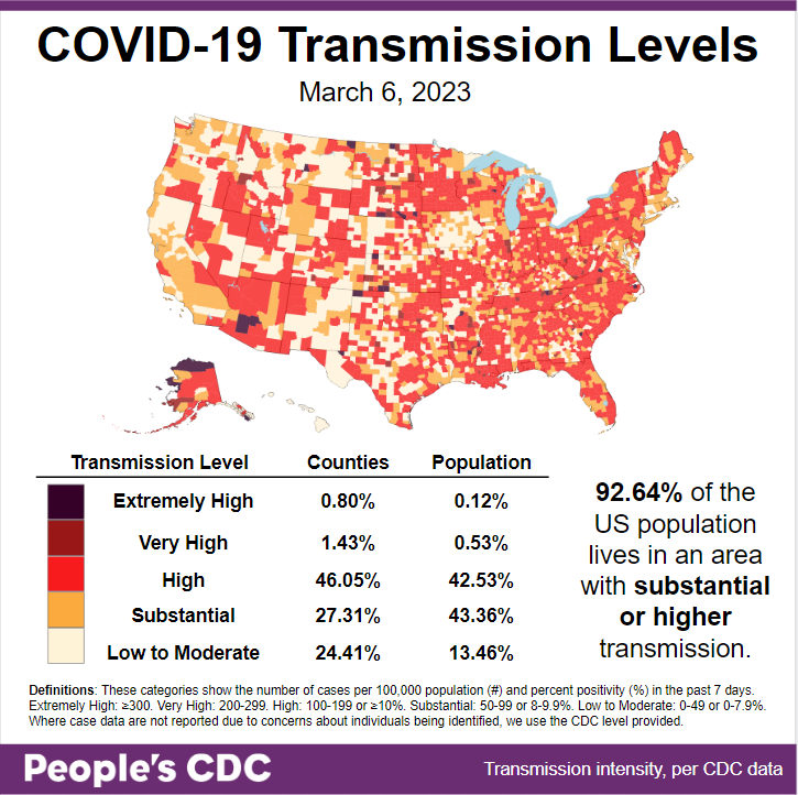
El clima: While transmission levels dropped slightly from last week, 86.54% of the population is living in areas with substantial or higher transmission.

Map and table show COVID transmission levels by US county as of Mar 6, 2023 based on the number of COVID cases per 100,000 population and percent positivity in the past 7 days. Low to Moderate levels are pale yellow, Substantial is orange, High is red, Very High is brown, and Extremely High is black. Eastern, Southern, Midwest, and parts of the Southwest are almost all red, while Northwest and California are pale yellow and orange. Text in the bottom right: 86.54 percent of the US population lives in an area with substantial or higher transmission. Transmission Level table shows 0.80 percent of counties (0.12 percent by population) as Extremely High, 1.43 percent of the counties (0.53 percent by population) as Very High, 46.05 percent of counties (42.53 percent by population) as High, 27.31 percent of counties (43.36 percent by population) as Substantial, and 24.41 percent of counties (13.46 percent by population) as Low to Moderate. The People's CDC created the graphic from CDC data.

Logros: El Illinois legislature is considering a bill that will adjust school policies to require ventilation assessments in all K-12 school settings with the addition of filters and carbon dioxide monitoring. This is one step towards adding layers of protection.

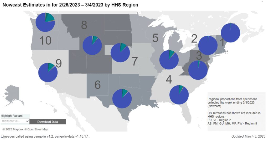
Sobre variantes: This week, Kraken (XBB.1.5) makes up 89.6% of cases, surpassing the 85% of cases reported in last week’s Weather Report.

A stacked bar chart with weeks on the x-axis shows weeks from Dec 3, 2022 to Mar 4, 2023 and y-axis as percentage of viral lineages among infections. Title of bar chart reads “Weighted and Nowcast Estimates in United States for Weeks of 11/27/2022 - 3/4/2023” and title of table reads “Nowcast Estimates in United States for 2/26/2023 0 3/4/2023.” The recent 3 weeks are labeled as Nowcast projections. XBB.1.5 (dark purple) continues to increase, making up about 89.6 percent of current week infections. BQ.1.1 (teal) continues to decrease in recent weeks but remains the second most prevalent lineage currently around 6.7 percent. BQ.1 (dark teal) is now much less prevalent than BQ.1.1 but remains visibly labeled at 1.6 percent. BA.5 (light teal), which in October was the dominant lineage, has recently gone down to nearly zero visibility - joined by XBB (periwinkle purple) and a handful of other colors. This remains the case in the week ending Mar 4, 2023.
Graphic source: CDC COVID Data Tracker: Variant Proportions

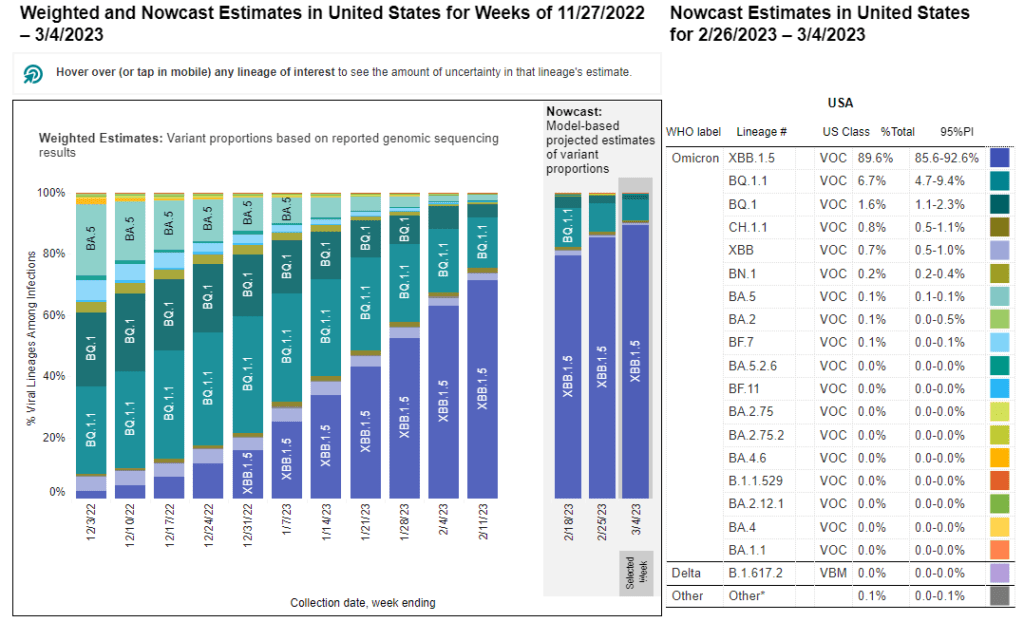
XBB.1.5 now represents more than 75 percent of all cases in each HHS region, and nearly 100% of all cases in the northeast.

Regional difference map of the US with 10 regions each depicted as shades of gray. In general, the numbers start in the Northeast and increase as they move south and then westward. Title reads “Nowcast Estimates for 2/26/2023 to 3/04/2023 by HHS Region.” Each region has a colored pie chart showing variant proportions. Legend at bottom right reads “Regional proportions from specimens collected the week ending 3/4/2023.” XBB1.5 (dark purple) makes up about 98 percent of the pie in regions 1 and 2, and 96 percent in 3 (Northeast & Mid-Atlantic). The proportion of XBB1.5 is lower moving westward, with ranges from about 77 to 91 percent across the remainder of the country. Bottom text reads: “Updated March 3, 2023” and “Lineages called using pangolin v4.2, pangolin-data v1.18.1.1.”
Graphic source: CDC COVID Data Tracker: Variant Proportions

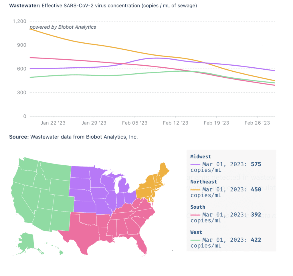
Monitoreo de aguas residuales: Wastewater levels appear to continue to slowly decrease or plateau across the country levels of COVID viral load still remain high indicating community spread.

Top title reads, “Wastewater: Effective SARS-Cov-2 virus concentration (copies/mL of sewage)” and bottom title reads, “Source: Wastewater data from Biobot Analytics, Inc.” Line graph shows the levels of COVID detected in wastewater by US region, each region with a different color trend line. The y-axis shows copies per mL of sewage and the x-axis shows time between January 18, 2023 to March 1, 2023. A legend map of the US in the center shows the West region as green, South as pink, Midwest as purple, and Northeast as orange. There is a box on the right of the map that indicates the absolute number of copies/mL per region. Northeast (orange) in Jan had the highest amount of copies/mL, decreasing from 1,105 copies on January 4 to 450 on March 1, and appears to be decreasing at a faster rate. As of March 1, Midwest (purple) now has the highest amount of copies/mL, at 575 copies/mL. Also as of this date, there are 422 copies/mL in the West (green) and 392 copies/mL in the South (pink).
Graphic source: Biobot Analytics

El CDC’s MMWR published a study analyzing wastewater from international flights that found 81% of flights contained positive samples of COVID.

As airlines lobbied to abandon protections such as pre-flight testing, limiting capacity, and mask mandates as well as cut isolation periods to 5 days for workers, this comes as little surprise.

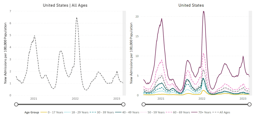
Hospitalizaciones: Hospitalizaciones for confirmed COVID cases remain high, with rates nationally remaining around 1 per 100,000 for all ages and around 5 per 100,000 for ages 70+.

Image of line graphs titled “New Admissions of Patients with Confirmed COVID-19” from August 1, 2020 to March 1, 2023. A line graph showing hospitalizations for all ages is on the left, and is broken down by age group on the right. The y-axis is labeled “New Admissions per 100,000 Population” and ranges from 0 to 7 for all ages and 0 to 20 by age group. The x-axis is time from August 1, 2020 to March 1, 2023. For all ages, the biggest peak is in January 2022, and another peak most recently occurred in early January 2023, currently at a rate of 0.96 per 100,000 people. All age groups individually peak in August and January of each year. 70+ (solid red-purple) is the highest for the whole graph, followed by 60-69 (dashed dark pink), and then progressively decreasing by decade, with the last 2 groups being 0-17 years (solid gold) and 18-29 years (dashed light cyan). In the last month, all ages are slightly decreasing. Age 70+ admissions are at about 4.7 per 100,000. The rest are under 2.
Graphic Source: https://covid.cdc.gov/covid-data-tracker/#new-hospital-admissions

Fallecidos: The week of March 1, 2023, 2,290 people have died of COVID nationally. At least 1,117,856 people have died from COVID in the US. Death data are to be considered incomplete due to processing delays indicating that the weekly counts may in fact be larger.

Covid Largo: An article in Washington Post addressed the rise in postural orthostatic tachycardia syndrome (POTS) diagnosis among survivors of COVID, which has led to dizziness, fatigue, and irregular heartbeat.

A JAMA article published this week found elevated risk of adverse health events such as heart attack and stroke as well as elevated mortality over 12-month follow up among individuals with Long COVID compared to those with no evidence of COVID. 

Pronóstico: NYPD is recommending business owners require patrons to remove their masks. It is clear that the NYPD has no interest in protecting the citizens of NYC. With over 45,000 COVID deaths, the city really needs mask and vaccine mandates, support for robust layers of protection including remote work and ventilation upgrades–NOT more policing.

California Department of Public Health shamefully updated their COVID policies to no longer require masks in health care settings and forcing workers back after 5 days of a positive COVID test, effective April 3.

We believe that workers need paid time to recover from infection of at least 10 days and masks should be mandated in all indoor settings, including health care, to prevent infection.

Tome accion: Tell the White House COVID Response Coordinator to tell the truth about Long COVID! Sign the letter here!

March 6th is National Covid Memorial day. Take action here!

Notes: 1) The numbers in this report were current as of 3/4. The CDC updates data frequently as it receives refreshed information. Today’s numbers may be slightly different from the data here. 2) Check out the links throughout & see our website for more! https://peoplescdc.org.

Compartir esto:
Traducir
Cerrar