This is the @PeoplesCDC weekly update for May 8, 2022! The People’s CDC supports people the world over who want to know how to stay safer during the COVID-19 pandemic. Our Weather Report sheds light on the COVID-19 situation in the United States.
The Current Situation – “The Weather”: The surge that started in the Northeast is now extending across the country, driven even more by the new BA.2.12 variant.
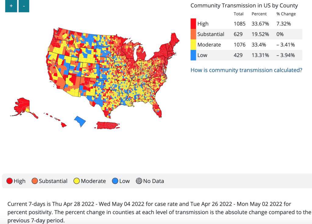
Using the CDC transmission levels (not the hospitalization-focused “Community Levels”), high case levels are now across most of the nation. Even these cases are likely underreported, as more folks use home tests.
This video shows transmission levels changing since March 15, 2022 till May 5. While there was a brief lull in March, the Northeast begins turning red in early April and by the end of April, high levels have spread across the country.
Video description: Video shows counties with high transmission (red) are sparse and mostly in coastal states starting in March 15, with most counties in the low (blue) or moderate (yellow) ranges. In late April, many more counties become substantial (orange) and high (red).
Overall, this means that over half of US residents – 57% – are living in a county with high transmission, up from 49% last week. Another 22% are living in an area of substantial transmission.
BA.1 , the original Omicron strain from the winter, has been replaced almost completely throughout the country. While BA.2 is still the most common variant, the Northeastern variant BA.2.12 is now spreading rapidly.
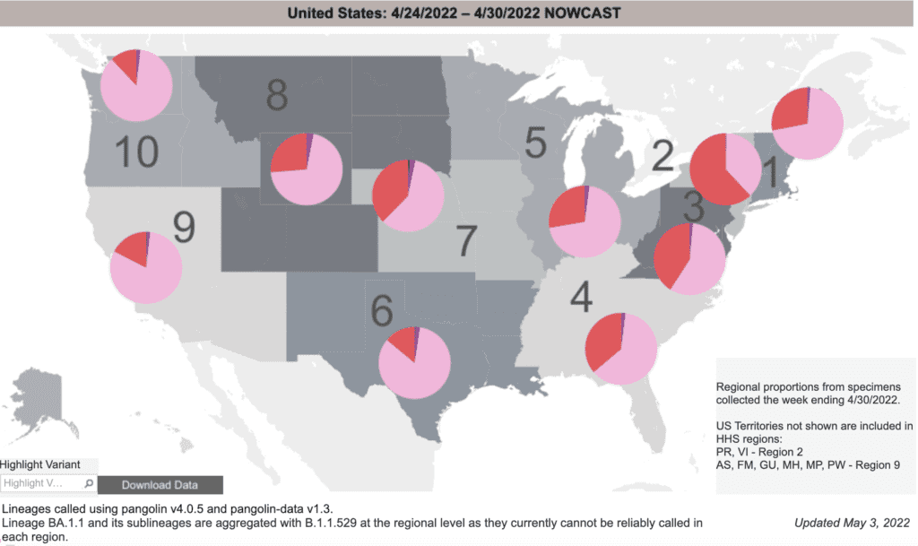
In addition, two new variants from South Africa, BA4 and BA5, have been identified in the U.S.
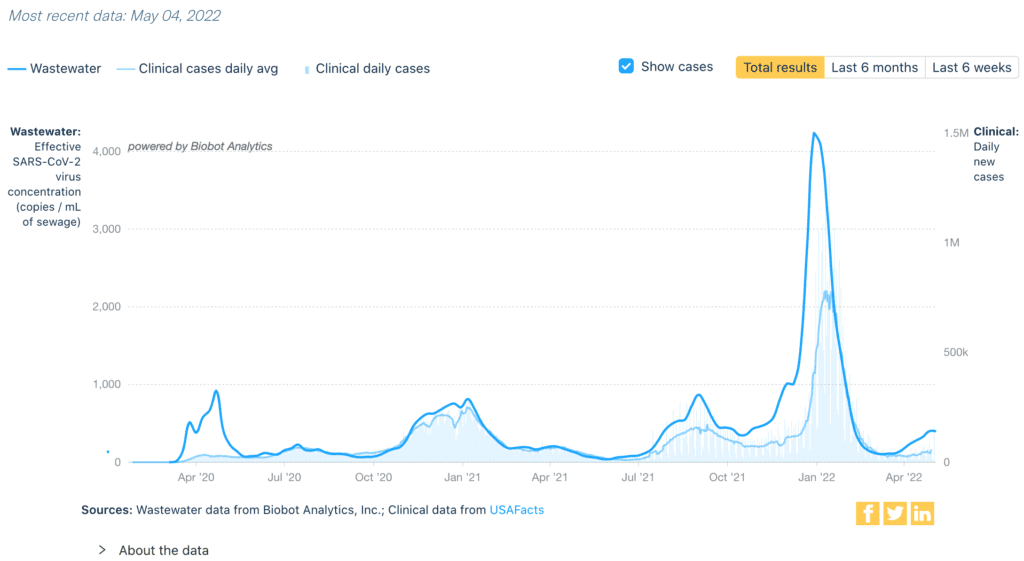
Wastewater data does not rely on testing. Nationally, rates are slowly increasing and are now at levels similar to late October 2021.
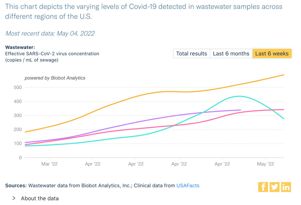
Regionally, Northeast levels (yellow/top) are highest and still rising. Midwest (purple/top middle) and South (pink/bottom) are slowly increasing. There’s an unusual downturn for the West (green/middle), which we’ll review again next week.
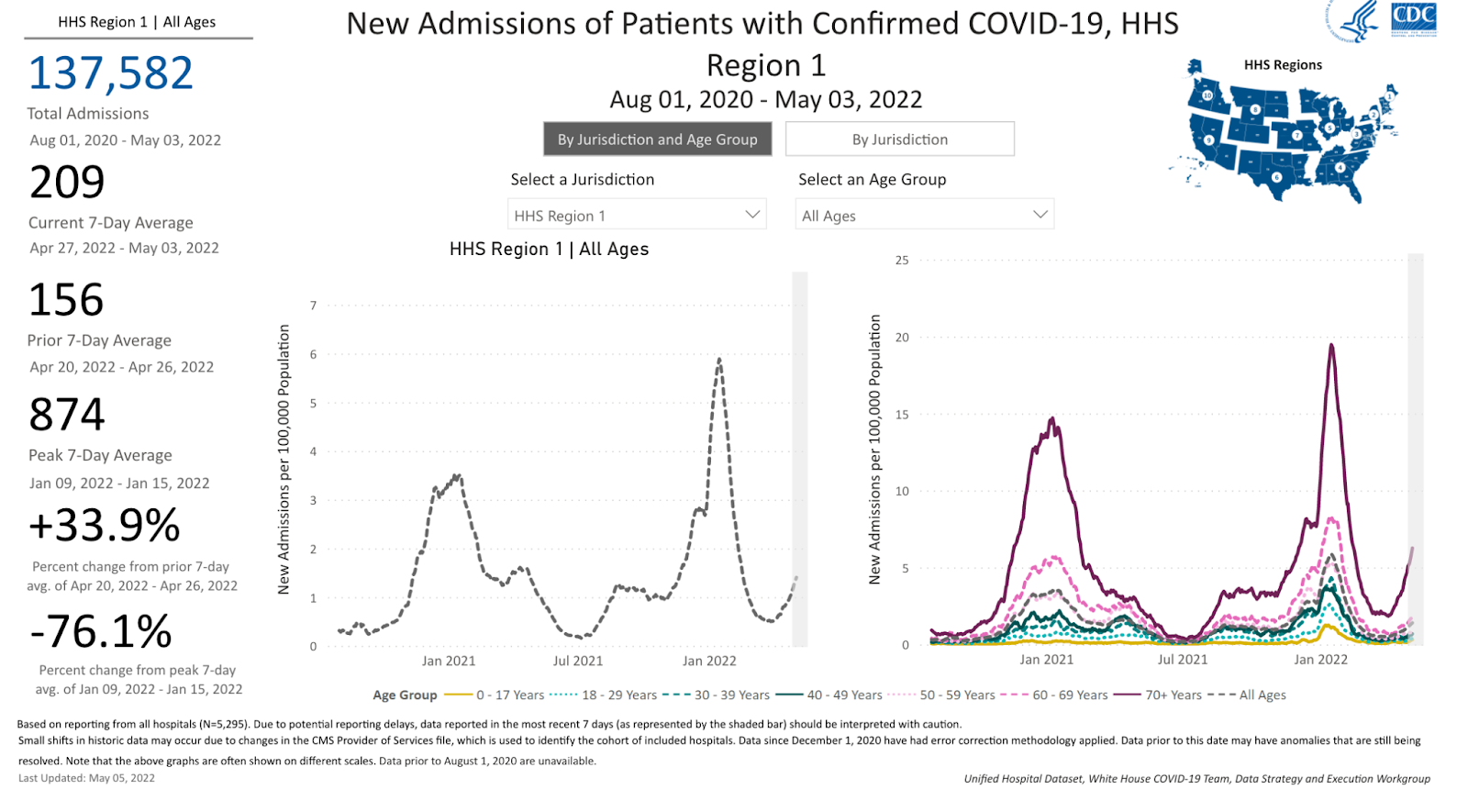
Hospitalizations are a lagging indicator that tell us who was infected 1-2 weeks ago. Hospitalizations are increasing in almost every region of the nation now. In the Northeast, hospitalizations are as high as during the Delta wave.
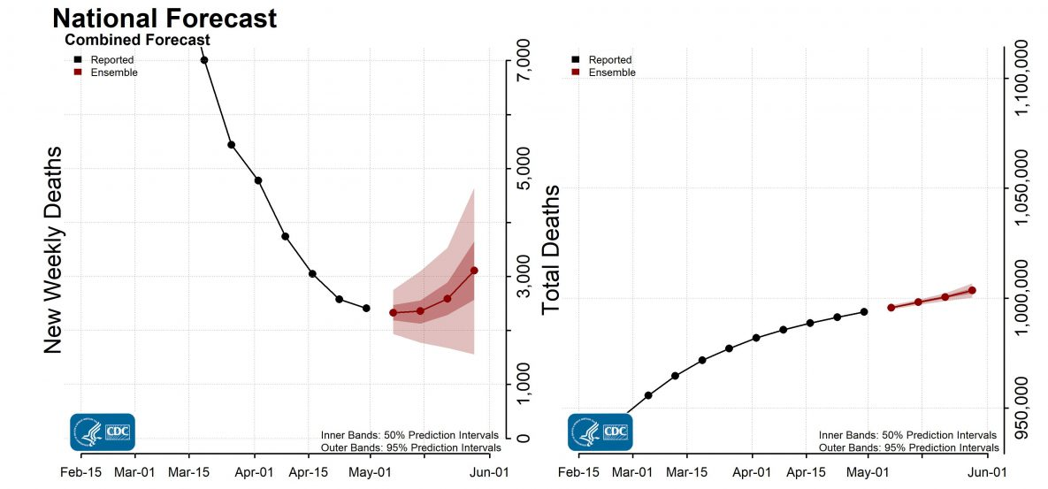
Last week, 2,342 people died of COVID-19 in the U.S. Many outlets reported that the U.S. death toll has exceeded 1 million; the CDC still reports slightly lower numbers. We emphasize that the official death toll is undercounted…
… and stand in solidarity with all those affected and in solemn reflection and remembrance of all we have lost.
Be prepared, whatever the weather: Vaccination rates remain virtually unchanged, < 46% of the population boosted. Additional boosters are available to everyone over 50 and any immunosuppressed individuals over 12.
Up-to-date vaccinations with boosters provide great protection against severe illness and death. They also reduce but don’t completely stop infections and transmission- so we need to use multiple layers of protection for everyone.
A new study on COVID in schools during spring 2021 found that although in-person schooling was associated with increased risks of COVID-19 cases in the household, cases were reduced or eliminated when layered protections were used.
Vaccination (not shown here) was very important; other layers to reduce cases were teacher & student masking, limiting school entry & daily symptom screens. Note: smaller Odds Ratio means less chance of COVID, which they measured in 3 ways.
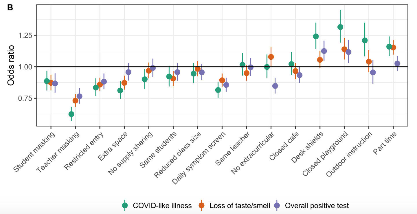
Notably, this study did not evaluate ventilation or air filtration impacts, which we would expect also to have a profound impact. Check out https://cleanaircrew.org/schools/
Forecast: As we mentioned last week, we expect deaths to start increasing following the increase in hospitalizations. Even the CDC forecasts 5000 deaths in the next 2 weeks, with a plan to… do absolutely nothing about it. This fight is not yet over.
On Long Covid: We are learning more about Long Covid every day. Patients report experiencing a range of symptoms, sometimes completely different from when first infected. Sometimes Long Covid lasts a few weeks or months, other times it lasts over a year.
New data out of the UK shows “among triple-vaccinated adults, the prevalence of Long Covid was 8.5% for Delta and 8.0% for Omicron BA.1.” Meaning 1 in 12 triple-vaxed patients that get Covid will develop Long Covid. h/t @loscharlos
Some people have been experiencing Long Covid since March 2020. Despite other viruses being known to cause chronic illness, Long Covid patients often struggle with being taken seriously by their provider.
If you or someone you know is experiencing Long Covid and would like to contribute to our collective understanding of the condition or would like to join a support group, you can visit the Patient-Lead Research Collaborative on Long Covid.
Tiny Tip: Whenever possible, open the windows! Improving ventilation can help reduce transmission.