
Week of 5/23/2022
The Current Situation – “The Weather”:
The latest COVID wave continues to flood the nation, with almost half of new cases caused by the BA2.12 variant.
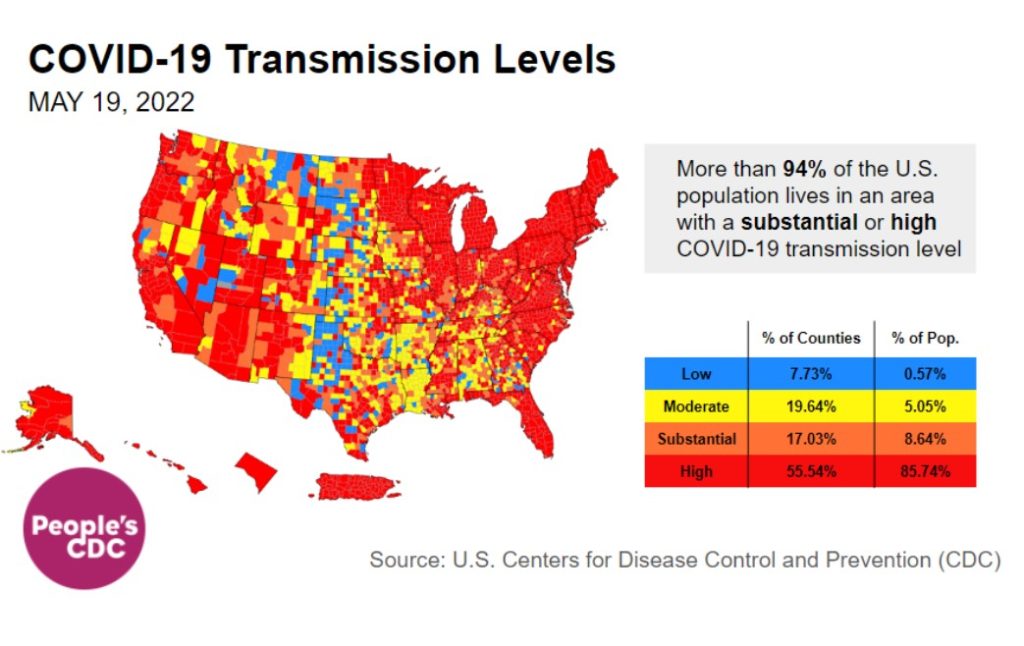
About three-quarters of US counties have high or substantial transmission. Even the CDC’s “community level” maps, which indicate hospital capacity, are beginning to turn red in Puerto Rico, much of the Northeast, and parts of the Midwest and Hawaii.
https://www.youtube.com/watch?v=VJvB1uTL_9Q
This video shows the evolution of 2022 transmission levels from March 18th – May 19th. While there was a brief lull in March, the Northeast begins turning red in early April and by the end of April, high levels have spread across the country. Now, most of the country is red.
Overall, this means almost 86 percent of US residents are living in a county with high transmission, up from 72 percent last week. Another 9 percent are living in an area of substantial transmission–together, 94 percent of US residents are now at increased risk.
On Variants:
In 2022, we’ve had 3 successive subvariants of Omicron wash over the country. BA2.12, first identified in the Northeast, is rapidly becoming the most common strain – now at 48 percent.
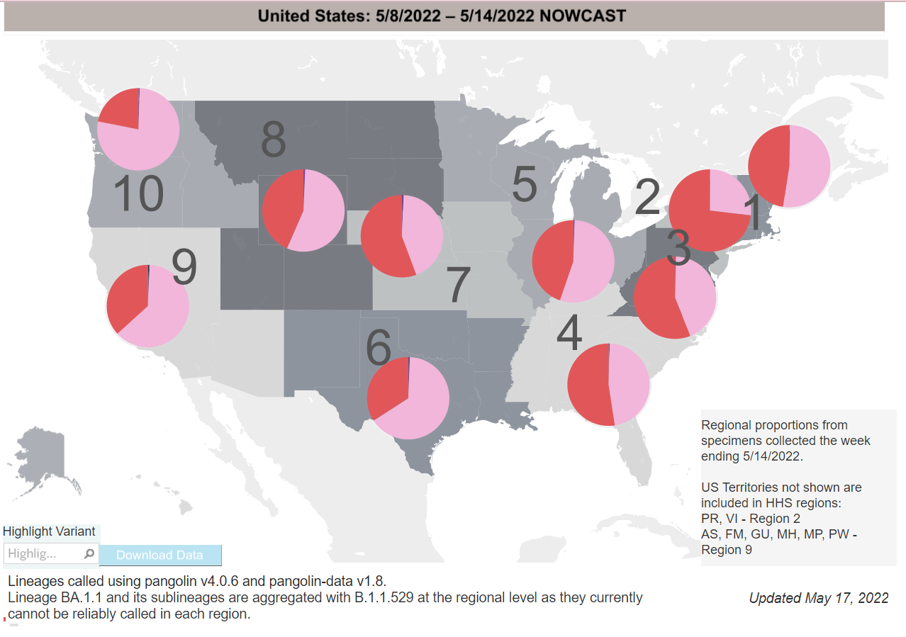
More subvariants, BA.4 and BA.5, were discovered by South African scientists earlier this year and have now become variants of concern in the EU. BA.5 is projected to overtake other variants in Portugal by the end of May.
These subvariants are already variants of concern in the US and it is not yet clear when these variants may overtake BA.2.12 in this country.
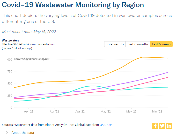
Wastewater Monitoring:
Wastewater data does not rely on testing or reporting. Nationally, rates are clearly rising, with levels that are now about the same as they were in the middle of November 2021.
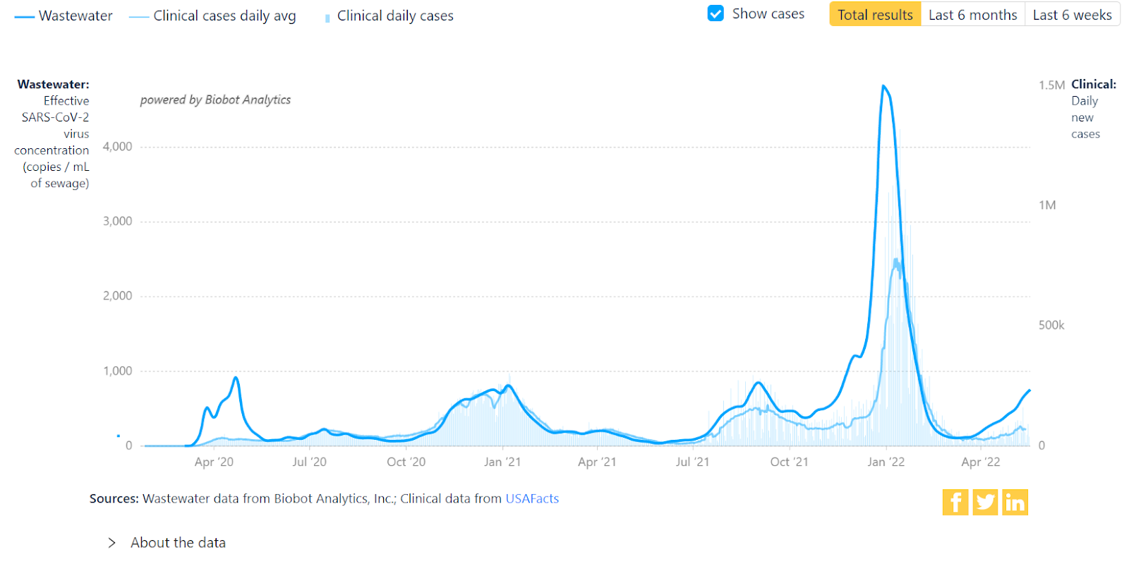
Most regions are rising, except the Northeast (highest numbers, in yellow) which may be stabilizing, followed by Midwest (purple) next, then South (pink). After an odd bump at the end of April, the West (aqua) is continuing to rise as well.
Hospitalizations:
For the fourth week in a row, hospitalizations continue to increase nationally. In the Northeast, Puerto Rico, and the Virgin Islands, they already surpass peak hospitalizations from the Delta wave. Other regions may soon reach similar levels.
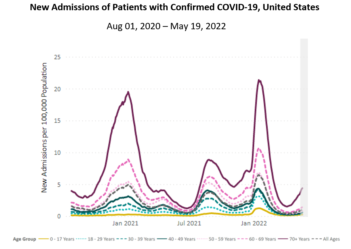
Note: Data reported in the most recent 7 days (gray bar) should be interpreted with caution due to reporting delays.
Source: Unified Hospital Dataset, White House COVID-19 Team, Data Strategy and Execution Workgroup.
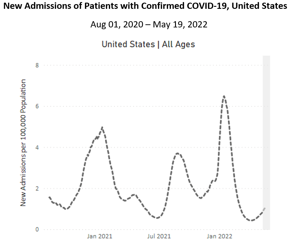
Note: Data reported in the most recent 7 days (gray bar) should be interpreted with caution due to reporting delays.
Source: Unified Hospital Dataset, White House COVID-19 Team, Data Strategy and Execution Workgroup.
Nationally, hospitalizations are up for all age groups, without exception. Those ages 70+ are experiencing the sharpest rise. Hospitalizations for this group in the Northeast have already surpassed the highest point of the Delta wave. A few other regions are not far behind.
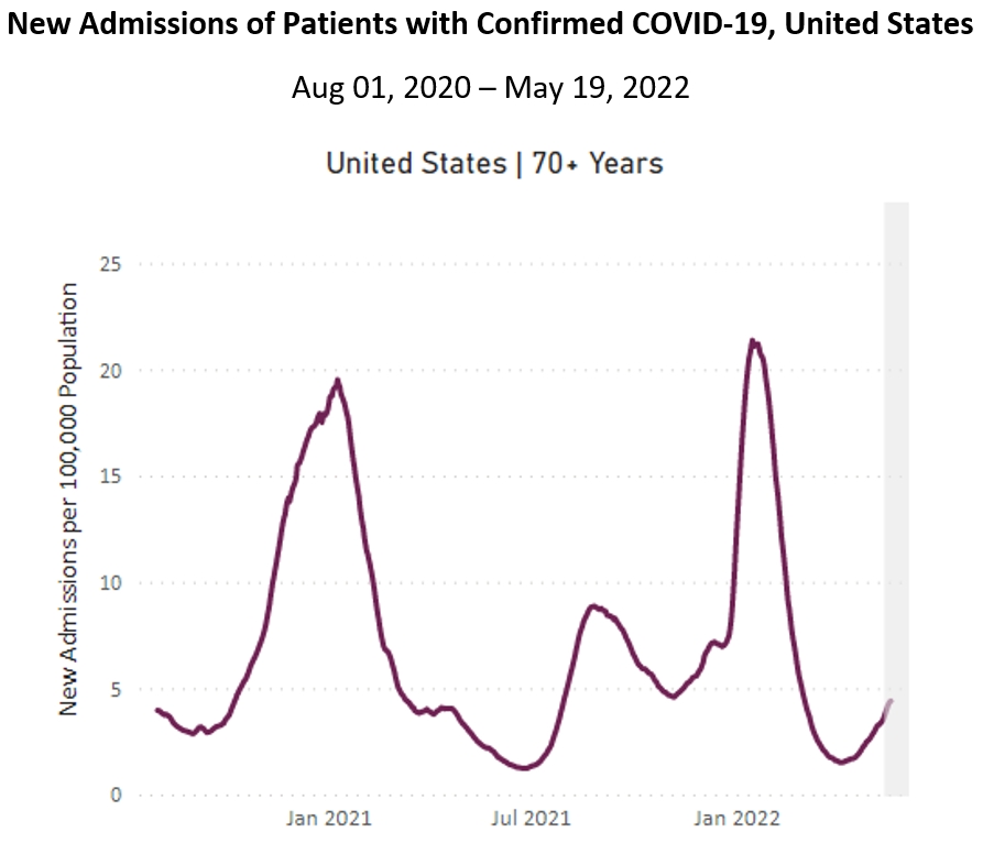
Note: Data reported in the most recent 7 days (gray bar) should be interpreted with caution due to reporting delays.
Source: Unified Hospital Dataset, White House COVID-19 Team, Data Strategy and Execution Workgroup.
Deaths:
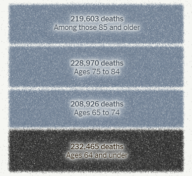
Two weeks ago, the People’s CDC recognized that the US death toll had exceeded 1 million by many accounts. A few days later, the New York Times marked the grim milestone. The CDC continues to report slightly lower numbers, about 1,000 shy of 1 million.
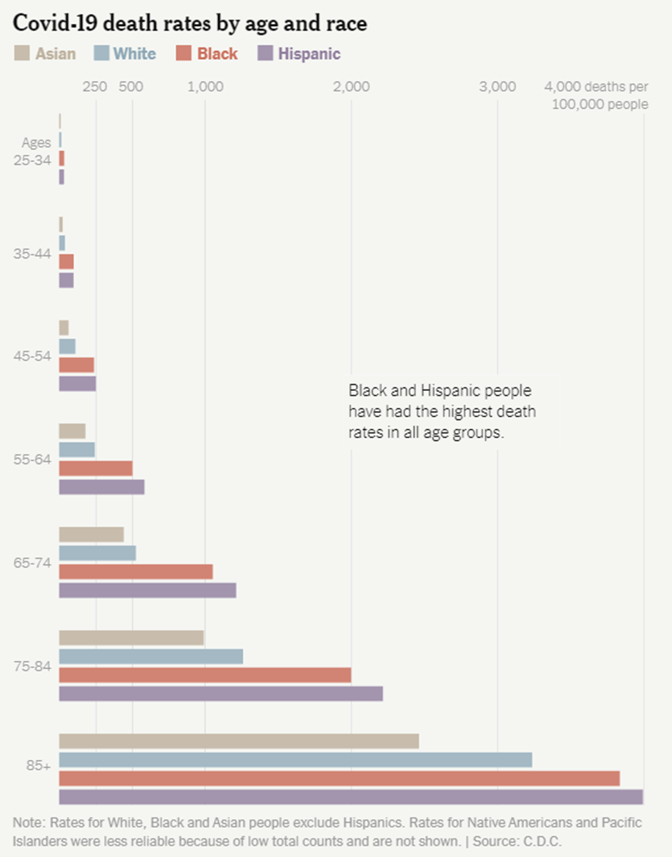
Older US residents ages 65+ contributed to three-quarters of the staggering death toll.
Source: The New York Times
Contrasted with Asian & white groups, Black & Latinx people had the highest death rates of each age group. Indigenous & Pacific Islander communities likely suffered the highest death rates of all groups, though often not well-represented in national figures due to low numbers.
Collective traumatic stress from COVID is common, but for older, disabled, poor & working class, and racially marginalized people, the trauma and impact of the pandemic are compounded. COVID is more than a natural disaster: it is also a political, economic, and social one.
In the past week, from May 13th to 19th, 1,953 people died of COVID nationally. COVID deaths remain well above even the worst of flu seasons pre-COVID; it is the third leading cause of death in the US.
Be Prepared, Whatever the Weather:
Mask whenever you are indoors with people outside of your household or in crowded outdoor spaces, preferably with a more effective mask, like a KN95 or N95 if possible. Increase ventilation indoors by opening windows and/or using a HEPA filter (or creating your own filter).
Vaccination & boosters are important layers of protection. The FDA recently authorized booster shots for children ages 5 to 11, which the CDC greenlit. However, we still need vaccines for children under 5 and more importantly, updated vaccines that match these variants.
For those who test positive for COVID and have access to a healthcare provider, COVID treatments are available. The People’s CDC stands in solidarity and rage with those who do not have access to healthcare.
We want to amplify the work of people and organizations fighting for universal healthcare and alternative models of care including @HCNow, @PNHP, and @abdulelsayed.
Forecast:
Mask mandates may return, as they have in Philadelphia schools. There has also been resistance and denial in responding to the CDC alert levels, like in NYC, despite guidance that a high alert level should trigger indoor masking.
As we continue to say, we need layers of protection to face this pandemic; otherwise cases, hospitalizations, and deaths will continue to skyrocket.
On the horizon: The FDA approved an at-home test that can detect multiple respiratory viruses: COVID, flu, & RSV. However, patients have to mail in their specimens, which is less convenient than the now widely-available at-home COVID antigen tests.
On Long COVID:
Long COVID is likely to be associated with the reactivation of dormant viruses already inside one’s body. That is, a virus that is normally well-contained by the body is essentially “woken up” and begins causing symptoms. One such virus is the Epstein-Barr virus (EBV), which is the virus that causes mono. About 90 percent of adults in the US have EBV living quietly in their bodies. Reactivation of EBV should be rare and even then, experiencing symptoms with this reactivation is supposed to be even rarer. However, Long COVID is showing us that this may not be the case any longer, and this reactivation can be quite debilitating.
Krista Coombs, who has been living with Long COVID since March 2020, describes what it’s like now experiencing reactivated EBV:
“I have reactivated EBV and [Cytomegalovirus] which cause many symptoms. I have had vision problems since the beginning of getting sick and everything is constantly blurry, whether it’s near or far. It has been really concerning to me. I also have had numerous headaches unlike any I have experienced before.”
Despite what the CDC and government officials say, it’s clear that COVID is often not mild. While it is not certain if SARS-CoV-2 (the virus that causes COVID) is directly causing this reactivation, it’s another piece in the complex puzzle of Long COVID that research must investigate so patients can begin to understand what is happening to them and receive the treatment they require.
Tiny Tip: Residential households in the US may now order an additional 8 free rapid antigen COVID test kits via the USPS website.
Sources (in order):
- https://COVID.cdc.gov/COVID-data-tracker/#variant-proportions
- https://COVID.cdc.gov/COVID-data-tracker/#county-view?list_select_state=all_states&list_select_county=all_counties&data-type=CommunityTransmission&null=Risk
- https://www.youtube.com/watch?v=VJvB1uTL_9Q
- https://COVID.cdc.gov/COVID-data-tracker/#variant-proportions
- https://www.nature.com/articles/d41586-022-01240-x
- https://www.cidrap.umn.edu/news-perspective/2022/05/ecdc-ups-ba4-ba5-variants-concern-warns-case-rises
- https://www.cdc.gov/coronavirus/2019-ncov/variants/variant-classifications.html
- https://www.latimes.com/california/story/2022-05-03/ba-4-ba-5-coronvirus-variants-reinfecting-omicron-survivors
- https://biobot.io/data/
- https://covid.cdc.gov/covid-data-tracker/#new-hospital-admissions
- https://bej.gbh.mybluehost.me/2022/05/09/peoples-cdc-covid-19-weather-report-4/
- https://www.nytimes.com/interactive/2022/05/13/us/covid-deaths-us-one-million.html
- https://covid.cdc.gov/covid-data-tracker/#trends_dailydeaths
- https://spia.princeton.edu/news/native-american-deaths-covid-19-highest-among-racial-groups
- https://ajph.aphapublications.org/doi/10.2105/AJPH.2021.306370
- https://med.stanford.edu/psychiatry/about/covid19/stress.html
- https://www.theatlantic.com/health/archive/2022/03/covid-us-death-rate/626972/
- https://yourlocalepidemiologist.substack.com/p/are-we-in-a-public-health-emergency?s=r
- https://www.medicalnewstoday.com/articles/best-face-masks-covid#what-are-they
- https://bej.gbh.mybluehost.me/2022/05/16/peoples-cdc-covid-19-weather-report-5/
- https://thehill.com/policy/healthcare/3491033-fda-authorizes-booster-for-children-aged-5-11/
- https://www.cdc.gov/media/releases/2022/s0519-covid-booster-acip.html
- https://twitter.com/trvrb/status/1472971351581290498?s=20&t=u0BckzSx7H53qTbZCB_PuA
- https://www.theatlantic.com/health/archive/2022/05/covid-vaccine-recipe-omicron-protection/629846/
- https://bej.gbh.mybluehost.me/2022/02/22/urgency-of-equity-toolkit/
- https://khn.org/morning-breakout/fda-oks-at-home-combined-test-for-covid-flu-and-rsv/
- https://combatcovid.hhs.gov/possible-treatment-options-covid-19
- https://twitter.com/hcnow
- https://twitter.com/PNHP
- https://twitter.com/abdulelsayed
- https://www.phillyvoice.com/philly-schools-mask-mandate-covid-19/
- https://www.cnn.com/2022/05/18/us/new-york-city-no-mask-mandate-high-COVID-alert-status/index.html
- https://www.nbcnewyork.com/news/coronavirus/nyc-enters-high-covid-alert-level-as-hospitalization-rate-tops-key-benchmark/3692127/
- https://www.cell.com/cell/fulltext/S0092-8674(22)00072-1
- https://www.nejm.org/doi/full/10.1056/NEJM200008173430707
- https://www.verywellhealth.com/long-covid-latent-viral-reactivations-5205269
- https://special.usps.com/testkits