
Semana del 23/05/2022
La Situación Actual – “El Clima”:
La última ola de COVID continúa inundando la nación, con casi la mitad de los nuevos casos causado por la variante BA2.12.
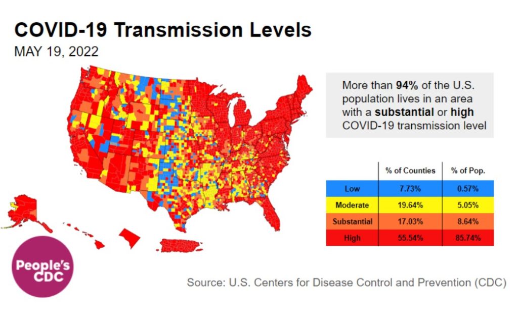
Sobre tres cuartas partes de los condados de EE. UU. tienen transmisión alta o sustancial. Incluso los mapas de “nivel comunitario” de los CDC, que indican la capacidad hospitalaria, están comenzando a ponerse rojos en Puerto Rico, gran parte del noreste y partes del medio oeste y Hawái.
https://www.youtube.com/watch?v=VJvB1uTL_9Q
Este video muestra la evolución de los niveles de transmisión de 2022 del 18 de marzo al 19 de mayo. Si bien hubo una breve pausa en marzo, el noreste comienza a ponerse rojo a principios de abril y, a fines de abril, los niveles altos se han extendido por todo el país. Ahora, la mayor parte del país es rojo.
En general, esto significa que casi el 86 por ciento de los residentes de EE. UU. viven en un condado con alta transmisión, frente al 72 por ciento de la semana pasada. Otro 9 por ciento vive en un área de transmisión sustancial; en conjunto, el 94 por ciento de los residentes de EE. UU. corren ahora un mayor riesgo.
Sobre variantes:
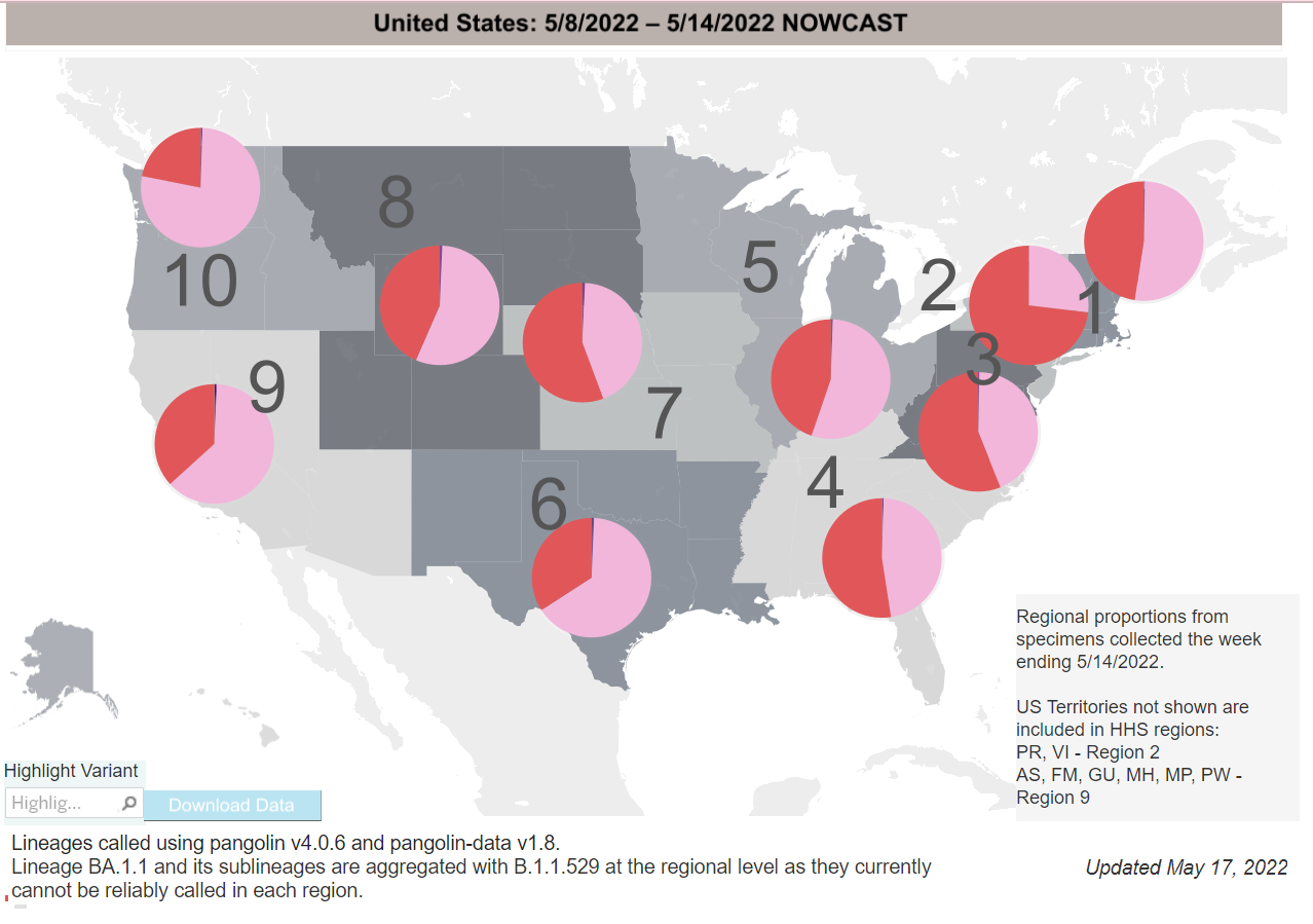
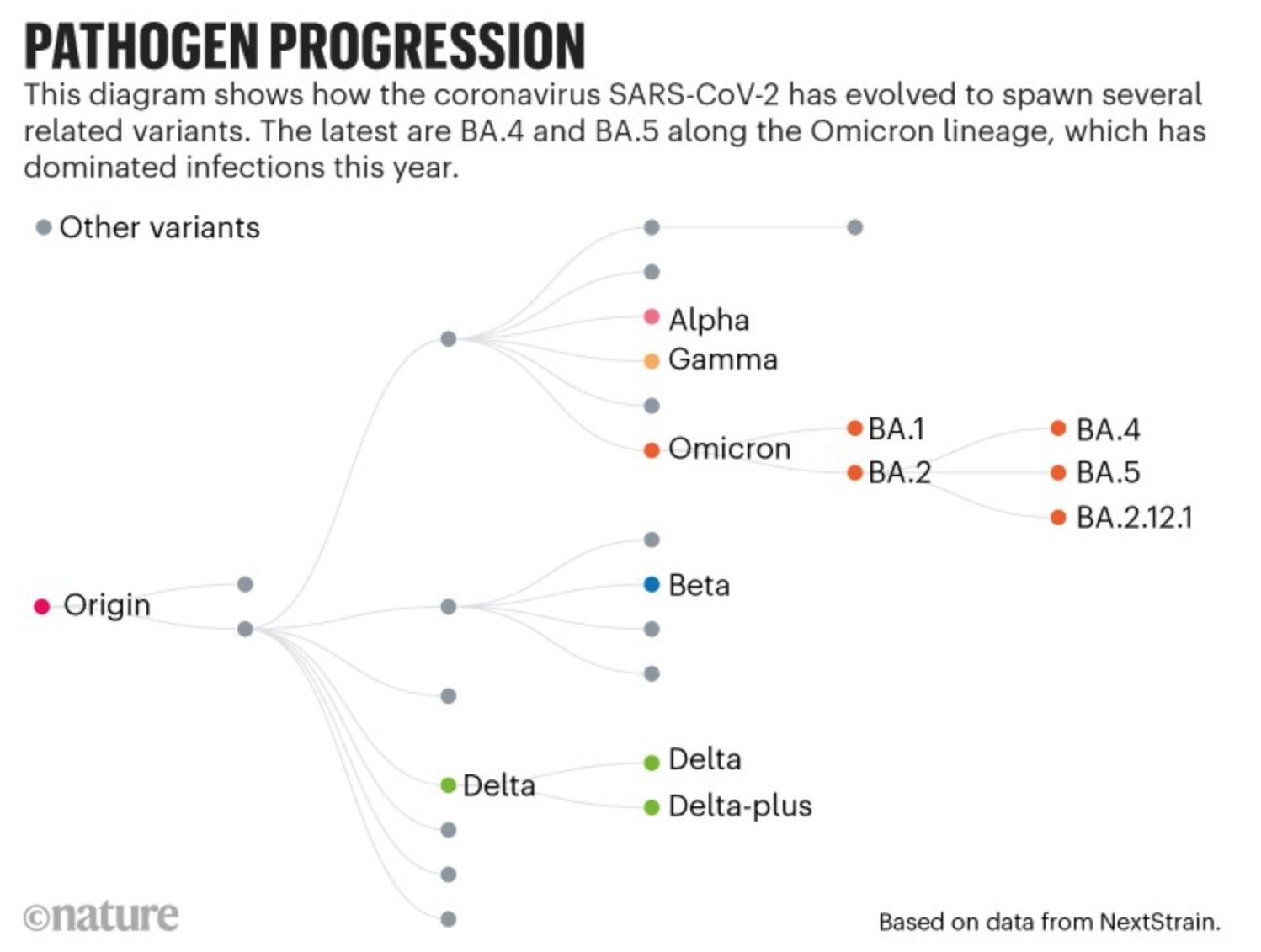
En 2022, hemos tenido 3 subvariantes sucesivas de Omicron inundando el país. BA2.12, identificado por primera vez en el noreste, se está convirtiendo rápidamente en la cepa más común, ahora con un 48 %.
Más subvariantes, BA.4 y BA.5, fueron descubierto por científicos sudafricanos a principios de este año y ahora se han convertido variantes de preocupación en la UE. Se prevé que BA.5 supere a otras variantes en Portugal a finales de mayo.
Estas subvariantes ya están variantes de preocupación en los EE. UU. y aún no está claro cuando estas variantes pueden superar BA.2.12 en este país.
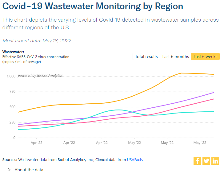
Monitoreo de aguas residuales:
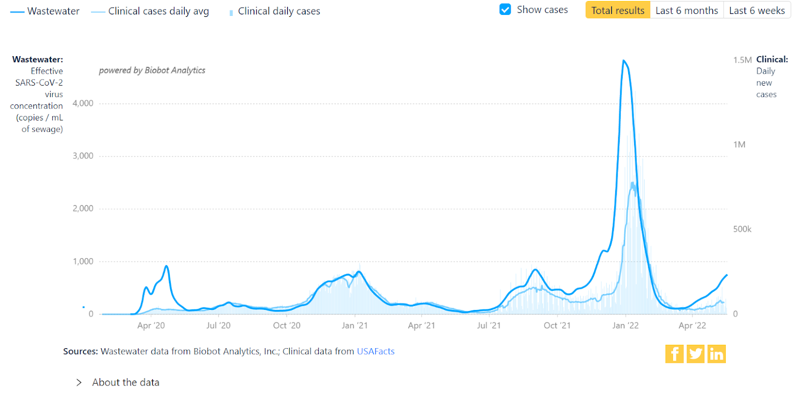
Datos de aguas residuales no se basa en pruebas o informes. A nivel nacional, las tasas están aumentando claramente, con niveles que ahora son más o menos los mismos que a mediados de noviembre de 2021.
La mayoría de las regiones están aumentando, excepto el noreste (números más altos, en amarillo) que puede estar estabilizándose, seguido por el medio oeste (púrpura) a continuación, luego el sur (rosa). Después de un extraño golpe a fines de abril, el Oeste (aguamarina) también continúa aumentando.
Hospitalizaciones:
Por cuarta semana consecutiva, hhospitalizaciones seguir aumentando a nivel nacional. En el noreste, Puerto Rico y las Islas Vírgenes, ya superan el pico de hospitalizaciones por la ola Delta. Es posible que otras regiones alcancen pronto niveles similares.
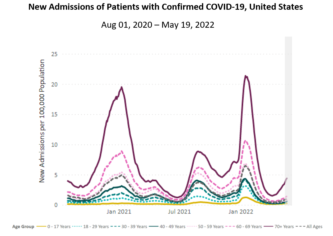
Nota: Los datos informados en los últimos 7 días (barra gris) deben interpretarse con precaución debido a los retrasos en la notificación.
Fuente: Conjunto de datos hospitalarios unificados, Equipo COVID-19 de la Casa Blanca, Grupo de trabajo de ejecución y estrategia de datos.
Nota: Los datos informados en los últimos 7 días (barra gris) deben interpretarse con precaución debido a los retrasos en la notificación.
Fuente: Conjunto de datos hospitalarios unificados, Equipo COVID-19 de la Casa Blanca, Grupo de trabajo de ejecución y estrategia de datos.
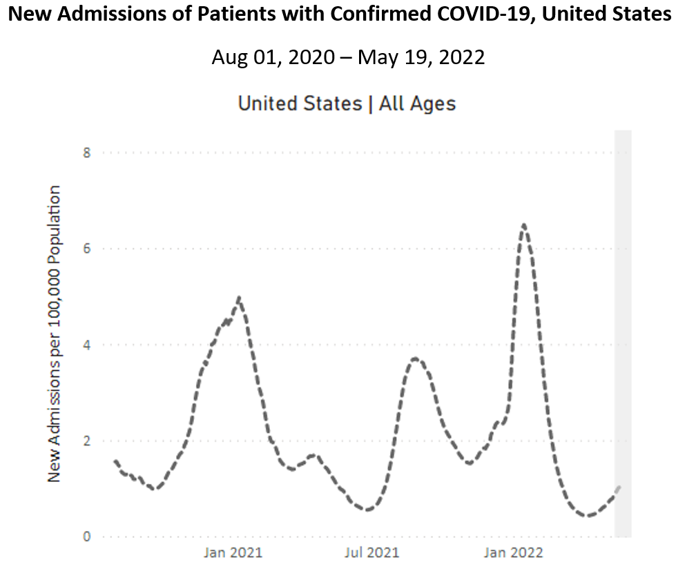
A nivel nacional, hhospitalizaciones están disponibles para todos los grupos de edad, sin excepción. Los mayores de 70 años están experimentando el aumento más pronunciado. Las hospitalizaciones de este grupo en el Nordeste ya superaron el punto más alto de la ola Delta. Algunas otras regiones no se quedan atrás.
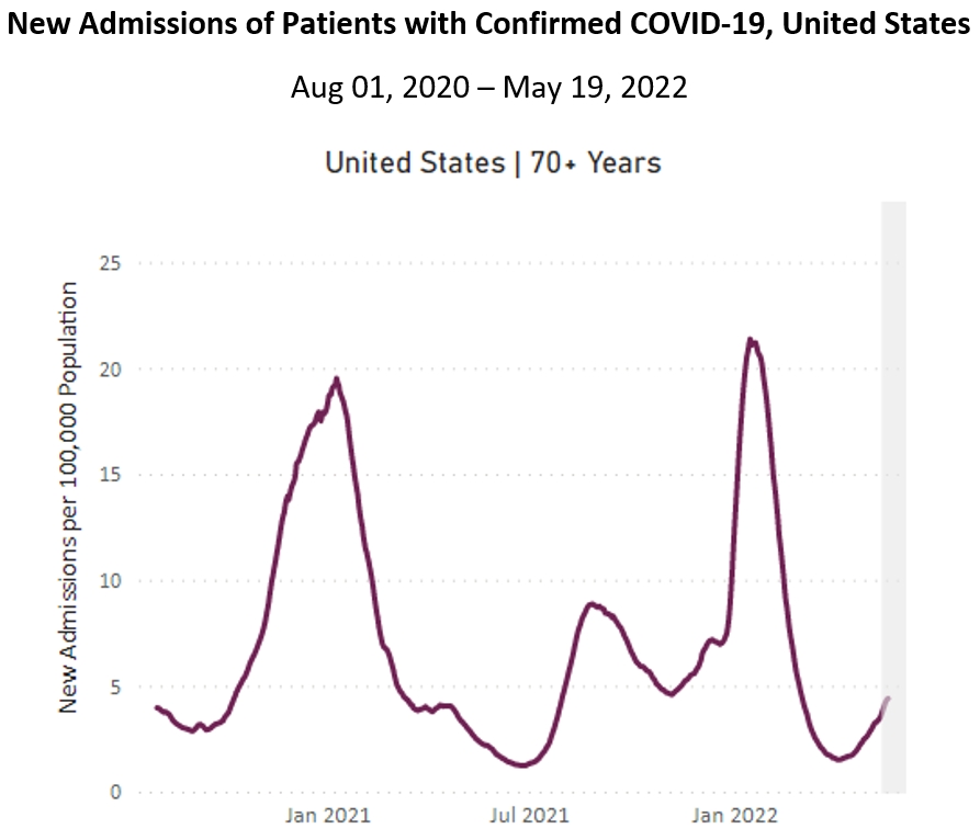
Nota: Los datos informados en los últimos 7 días (barra gris) deben interpretarse con precaución debido a los retrasos en la notificación.
Fuente: Conjunto de datos hospitalarios unificados, Equipo COVID-19 de la Casa Blanca, Grupo de trabajo de ejecución y estrategia de datos.
Fallecidos:
Hace dos semanas, el CDC del Pueblo reconoció que el número de muertos en los EE. UU. había superado el millón en muchas cuentas. Unos días después, el New York Times marcó el sombrío hito. El CDC sigue informando números ligeramente más bajos, alrededor de 1,000 menos de 1 millón.
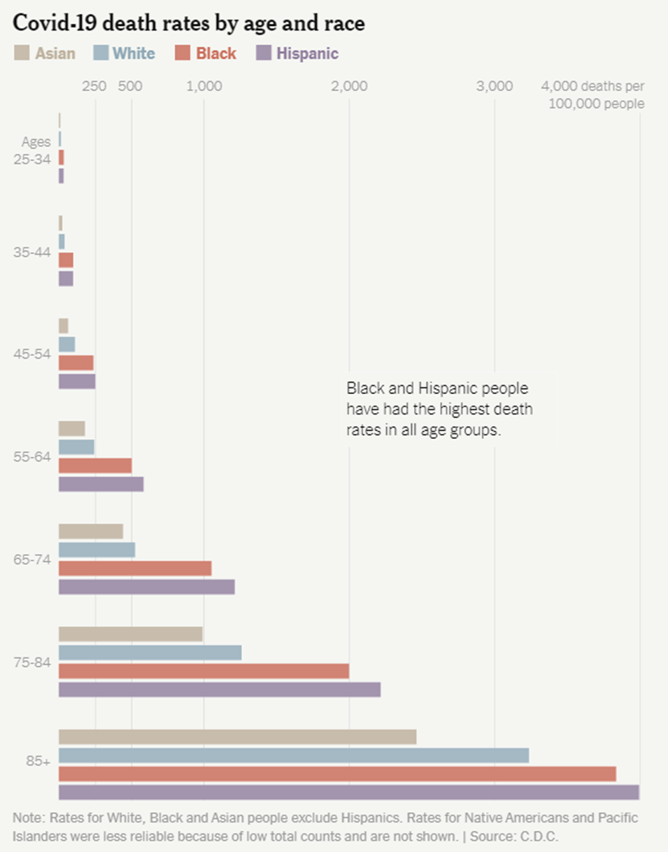
Los residentes estadounidenses mayores de 65 años contribuyeron a las tres cuartas partes de la asombrosa cifra de muertos.
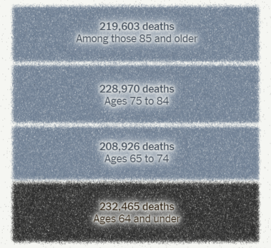
Fuente: The New York Times
En contraste con los grupos asiáticos y blancos, las personas negras y latinas tenían las tasas de mortalidad más altas de cada grupo de edad. Indígena & Isleño del Pacífico comunidades probablemente sufrieron las tasas de mortalidad más altas de todos grupos, aunque a menudo no están bien representados en las cifras nacionales debido a los bajos números.
estrés traumático colectivo de COVID es común, pero para las personas mayores, discapacitadas, pobres y de clase trabajadora y marginadas racialmente, el trauma y el impacto de la pandemia se agravan. El COVID es más que un desastre natural: también es un político, económico y social.
La semana pasada, del 13 al 19 de mayo, 1,953 personas fallecieron por COVID a nivel nacional. Se mantienen las muertes por COVID muy por encima incluso la peor de las temporadas de gripe antes de la COVID; es la tercera causa principal de muerte en los Estados Unidos.
Esté preparado, sin importar el clima:
Mascarilla siempre que esté en interiores con personas fuera de su hogar o en espacios al aire libre llenos de gente, preferiblemente con una máscara más máscara eficaz, como un KN95 o N95 si es posible. Aumente la ventilación en el interior abriendo las ventanas y/o usando un filtro HEPA (o creando tu propio filtro).
La vacunación y los refuerzos son capas importantes de protección. La FDA autorizó recientemente vacunas de refuerzo para niños de 5 a 11 años, que el CDC luz verde. Sin embargo, todavía necesitamos vacunas para niños menores de 5 años y, lo que es más importante, vacunas actualizadas ese coincidir con estas variantes.
Para aquellos que dan positivo por COVID y tienen acceso a un proveedor de atención médica, Los tratamientos COVID están disponibles. El CDC del Pueblo se solidariza y enfurece con aquellos que no tienen acceso a la atención médica.
Queremos amplificar el trabajo de las personas y organizaciones que luchan por la atención médica universal y modelos alternativos de atención, incluido @HCAhora, @PNHP, y @abdulelsayed.
Pronóstico:
Los mandatos de máscara pueden regresar, ya que tener en las escuelas de Filadelfia. también ha habido resistencia y negación en responder a los niveles de alerta de los CDC, como en la ciudad de Nueva York, a pesar de la orientación de que un el nivel de alerta alto debería activar el enmascaramiento en interiores.
Como nosotros seguir diciendo, necesitamos capas de protección para enfrentar esta pandemia; de lo contrario, los casos, las hospitalizaciones y las muertes seguirán disparándose.
En el horizonte: la FDA aprobado una prueba casera que puede detectar múltiples virus respiratorios: COVID, gripe y RSV. Sin embargo, los pacientes tienen que enviar sus muestras por correo, lo cual es menos conveniente que las pruebas de antígeno de COVID en el hogar ahora ampliamente disponibles.
Sobre COVID largo:
Es probable que el COVID largo sea asociado con la reactivación de virus latentes que ya están dentro del cuerpo. Es decir, un virus que normalmente está bien contenido en el cuerpo esencialmente se “despierta” y comienza a causar síntomas. Uno de esos virus es el virus de Epstein-Barr (EBV), que es el virus que causa la mononucleosis. Sobre 90 por ciento de los adultos en los EE. UU. tienen EBV viviendo tranquilamente en sus cuerpos. La reactivación de EBV debería ser rara e incluso entonces, experimentar síntomas con esta reactivación es se supone que es aún más raro. Sin embargo, Long COVID nos muestra que este puede no ser el caso por más tiempo, y esta reactivación puede ser bastante debilitante.
Krista Coombs, quien ha estado viviendo con Long COVID desde marzo de 2020, describe cómo es ahora experimentar el EBV reactivado:
“He reactivado EBV y [Cytomegalovirus] que causan muchos síntomas. He tenido problemas de visión desde el principio de enfermarme y todo se ve borroso constantemente, ya sea de cerca o de lejos. Ha sido realmente preocupante para mí. También he tenido numerosos dolores de cabeza como ninguno que haya experimentado antes”.
A pesar de lo que dicen los CDC y los funcionarios del gobierno, está claro que el COVID a menudo no templado. Si bien no es seguro si el SARS-CoV-2 (el virus que causa el COVID) está causando directamente esta reactivación, es otra pieza en el complejo rompecabezas de Long COVID que la investigación debe investigar para que los pacientes puedan comenzar a comprender lo que les está sucediendo y recibir el tratamiento que requieren.
Pequeño consejo: Los hogares residenciales en los EE. UU. ahora pueden solicitar 8 kits de prueba rápida de antígeno COVID adicionales a través del sitio web de USPS.
Fuentes (en orden):
- https://COVID.cdc.gov/COVID-data-tracker/#variant-proportions
- https://COVID.cdc.gov/COVID-data-tracker/#county-view?list_select_state=all_states&list_select_county=all_counties&data-type=CommunityTransmission&null=Risk
- https://www.youtube.com/watch?v=VJvB1uTL_9Q
- https://COVID.cdc.gov/COVID-data-tracker/#variant-proportions
- https://www.nature.com/articles/d41586-022-01240-x
- https://www.cidrap.umn.edu/news-perspective/2022/05/ecdc-ups-ba4-ba5-variants-concern-warns-case-rises
- https://www.cdc.gov/coronavirus/2019-ncov/variants/variant-classifications.html
- https://www.latimes.com/california/story/2022-05-03/ba-4-ba-5-coronvirus-variants-reinfecting-omicron-survivors
- https://biobot.io/data/
- https://covid.cdc.gov/covid-data-tracker/#new-hospital-admissions
- https://peoplescdc.org/2022/05/09/peoples-cdc-covid-19-weather-report-4/
- https://www.nytimes.com/interactive/2022/05/13/us/covid-deaths-us-one-million.html
- https://covid.cdc.gov/covid-data-tracker/#trends_dailydeaths
- https://spia.princeton.edu/news/native-american-deaths-covid-19-highest-among-racial-groups
- https://ajph.aphapublications.org/doi/10.2105/AJPH.2021.306370
- https://med.stanford.edu/psychiatry/about/covid19/stress.html
- https://www.theatlantic.com/health/archive/2022/03/covid-us-death-rate/626972/
- https://yourlocalepidemiologist.substack.com/p/are-we-in-a-public-health-emergency?s=r
- https://www.medicalnewstoday.com/articles/best-face-masks-covid#what-are-they
- https://peoplescdc.org/2022/05/16/peoples-cdc-covid-19-weather-report-5/
- https://thehill.com/policy/healthcare/3491033-fda-authorizes-booster-for-children-aged-5-11/
- https://www.cdc.gov/media/releases/2022/s0519-covid-booster-acip.html
- https://twitter.com/trvrb/status/1472971351581290498?s=20&t=u0BckzSx7H53qTbZCB_PuA
- https://www.theatlantic.com/health/archive/2022/05/covid-vaccine-recipe-omicron-protection/629846/
- https://peoplescdc.org/2022/02/22/urgency-of-equity-toolkit/
- https://khn.org/morning-breakout/fda-oks-at-home-combined-test-for-covid-flu-and-rsv/
- https://combatcovid.hhs.gov/possible-treatment-options-covid-19
- https://twitter.com/hcnow
- https://twitter.com/PNHP
- https://twitter.com/abdulelsayed
- https://www.phillyvoice.com/philly-schools-mask-mandate-covid-19/
- https://www.cnn.com/2022/05/18/us/new-york-city-no-mask-mandate-high-COVID-alert-status/index.html
- https://www.nbcnewyork.com/news/coronavirus/nyc-enters-high-covid-alert-level-as-hospitalization-rate-tops-key-benchmark/3692127/
- https://www.cell.com/cell/fulltext/S0092-8674(22)00072-1
- https://www.nejm.org/doi/full/10.1056/NEJM200008173430707
- https://www.verywellhealth.com/long-covid-latent-viral-reactivations-5205269
- https://special.usps.com/testkits