
The Current Situation – “The Weather”:
We are in a sustained surge. While BA2.12 has reached its peak in many areas, BA4/5 have arrived & are causing increased cases. The transmission map shows 99% of people in the US continue to be at high/substantial transmission.
Watch the video spread here:
On Variants:
Cases this year have been driven by wave after wave of new variants. Just as BA2.12 was becoming the major strain in the US (at 64%), BA4/5 have emerged (at 22%) & are rapidly growing.
There are regional differences – the Northeast still has the largest proportion of BA2.12, while the West/Midwest see much larger proportions of BA4/5. BA2.12 seems to have peaked in most areas according to this data.
Wastewater Monitoring:
Nationally, wastewater levels are plateauing at about the same level as last year’s Delta surge. Regionally, there is a small decrease in the Northeast while other areas are mostly stable.
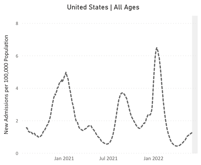
Hospitalizations:
For 8 weeks in a row, hospitalizations are rising nationally, though still at relatively low levels (1.3 per 100,000 people). Hospitalizations seem to have peaked in the Northeast but are continuing to rise in other regions.
Deaths:
In the past week, from June 9 to June 15, 1,862 people died of COVID nationally. Since the beginning of the pandemic, the moving average of daily deaths has never been less than 200.
Be Prepared:
In the face of multiple new variants, we continue to recommend layers of protection – vaccines/boosters, high-quality masks, improved ventilation, and access to testing. We also need updated vaccines, paid sick leave, and research into Long COVID treatment & prevention.
Improving indoor air quality in schools could reduce COVID & influenza! And yet, according to the CDC, most US public schools have made no major investments in indoor ventilation since the pandemic began. Ask your school board what they are doing to keep kids safer!
One spot of good news: By unanimous vote, the FDA recommended both Moderna and Pfizer vaccines for children 6 months through 5 years. While these vaccines are still designed for the original strain, they are an important tool that children deserve access to!
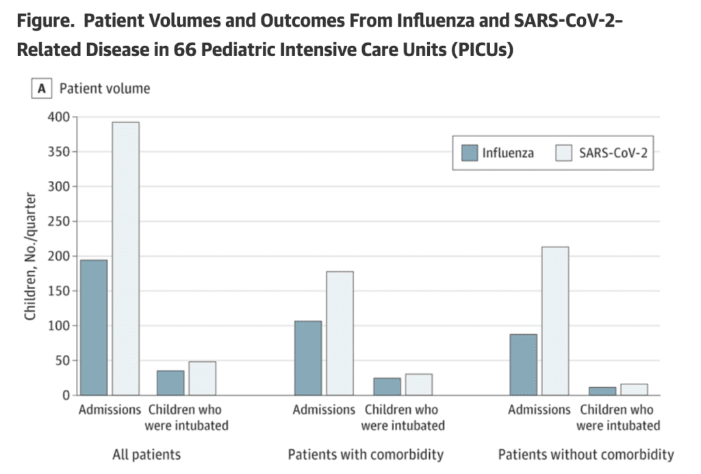
In fact, data this week highlighted that COVID is much worse than the flu for children, in terms of both hospital admissions and death rates.
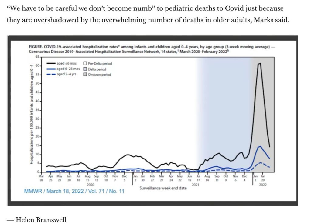
Likewise, the FDA vaccine review highlighted the increased risk of hospitalization for young children during the Omicron surge.
Forecast:
Infection with Omicron does not boost immunity against the variant later. A study in Science found that “people who had previously been infected [with Omicron] are not immune boosted against a subsequent infection with the variant, and potentially its subvariants BA.4 and BA.5.”
The relationship between prior infections, vaccination, and immunity to Omicron is increasingly complex. However, we are concerned there is potential for sustained high case levels throughout the summer, as new variants continue to spread while providing little to no protection.
On Long COVID:
So far, there are three leading theories behind what causes Long COVID: microscopic clots, lingering virus, or an overactive immune system. These are likely related to one another, and there is still much to understand about this enduring, complicated condition.
In addition, researchers report that brain fog, a common symptom of Long COVID, may be related to brain plaques similar to those seen in Alzheimer’s.
Sources (in order):
Or check out the links on our web version: https://bej.gbh.mybluehost.me/reports/
- https://covid.cdc.gov/covid-data-tracker/#county-view?list_select_state=all_states&list_select_county=all_counties&data-type=CommunityTransmission&null=Risk
- https://covid.cdc.gov/covid-data-tracker/#variant-proportions
- https://biobot.io/data/
- https://covid.cdc.gov/covid-data-tracker/#new-hospital-admissions
- https://covid.cdc.gov/covid-data-tracker/#trends_dailydeaths
- https://www.biorxiv.org/content/10.1101/2022.05.25.493397v1
- https://www.cdc.gov/mmwr/volumes/71/wr/mm7123e2.htm?s_cid=mm7123e2_w
- https://khn.org/news/article/covid-funding-pries-open-a-door-to-improving-air-quality-in-schools/
- https://www.statnews.com/2022/06/15/tracking-an-fda-advisory-panel-meeting-on-covid-vaccines-in-young-children/
- https://yourlocalepidemiologist.substack.com/p/fda-meeting-for-5-covid-vaccine-q?s=w&fbclid=IwAR3QzgOFIstsDOiLuY_MYlgap2xFAajEVm6za1xeb-MeqdH9BovH1RK_-Ic
- https://jamanetwork.com/journals/jamanetworkopen/fullarticle/2793366
- https://www.statnews.com/2022/06/15/tracking-an-fda-advisory-panel-meeting-on-covid-vaccines-in-young-children/
- https://www.imperial.ac.uk/news/237315/omicron-infection-poor-booster-covid-19-immunity/
- https://www.science.org/content/article/what-causes-long-covid-three-leading-theories
- https://www.smh.com.au/national/australian-researchers-find-parallels-between-alzheimer-s-and-long-covid-brain-fog-20220614-p5atnp.html