
La Situación Actual – “El Clima”:
Estamos en una oleada sostenida. Si bien BA2.12 ha alcanzado su punto máximo en muchas áreas, BA4/5 han llegado y están causando un aumento de casos. los mapa de transmisión muestra que 99% de personas en los EE. UU. continúan teniendo una transmisión alta/sustancial.
Mira el video difundido aquí:
Sobre variantes:
Los casos de este año han sido impulsados por ola tras ola de nuevas variantes. Justo cuando BA2.12 se estaba convirtiendo en la cepa principal en los EE. UU. (en 64%), surgieron BA4/5 (en 22%) y están creciendo rápidamente.
Hay diferencias regionales – El noreste todavía tiene la mayor proporción de BA2.12, mientras que el oeste/medio oeste tiene proporciones mucho mayores de BA4/5. BA2.12 parece haber alcanzado su punto máximo en la mayoría de las áreas según estos datos.
Monitoreo de aguas residuales:
Nacionalmente, niveles de aguas residuales se están estabilizando aproximadamente al mismo nivel que el aumento de Delta del año pasado. A nivel regional, hay una pequeña disminución en el noreste, mientras que otras áreas son en su mayoría estables.
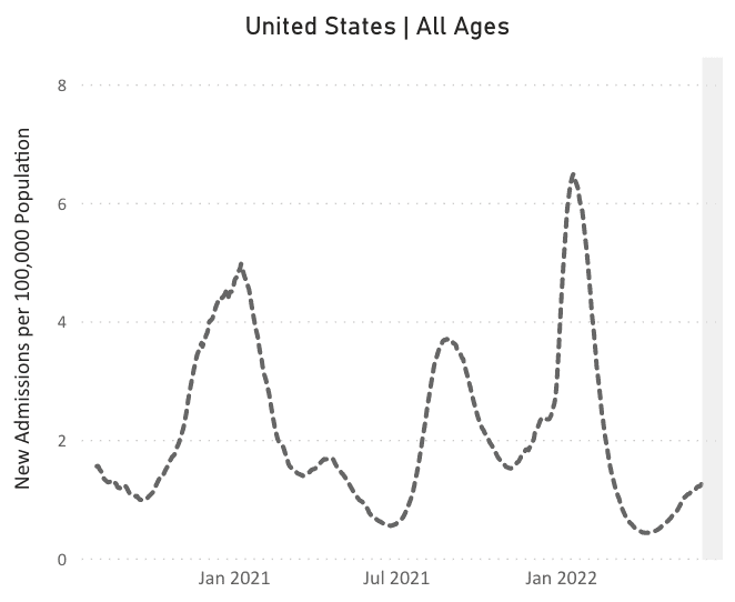
Hospitalizaciones:
Durante 8 semanas seguidas, hhospitalizaciones están aumentando a nivel nacional, aunque todavía en niveles relativamente bajos (1,3 por cada 100.000 personas). Las hospitalizaciones parecen haber alcanzado su punto máximo en el noreste, pero continúan aumentando en otras regiones.
Fallecidos:
La semana pasada, del 9 al 15 de junio, 1.862 personas han fallecido por COVID a nivel nacional. Desde el comienzo de la pandemia, la media móvil de muertes diarias nunca ha sido inferior a 200.
Estar preparado:
Ante múltiples variantes nuevas, seguimos recomendando capas de protección: vacunas/refuerzos, máscaras de alta calidad, ventilación mejorada y acceso a pruebas. También necesitamos vacunas actualizadas, licencia por enfermedad remunerada e investigación sobre el tratamiento y la prevención de COVID prolongado.
¡Mejorar la calidad del aire interior en las escuelas podría reducir el COVID y la influenza! Y todavía, Según el CDC,, la mayoría de las escuelas públicas de EE. UU. tienen no hizo grandes inversiones en la ventilación interior desde que comenzó la pandemia. ¡Pregúntele a su junta escolar qué están haciendo para mantener a los niños más seguros!
Una buena noticia: por voto unánime, el La FDA recomendó las vacunas Moderna y Pfizer para niños de 6 meses a 5 años. Si bien estas vacunas todavía están diseñadas para la cepa original, son una herramienta importante que los niños merecen tener acceso!
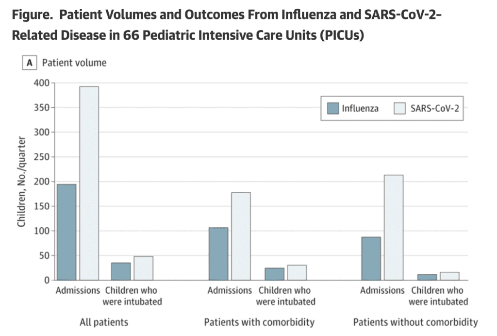
En realidad, datos de esta semana destacó que COVID es mucho peor que la gripe para los niños, tanto en términos de ingresos hospitalarios como de tasas de mortalidad.
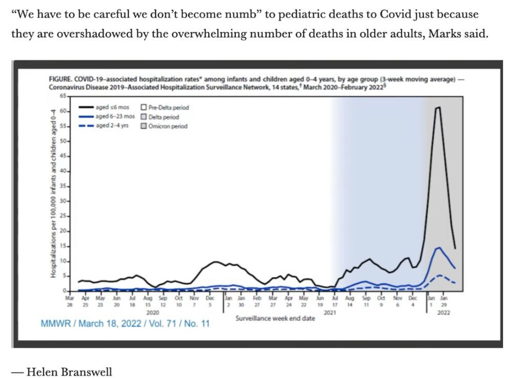
Asimismo, la revisión de vacunas de la FDA destacó la mayor riesgo de hospitalización para niños pequeños durante la oleada de Omicron.
Pronóstico:
La infección con Omicron no aumenta la inmunidad contra la variante más adelante. A estudiar en Ciencias descubrió que "las personas que habían sido infectadas previamente [con Omicron] no están inmunoestimuladas contra una infección posterior con la variante, y potencialmente sus subvariantes BA.4 y BA.5".
La relación entre infecciones previas, vacunación e inmunidad a Omicron es cada vez más compleja. Sin embargo, nos preocupa que exista la posibilidad de niveles de casos altos sostenidos durante el verano, ya que las nuevas variantes continúan propagándose y brindan poca o ninguna protección.
Sobre COVID largo:
Hasta ahora, hay tres teorías principales detrás de lo que causa Long COVID: coágulos microscópicos, virus persistente o un sistema inmunológico hiperactivo. Es probable que estén relacionados entre sí, y aún queda mucho por entender acerca de esta condición complicada y duradera.
Además, los investigadores informan que la niebla mental, un síntoma común de Long COVID, puede estar relacionado con placas cerebrales similares a los observados en el Alzheimer.
Fuentes (en orden):
O echa un vistazo a los enlaces en nuestra versión web: https://peoplescdc.org/reports/
- https://covid.cdc.gov/covid-data-tracker/#county-view?list_select_state=all_states&list_select_county=all_counties&data-type=CommunityTransmission&null=Risk
- https://covid.cdc.gov/covid-data-tracker/#variant-proportions
- https://biobot.io/data/
- https://covid.cdc.gov/covid-data-tracker/#new-hospital-admissions
- https://covid.cdc.gov/covid-data-tracker/#trends_dailydeaths
- https://www.biorxiv.org/content/10.1101/2022.05.25.493397v1
- https://www.cdc.gov/mmwr/volumes/71/wr/mm7123e2.htm?s_cid=mm7123e2_w
- https://khn.org/news/article/covid-funding-pries-open-a-door-to-improving-air-quality-in-schools/
- https://www.statnews.com/2022/06/15/tracking-an-fda-advisory-panel-meeting-on-covid-vaccines-in-young-children/
- https://yourlocalepidemiologist.substack.com/p/fda-meeting-for-5-covid-vaccine-q?s=w&fbclid=IwAR3QzgOFIstsDOiLuY_MYlgap2xFAajEVm6za1xeb-MeqdH9BovH1RK_-Ic
- https://jamanetwork.com/journals/jamanetworkopen/fullarticle/2793366
- https://www.statnews.com/2022/06/15/tracking-an-fda-advisory-panel-meeting-on-covid-vaccines-in-young-children/
- https://www.imperial.ac.uk/news/237315/omicron-infection-poor-booster-covid-19-immunity/
- https://www.science.org/content/article/what-causes-long-covid-three-leading-theories
- https://www.smh.com.au/national/australian-researchers-find-parallels-between-alzheimer-s-and-long-covid-brain-fog-20220614-p5atnp.html