People’s CDC COVID-19 Weather Report

Published

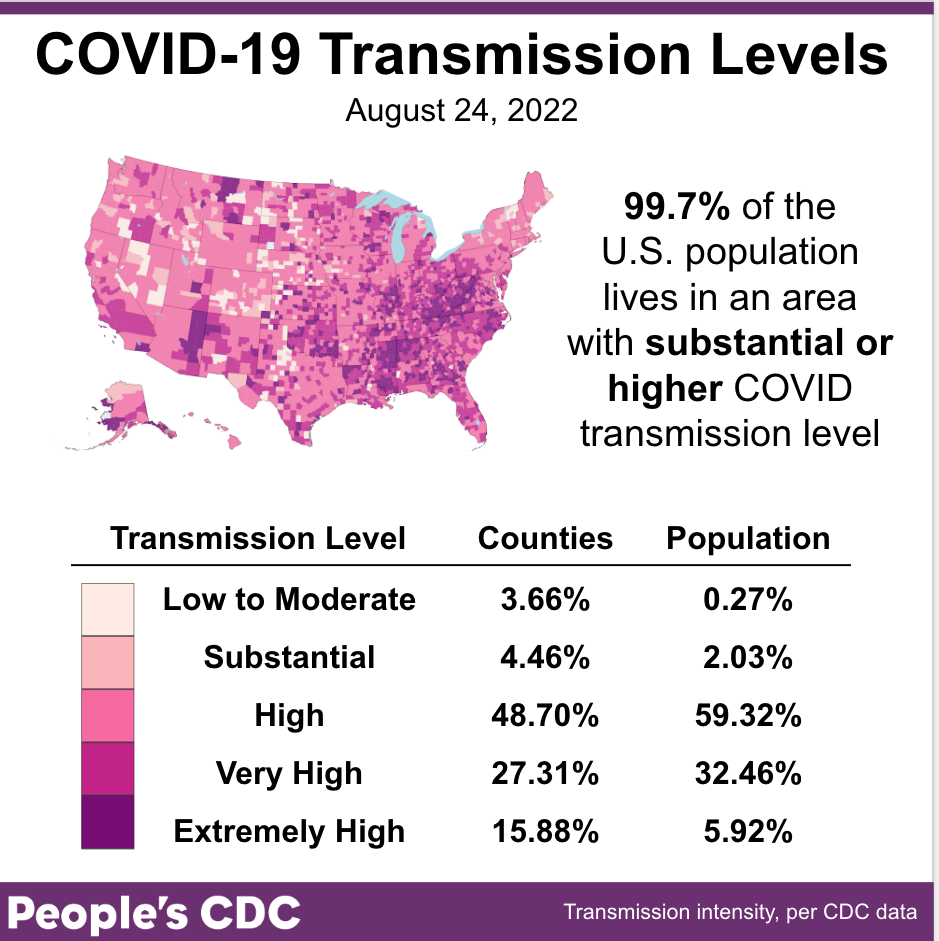
The Weather: Our transmission map–based on the CDC’s original metrics–shows just how high cases are in some areas, with two new categories for 200-300 & >300 weekly cases per 100,000. Currently more than 90 percent of people live in an area with more than 100 weekly cases per 100,000!

This map and table show COVID community transmission in the US by county, with High broken into 3 subcategories: High, Very High, and Extremely High. Transmission is indicated via shades of fuschia, with the darkest shade indicating areas of Extremely High transmission, and the palest shade representing Low to Moderate transmission. Text indicates that 99.7 percent of the US population lives in an area with substantial or higher COVID transmission level, which is also represented via the three darkest shades of fuschia covering most of the map itself. Only 3.66 percent of counties, representing 0.27 percent of the population, are experiencing Low to Moderate transmission. Most of the country is experiencing High transmission, at 48.70 percent of counties representing 59.32 percent of the population; followed by Very High transmission, at 27.31 percent of counties representing 32.46 percent of the population. The graphic is visualized by the People’s CDC and the data are from the CDC.

On Variants: Nationally, there is little change from last week: BA5 remains at about 88% & BA4.6 increased slightly from 7% to 8%. This may be a small break in a year where we have seen rapid, consistent turnover of variants.

A bar chart shows data for the weeks of 5/28/2022 through 8/27/2022 with levels for each viral lineage shown vertically. In late-May, BA.2.12.1 and BA.2 were the dominant lineages, with only small amounts of BA.4 and BA.5 circulating. As time goes on, BA.4 and BA.5 quickly grow and BA.2.12.1 and BA.2 begin to shrink. By early July, BA.5 had become the dominant variant. As of 8/27/2022, BA.5 makes up the vast majority of cases at 88.7 percent, followed by BA.4.6 at 7.5 percent, and BA.4 at 3.6 percent of cases. The pattern of growth of BA.5 over the aforementioned time period appears to be exponential.

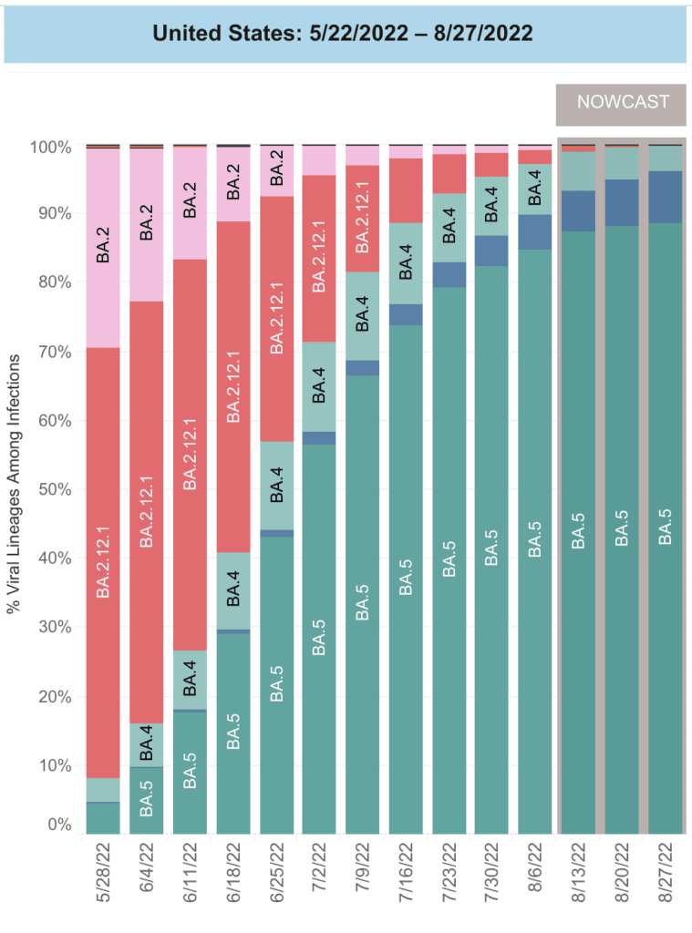
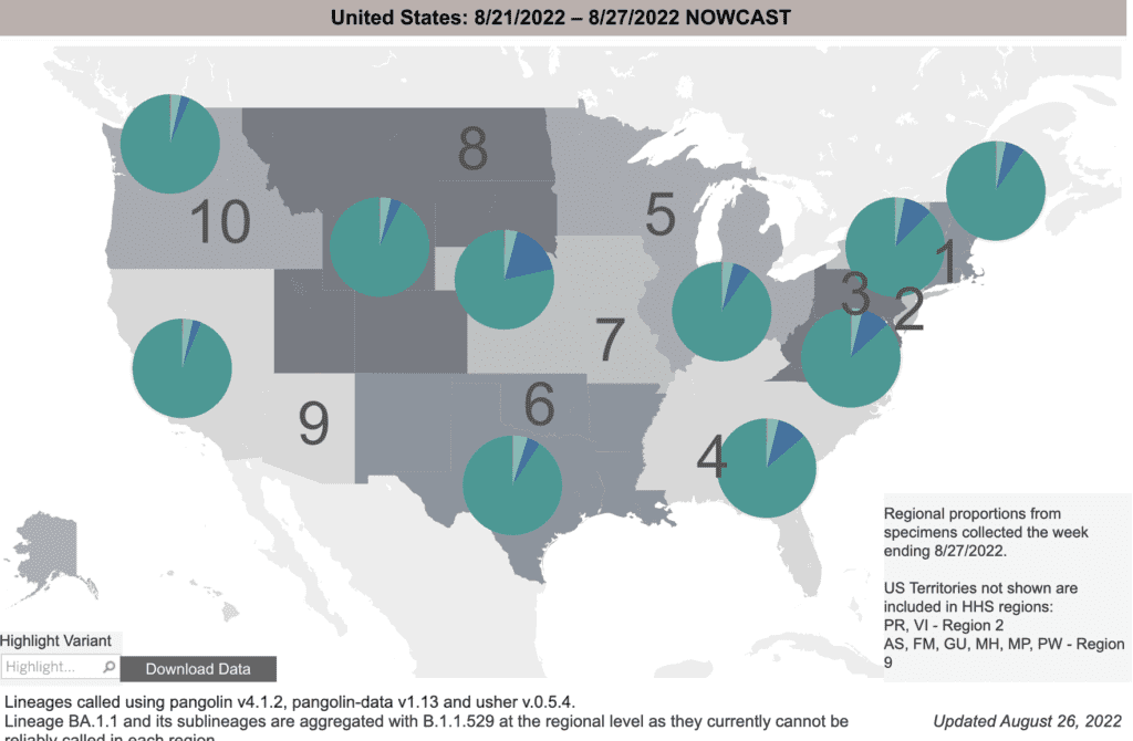
Regionally, we see some variation, with BA4.6 less common on the West Coast but making up to 15 percent of cases in the Central US. The Northeast is in between, with BA4.6 comprising about 9 percent of cases.

A grayscale map of the US shows proportions of COVID variants in 10 regions. On top of each region are pie charts indicating different regions’ proportion of each variant. The charts show that BA.5, in dark teal, is the largest proportion of variants in all regions. BA.4.6, in dark blue, is the next most prominent variant in nearly all regions but most notably in region 7, which represents Iowa, Kansas, Missouri, and Nebraska. On the bottom right, text says "Regional proportions from specimens collected the week ending 8/27/2022. US territories not shown are included in HHS regions: Puerto Rico, Virgin Islands - Region 2; American Samoa, Federated States of Micronesia, Guam; Marshall Islands, Northern Mariana Islands, Palau - Region 9."

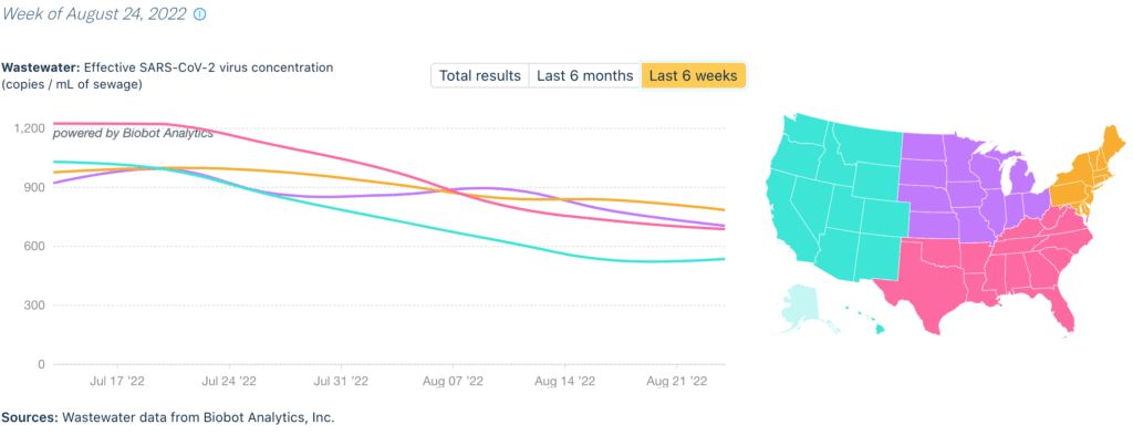
Wastewater Monitoring: National wastewater data show the BA5 surge has peaked, with the first decline since March. Levels are still high & the length of this surge raises questions about what “living” with COVID looks like.

A graph with overlapping lines indicates wastewater viral concentration in dark blue & daily clinical cases in light blue from January 2020 to August 2022. The x-axis is the date & the y-axis on the left states “Wastewater: Effective SARS-CoV-2 virus concentration, copies per mL, or milliliter, of sewage” and the y-axis on the right states “Clinical: daily new cases.” The clinical cases & daily average have fairly consistent peaks & valleys, though the lines are discrepant, with the wastewater levels consistently higher than the daily clinical cases, especially during surges. This year the wastewater was at its lowest in mid-March, but it’s climbed since then with peaks of 780 copies per mL in June and 1077 copies per mL in July. The latest data point indicates a viral concentration of 678 copies per ML as of August 24. Source: “Wastewater data from Biobot Analytics, Inc.; Clinical data from USAFacts.”

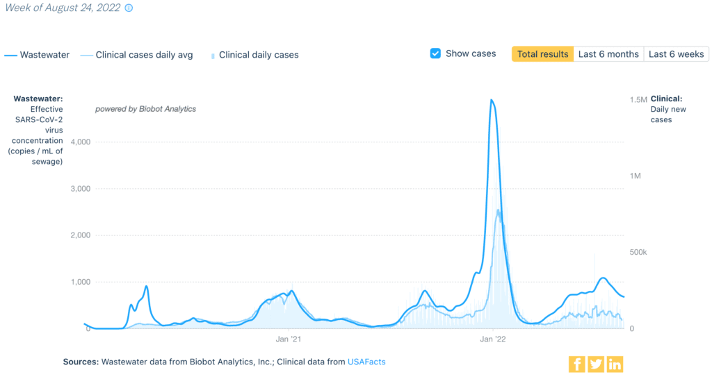
By region, wastewater data (which is not affected by unreported home tests or reduced testing) show declines in all areas. The West currently has the lowest levels overall, at 536 copies per milliliter.

A line graph shows the concentration of COVID virus in wastewater in four regions of the US: the west, which includes Alaska and Hawaii on this map; northeast; south; and midwest, from early 2020 to August 2022. Levels in all regions are decreasing, with levels ranging from 529 copies per milliliter of sewage in the west to 785 copies per milliliter of sewage in the northeast as of August 24, 2022. Data from Biobot Analytics.

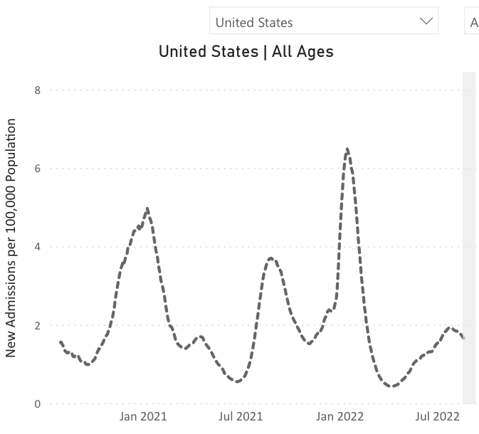
Hospitalizations: While still elevated, hospitalizations are also beginning to decline as the BA5 surge slows down.

A line chart representing new admissions of patients with confirmed COVID in the United States over time. The chart has “United States, All Ages,” as its title, “New Admissions per 100,000 Population” on its y-axis, and dates from January 2021 to July 2022 on its x-axis, though actual dates range from August 2020 to August 2022. The dotted line represents new admissions of patients with confirmed COVID in the US over time across all age ranges. The line indicates peak hospitalizations occurred in January 2021, August 2021, and January 2022, with smaller peaks happening in April 2021 and July 2022. At its latest data point, the line indicates that hospitalizations are currently moving in a downward trend.

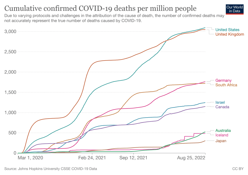
Deaths: From August 18th to August 24th, 2,729 people died of COVID nationally. Over 210,000 Americans have died from COVID so far in 2022.

The US is a world leader in COVID deaths. Along with the UK, we have the highest deaths per population–suggesting that our approach to controlling the pandemic is not as successful as other countries.

A line chart titled “cumulative confirmed COVID-19 deaths per million people,” representing cumulative deaths in nine countries, with numbers from 0 to 3,000 on the y-axis and dates from from March 2020 to August 2022 on the x-axis. Confirmed deaths per million people is led by the US, followed quite closely by the UK, both showing around 3,000 cumulative confirmed deaths per million people. Next are Germany and South Africa, showing around 1,750 confirmed deaths per million people; Israel and Canada, with around 1,250 confirmed deaths per million people; Australia and Iceland, with around 500 confirmed deaths per million people; and Japan, with around 250 confirmed deaths per million people. Text indicates that “due to varying protocols and challenges in the attribution of the cause of death, the number of confirmed deaths may not accurately represent the true number of deaths caused by COVID-19.” The source for these data is Johns Hopkins University CSSE COVID-19 Data.

On Long COVID: Scientists are examining the possible roles–& treatments–of microclots in Long COVID (LC). While those with COVID are more likely to develop clots, it is not yet definite that clots contribute to LC. 

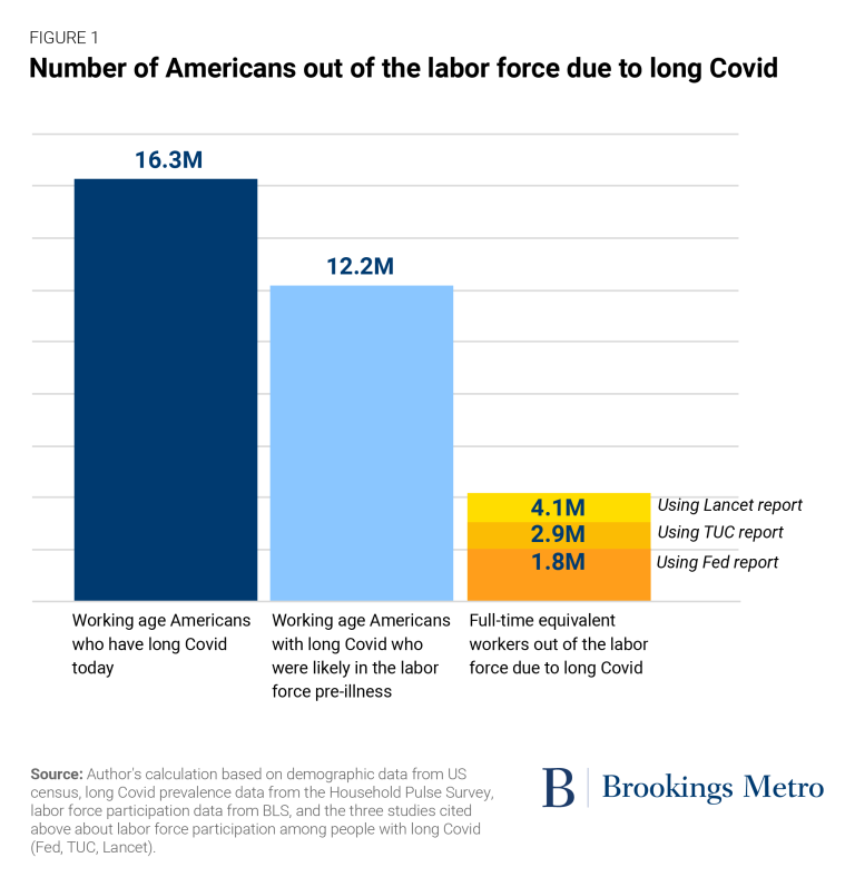
New reports make clear that Long COVID is having a large impact on the labor force. While preventing disease should be a goal by itself, businesses should also realize that keeping their staff & customers healthy is in their best interest.

Bar chart titled “number of Americans out of the labor force due to long Covid,” presented by Brookings Metro. The first bar, in dark blue, represents “working age Americans who have long Covid today,” at 16.3 million. The next bar, in light blue, represents “working age Americans with long Covid who were likely in the labor force pre-illness,” at 12.2 million. The third bar, split into three categories in dark, medium, and light orange, represents “full-time equivalent workers out of the labor force due to long Covid,” with 1.8 million people per the Fed report, 2.9 million people per the TUC report, and 4.1 million people per the Lancet report. Text at the bottom notes, “Source: Author’s calculation based on demographic data from US census, long Covid prevalence data from the Household Pulse Survey, labor force participation data from BLS, and the three studies cited above about labor force participation among people with long Covid (FED, TUC, Lancet).”

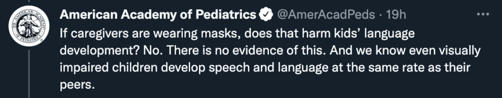
Forecast: As students return to school, using layers of protection are the best way to keep schools safer & prevent disruptions due to sick days. The American Academy of Pediatrics is clear: masks do not interfere in student learning.

Screenshot of a tweet from the American Academy of Pediatrics that reads, “If caregivers are wearing masks, does that harm kids’ language development? No. There is no evidence of this. And we know even visually impaired children develop speech and language at the same rate as their peers.”

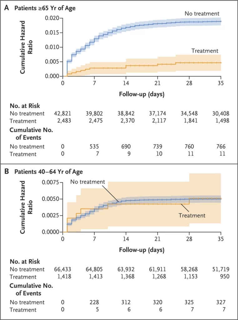
The administration decided on a treatment & vaccination approach. Studies show Paxlovid works to prevent hospitalization & death among older folks – but with no benefit for those under 65 or without underlying conditions. We need next generation treatments!

Two sets of line charts representing “cumulative hazard ratio for hospitalizations due to Covid-19, according to age group and treatment status,” with cumulative hazard ratios on the y-axes, and follow-up in days from 0 to 35 on the x-axes. Each chart includes a blue line representing “no treatment,” for those who did not receive Paxlovid, and an orange line representing “treatment,” for those who did receive Paxlovid. The top chart, representing data among patients aged 65 and older, shows Paxlovid helped to prevent hospitalizations and death, with the no treatment line indicating much higher cumulative hazard ratios compared to the treatment group among that age group. The bottom chart, representing data among patients aged 40-64, shows Paxlovid did not help to prevent hospitalization or death, with the no treatment line close to and at times overlapping with the treatment line, indicating no difference in cumulative hazard ratios among those who did or did not receive treatment.

Updated vaccines, targeting BA5 & the original strain, may be available as soon as September. This fantastic news comes with a few concerns. The boosters will only be available to folks 11 & older – once again leaving young children unprotected. 

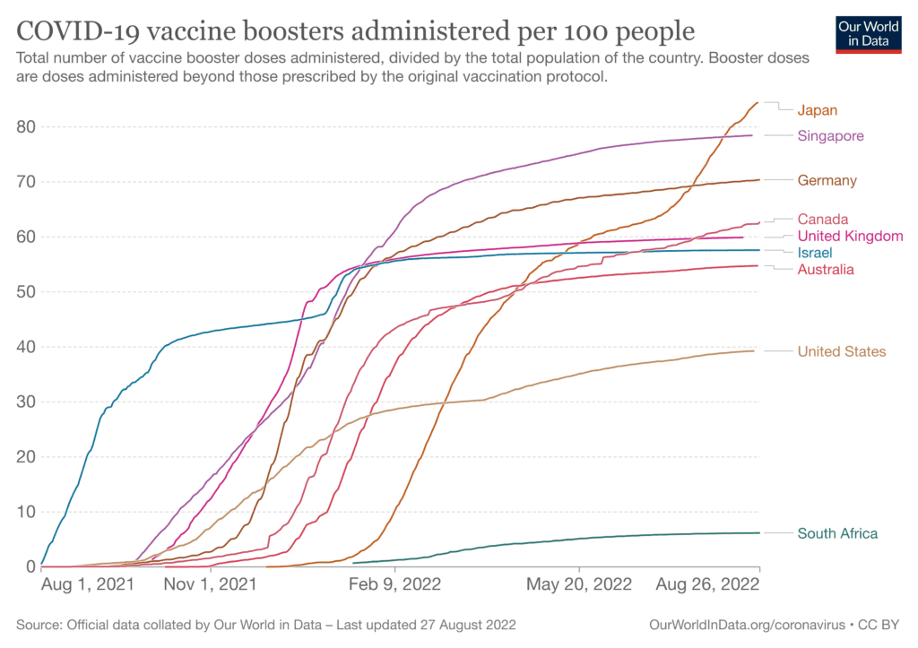
Our vaccine infrastructure has largely been shut down. We need an equitable, well-funded roll-out of these boosters. However, the US lags most of the world in using boosters & it may be challenging to motivate the public to get this booster.

A line chart titled “COVID-19 vaccine boosters administered per 100 people,” representing booster rates in nine countries, with numbers from 0 to 80 on the y-axis and dates from August 1, 2021 to August 26, 2022 on the x-axis.The chart indicates that Japan has the highest booster rates, with around 84 per 100 people having received booster doses as of the latest data point. Next is Singapore at 78.5 per 100 boosted, Germany at 70.4, Canada at 62.7, the UK at 59.9, Israel at 57.6, Australia at 54.8, the US at 39.3, and South Africa at 6.2. The source for these data is noted as “official data collected by our World in Data,” with the latest update having occurred on August 27, 2022.

We are potentially at a turning point. If no new variants emerge & the new bivalent boosters are effective, we may see a true decline in cases. 

Data already suggest that with high vaccine levels, we are seeing fewer deaths–though still high hospitalization rates–during surges. This does not change the PCDC’s position that preventing infections in the first place is essential, especially given the high rates of LC.

However, it’s unclear what impact the return to school & typical winter surge might have. And new variants can emerge at any time–another reason to prevent cases & reduce chances for the virus to mutate.

Be Prepared: Time sensitive: The government plans to end its program of delivering a limited number of free, at-home COVID tests via USPS beginning September 2nd, per the USPS. You can check to see if you’re due to receive a last round of tests by visiting the USPS free test site.

And if your government tests look like they expire soon – check here to see how long they are actually good for. 

Data Note: In this report, numbers pulled from the CDC were current as of August 24, 2022. The CDC updates data frequently as it receives refreshed information from states and counties. The numbers you view today may be slightly different from the numbers from this report. 

Sources: Check out the links throughout and see our website for more! https://peoplescdc.org

Share this:
Translate
Close